How to create a Google Sheets stacked bar chart
If your goal is to show the relationship between parts and wholes in your data, the best chart to use is a stacked bar chart in Google Sheets..
Each type of chart in Google Sheets has its own function. If your goal is to show the relationship between parts and wholes in your data, your best chart should be a stacked bar chart in Google Sheets. This chart allows you to easily compare individual data points with aggregated values. This article will guide you through creating a Google Sheets stacked bar chart.
How to create a Google Sheets stacked bar chart
Step 1:
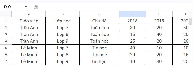
You prepare your Google Sheets data table as usual.
Please check the data format in the table again to get a complete and accurate chart.
Step 2:
Next, we proceed to select the range of data that you want to display in the stacked bar chart in Google Sheets.
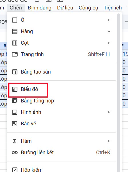
Click Insert again , select Chart from the displayed list.
Step 3:
Display the chart that Google Sheets creates for you, we look to the side and click on the Chart Type section to change it again.
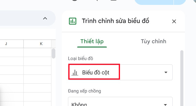
We scroll down to the Bar section and select Stacked Bar Chart to change the existing column chart in the data table.

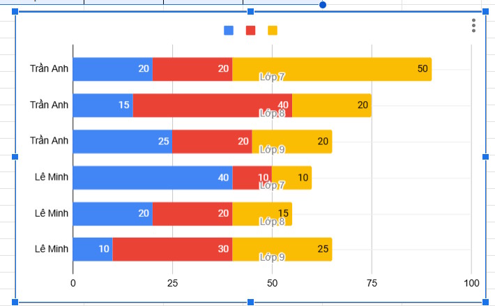
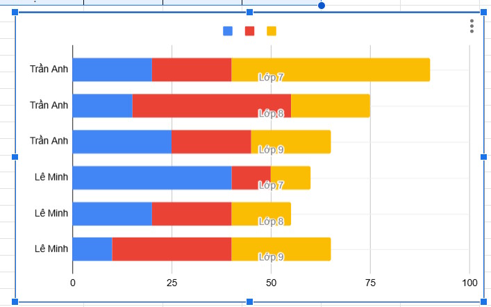
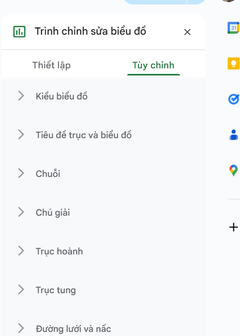
Then we have a stacked bar chart as shown below. Continue to click on Customize to change the chart interface again.
Step 4:
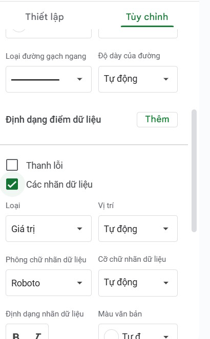
If you want to display specific data in each chart bar , click on the Series item, then select the Data Labels item .
Then the specific numbers will be displayed in each horizontal bar as shown below.
You continue to customize the chart display interface according to your needs.