How to create graphs, charts in Google Sheets
Google Sheets also features a graphical representation, showing the data that are included so that users can change the chart..
In addition to Microsoft Office office tools, now users also tend to use a number of online office tools, quickly respond to user needs and can access anywhere. Among them must be the suite of online office tools from Google. These tools provide the most basic content editing features, from importing text content, tabular presentations, presentation slides, or creating charts on Google Sheets.
The ability to create charts and graphs on Google Sheets is similar to when we do on Excel. Users will have many other options to edit the graph to represent the data to represent. The following article will guide you to read the basic steps to create charts on Google Sheets.
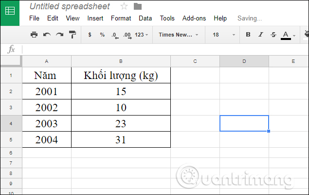
We will take the example with the data table below to create a chart.
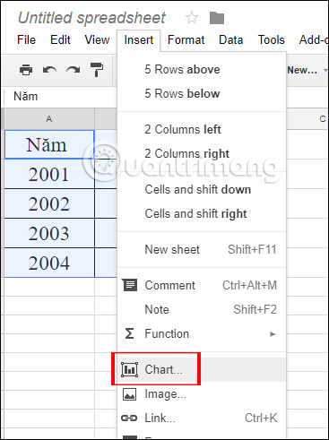
Step 1:
First of all, you need to black out the entire contents of the data table you want to display with a chart. Then, click the Insert tab on the toolbar, then select Chart .
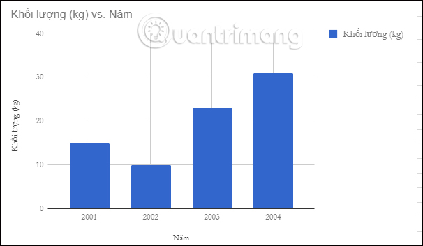
Step 2:
After that, we will see the previous display graph that Google Sheets represents for you.

At the right side of the screen, a setting frame will appear with options to change the graph. First of all in the Data section, the Chart type section can change the type of graph representation.

You can scroll down to select the type of Googole Sheets chart provided. For example, change to the column chart type as shown below.
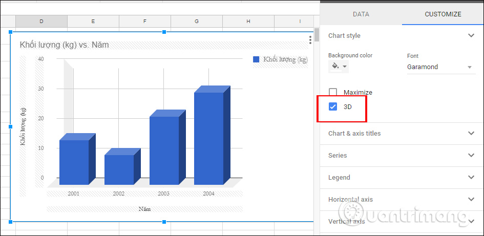
Step 3:
Switch to Customize . This column will change the font in the table, font color, title of the chart, .
We can change the style for the chart in Chart style, such as using a 3D chart. Click on the 3D option and we will be charted as shown below.
Step 4:
To change the color of the chart, you can select the background color for the chart in the Background color section.
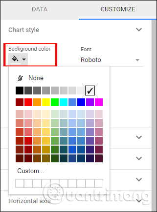
Or users can change the font for the entire content of the title in the chart in the Font section .

Step 5:
Next, users can choose to change the format for the titles in the graph. Google Sheets provides format settings for headlines for you to choose and change.
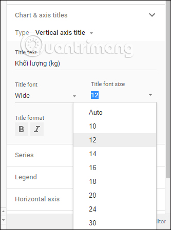
We can change the font, font size, format or color for each title in the chart in the Customize section . You drag down the Chart & axis section titles to perform.

You can change the content for each title, font format, can change the font size, color for each title that appears in the Google Sheets chart if desired.
The changes will be applied immediately when we proceed to change any details. The chart will automatically be saved to the content and made into a file, like when you create a data sheet on Google Sheets.
So, with the above steps, you can create charts and graphs in content on Google Sheets. Graph representation is a basic operation not only on Google Sheets, but also on Excel or on Word. The chart will make the document content more vivid, summarize some statistics. Users can use the settings to create a complete chart on Google Sheets.
I wish you all success!