How to create a stacked bar chart in Google Sheets
Stacked bar charts in Google Sheets are a very useful chart type when you want to show the relationship between individual pieces of data and the whole.
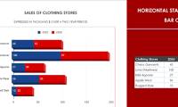
Stacked bar charts in Google Sheets are a very useful chart type when you want to show the relationship between individual data components and the whole, making it easy for viewers to compare the components within each data category. Compared to other chart types, stacked bar charts are particularly suitable for viewing the overall sum of each component in a single bar, rather than separating them into individual parts.
We will select the Stacked Bar Chart type in the chart creation interface under the Sheets selection. After selecting it, the chart will transform into a stacked chart, displaying the parts of each bar in the correct order and proportion.
Google Sheets allows you to customize charts to your needs. For example, you can display specific data directly on each bar, or change colors, fonts, titles, axes, etc., to make the chart more beautiful and professional.
Was this article helpful?
Your feedback helps us improve.
Related Articles
 How to create a Google Sheets stacked bar chart2 minutes read
 How to create graphs, charts in Google Sheets4 minutes read
 How to create a spreadsheet chart in Canva Sheets2 minutes read
 Instructions on how to plot stacked columns in Excel4 minutes read
 How to insert Google Sheets charts into Google Docs4 minutes read
 How to use the DMAX function in Google Sheets3 minutes read
Reader Comments 0
Sign in with email or Google to join the discussion.