Guide to drawing charts in Canva
Canva offers many tools to help you design your content, including support for drawing charts in slides or documents..
Canva offers many tools to help you design your content, including support for drawing charts in slides or documents. There are many similar chart templates available in its editors, making it easy to choose a chart that suits your presentation needs. Below is a guide on how to draw charts in Canva.
Drawing charts in Canva is very simple.
Step 1:
Open the content where you want to insert the chart, then click on the "Components" option on the left and enter the keyword "chart" to search for charts.
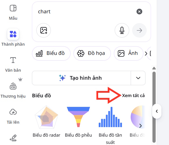
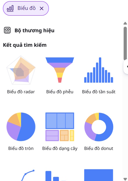
Then, in the Charts section , click View All to expand the chart types available in Canva.
Step 2:
We select the type of chart we want to use in our document. After inserting the chart into the content, we continue to click to edit it.
Step 3:
We can manually enter data into the data table to make changes, or we can upload the data file to Canva to modify the diagram.
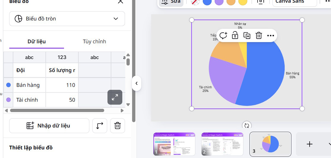
Next, you adjust the Labels and Segments for the chart in the displayed list.

Step 4:
Next, click on the Customize option , and you'll see the options to customize the chart's appearance. Enter your desired content into these fields to change the chart's appearance in Canva.

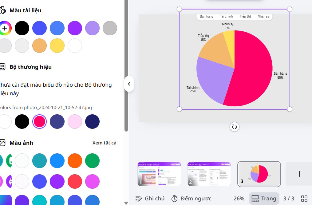
To change the color of a chart, click on the part of the chart you want to change the color of, then select a new color for that area of the chart.