3 data visualization tools to replace Excel's outdated charts.
Are basic Excel charts no longer professional enough? Discover 3 alternative tools: Flourish (interactive/animated), Bricks (AI Dashboard), and Datawrapper (web visualization)..
Microsoft Excel has always been the leading tool for handling raw data (data manipulation) and complex calculations . Excel spreadsheets and functions are unbeatable for quickly completing internal reports. However, when it comes to creating professional and eye-catching charts for important presentations or websites, Excel's static, default chart formats begin to show their shortcomings.
The goal isn't to eliminate Excel—as it remains the backbone of all data manipulation—but rather to upgrade the Visualization process . Below are three specialized tools designed to transform raw Excel spreadsheets into interactive, compelling, and effective data stories.
Flourish – Telling Stories Through Dynamic Charts
Access Flourish
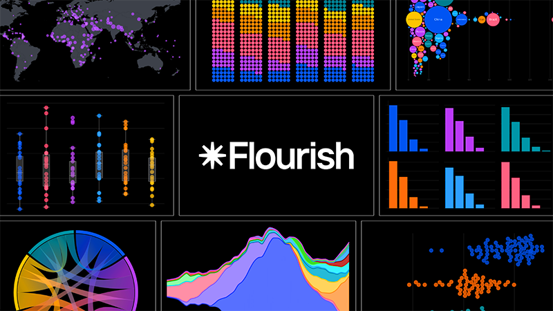
Flourish is a browser-based data visualization tool favored by news organizations, marketing professionals, and anyone wanting to transform spreadsheets into interactive stories .
1. Core Strengths
- Animation and Interaction: Specializes in creating animated visuals such as the popular "Bar Chart Race" video on YouTube, zoomable hierarchy charts, and 3D maps.
- Extensive Template Library: Provides countless chart templates, from standard types (Line, Bar, Pie) to unique formats such as Population Pyramids, Streamgraphs, Arc Diagrams , categorized by purpose (comparison, time change, hierarchy).
- Flexible workflow: Allows users to select a template first and then upload data, or upload a spreadsheet first so Flourish can suggest suitable chart types (e.g., bubble charts, heatmaps) based on the column structure.
2. Suitable for which situations?
Flourish is an optimal choice when you need to present data to an audience . Its interactive elements make it ideal for embedding in articles, websites, or sharing on social media platforms, where viewers can explore the layers of data themselves.
3. Cost and Integration
- Free Version: Provides a full library of unlimited templates and projects, but published work will display the Flourish logo.
- Canva integration: Canva Business/Enterprise users can access Flourish through integration, which removes the logo and supports exporting high-quality SVG files.
Bricks – AI-Powered Automated Reporting

Access Brick
Bricks is the ideal solution to eliminate the tedious process of manually capturing Excel chart screenshots and pasting them into PowerPoint. This platform integrates spreadsheets, documents, and presentations into a single space, with Artificial Intelligence (AI) at every layer.
1. Core Strengths
- Instant Dashboard Creation: The spreadsheet interface is similar to Excel but with the addition of an AI Chat panel . Users simply enter their request (e.g., "create a dashboard to display regional sales performance"), and the AI will automatically generate charts, summary tables, and KPI (Key Performance Indicator) tags.
- Create Text Reports: In addition to images, AI also generates written insights , identifying trends, top performers, and revenue volatility, placed right alongside the charts.
- Automatic Synchronization: The dashboard automatically updates when spreadsheet data changes. The Present button instantly converts the entire report into a full-screen presentation.
2. Suitable for which situations?
Bricks is ideal for those who frequently present data and need to quickly convert raw data into written reports or presentations , saving time on file import/export between applications.
3. Costs and Limitations
- Free version: Limited to 20 AI messages (it was quite fast during testing).
- Paid Version: Starts at $25/month with 200 AI messages and more advanced features.
Datawrapper – Professional Journalistic Style Chart
Access Datawrapper
Datawrapper is a browser-based tool trusted by newsrooms to create clean, responsive, and accessible charts , especially when embedded on websites. Datawrapper's goal is to create charts that effectively convey information without being cluttered with excessive graphic elements.
1. Strengths of
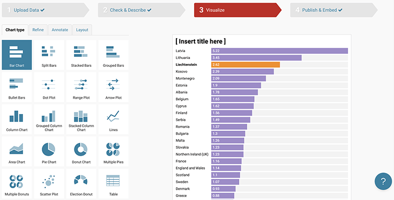
- Strict process: Follow the efficient 4-step process: Upload → Check & Describe → Visualize → Publish .
- Focus on Accessibility: Provides integrated tools such as color-vision-deficiency filters and automatic dark mode support , ensuring charts work well on all devices and audiences.
- Web features: Create responsive embed code for websites. Supports Tooltip functionality (displays values when hovering the mouse over a data point).
- Minimalist Format: Provides standard chart types (Bar, Line, Scatter, Pie/Donut) and specialized options such as Range Plots, Election Donuts , with a default minimalist, easy-to-read style.
2. Suitable for which situations?
Datawrapper is the best choice when charts need to be embedded on a webpage and require fast loading speeds , responsiveness across various screen sizes, and high clarity and accuracy .
3. Costs and Limitations
- Free Version: Very generous, allowing unlimited chart creation, but has a small watermark.
- Paid Version: Customizable packages start at $599/month, remove branding, and add team collaboration features.
The right choice for the job.
The choice of which visualization tool to use will depend entirely on your data output :
- Choose Flourish: When the goal is to create interaction and animation for the audience (e.g., social media reports or in-depth articles).
- Choose Bricks: When you need to quickly convert a spreadsheet into a comprehensive written report/presentation (saving time on taking screenshots).
- Choose Datawrapper: When charts need to be embedded on the web , speed, responsiveness, and clear, easily accessible journalistic standards are required.
Since all three tools offer free versions, try importing an existing Excel spreadsheet into each tool to see which workflow best suits your analytical and presentation style.