How to edit chart notes in Google Sheets
Notes in the chart are like street signs. It is basically labels that describe part of a chart that contains at least two elements.
Express data by chart types such as pie charts, column charts, line charts, etc., making it easier for readers to read and understand when looking at dry numbers.
A chart has a clearer note than a spreadsheet with complex numbers and percentages. If a chart doesn't have a caption, that chart is completely useless because no one can understand what it wants to show. Therefore note in the chart is extremely important, is an indispensable part in the data set. Here are some customizations that make your notes more neat and understandable in Google Sheets.
- How to create graphs, charts in Google Sheets
- How to insert Google Sheets charts into Google Docs
- How to format conditional cells in Google Sheets
How to add and format notes in Google Sheets on a computer
Notes in the chart are like street signs. It is basically labels that describe part of a chart that contains at least two elements. To display and edit chart notes follow the steps below.
Step 1 . Be sure to select the first and the first row of data while creating the chart. If the default note does not appear, click on the chart to activate the Chart Editor. Next select the Setup tab and scroll down until you see the checkbox.
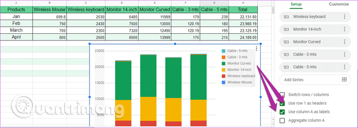
Select the second and third boxes to display chart notes.
Step 2. Next, select Customize> Legend and click Position to change the note location.

You can also change the font, format or text color to highlight them. Note, however, that the note must be the same color as the column it explains in the chart. When changing the note color, the column color also changes.
To do this, double-click the column (or line in the case of the line chart) to activate the Series . Now change color according to your preference.
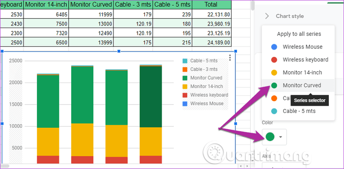
To change the color of the remaining elements, choose a color from the drop-down menu.
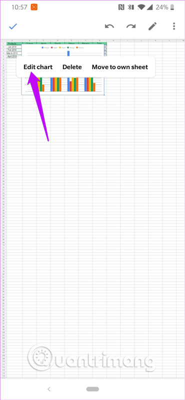
How to add and format notes in Google Sheets on your phone
Adding and formatting notes in Google Sheets on the phone is simple. Access to Edit mode, select notes and location.
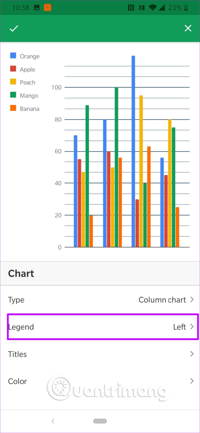
Adding or changing the color is the same as on the computer, touch the column and the color option will appear.

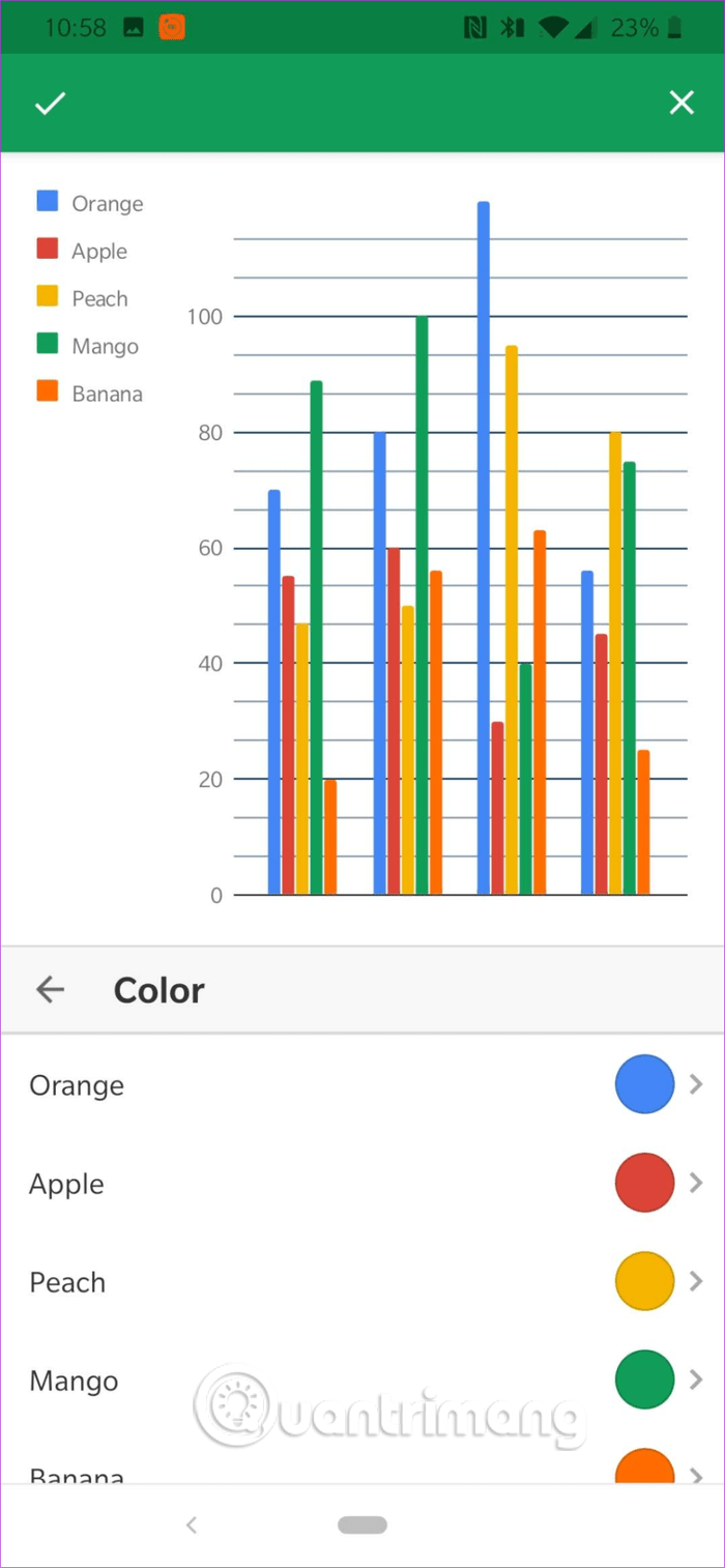
Currently, you cannot change the note text here. To edit a note, you need to edit the text in the data column.
Format each data label in Google Sheets
Data labels are just as important as notes. However, unlike notes, data labels are not automatically added, so you need to add them manually.
Step 1. Double-click the chart to open the Chart Editor, click the Customize tab, and click the Series drop-down menu.
Step 2 . Now, select the Data labels checkbox to add to the chart, adjust your desired position.

In addition, you can edit the font, size and font color here.

Step 3 . To add an image to the data label, tap Point and select the image you want to display on the chart. Note, these images are for line charts only.
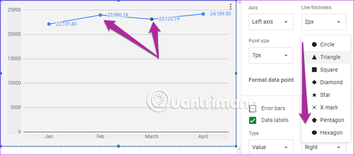
Tip: You can display trend changes via Trendline option ( Customize> Series ), similarly if you want to delete other bars, just select the option Error bars .
The mobile version of Google Sheets is limited, you cannot add data labels on your phone.
Add or delete grid lines
Google Sheets does a pretty good job of calculating and displaying grid lines. However, sometimes these lines don't appear the way you want. You don't need to worry because you can change or modify it easily.
Go to Customize> Gridlines and select Major gridline count .
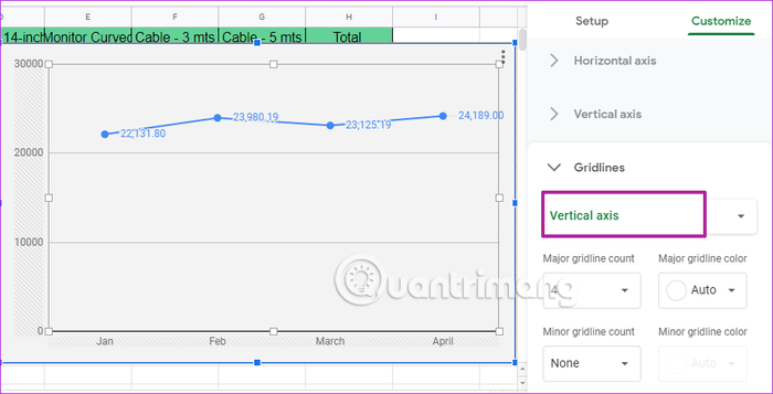
If you don't need this grid line, just select a number from the Minor gridline count drop-down menu. You also cannot make this change from the mobile version.
I wish you all success!
- How to create a stacked bar chart in Google Sheets
- How to create graphs, charts in Google Sheets
- How to create a spreadsheet chart in Canva Sheets
- How to set up the right to edit spreadsheets on Google Sheets
- How to add notes and comments on Google Sheets quickly
- How to align spreadsheets before printing on Google Sheets
- Familiarize yourself with spreadsheets, rows, columns, and cells.
- How to Use Sparklines in Google Sheets to Visualize Data
- How to use Format Painter in Google Sheets
- How to get web page data with Google Sheets
- This is a very useful function in Google Sheets but not many people know it
- 4 Google Script makes Google Sheets more powerful
- How to use the MEDIAN function in Google Sheets
- How to generate random numbers in Google Sheets
- Google Docs, Sheets and Slides update the new Material interface
- How to limit data with Data Validation in Google Sheets
- Google Drive adds 6 new features
- Google Drive for iOS updates the new version that supports password protection


 Instructions on how to edit and delete chart data in PowerPoint
 How to show or hide chart axes in Excel
 PowerPoint 2016: Working with Charts
 JavaScript code to create a zoomable chart with Zoom & Pan functionality.
 Excel 2019 (Part 22): Charts
 How to create a spreadsheet chart in Canva Sheets
-
 Application
-
Web Email
-
Website - Blog
-
Web browser
-
Support Download - Upload
-
Software conversion
-
Social Network
-
Simulator software
-
Online payment
-
Office information
-
Music Software
-
Map and Positioning
-
Installation - Uninstall
-
Graphic design
-
Free - Discount
-
Email reader
-
Edit video
-
Edit photo
-
Compress and Decompress
-
Chat, Text, Call
-
Archive - Share
-
-
System
-
Mac OS X
-
Hardware
-
Game
-
Tech info
-
Technology
-
Science
-
Life
-
Electric
-
Program
-
Mobile