How to Use Sparklines in Google Sheets to Visualize Data
Did you know you can fit an entire chart into a single cell in Google Sheets? It's called a Sparkline, and it shows you patterns in your data at a glance.
Table of Contents
Did you know you can fit an entire chart into a single cell in Google Sheets ? It's called a Sparkline, and it shows patterns in your data at a glance. It may not sound like much, but once you start using it, you'll realize how powerful it is for spotting trends and interpreting data quickly.
Why are Google Sheets Sparklines so good?
Convert numbers into a pie chart
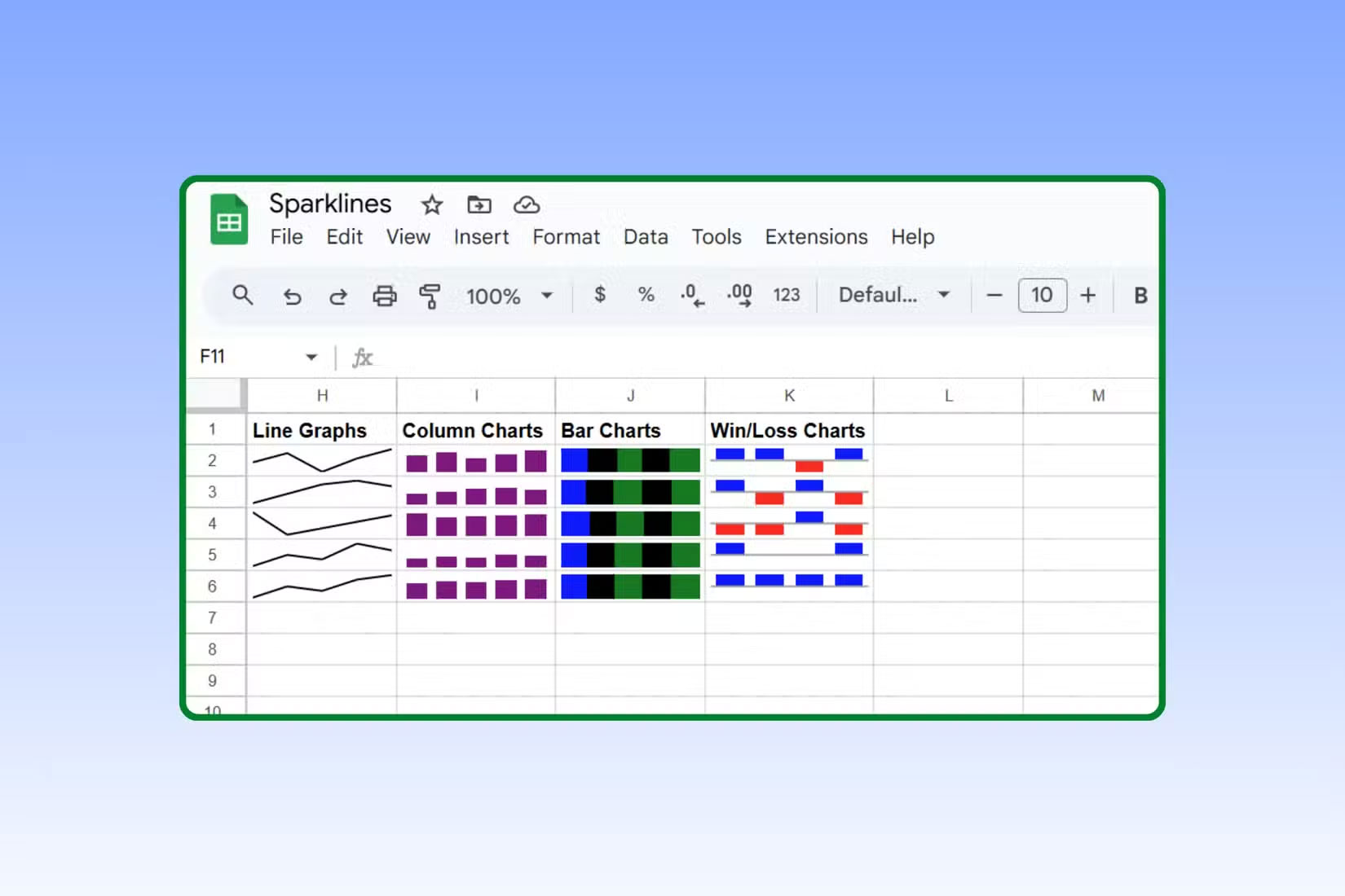
The SPARKLINE function in Google Sheets essentially takes a row of numbers and turns them into a small chart that fits in a single cell. Instead of a large chart that takes up half the screen, you get a small, elegant visualization that shows trends at a glance.
The basic syntax looks like this:
=SPARKLINE(range)So a formula with a real data set would look like this:
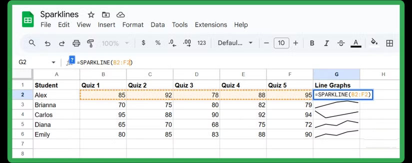
=SPARKLINE(B2:F2)This formula can give you a neat little line graph of any values you have in cells B2 through F2. If you track your students' test scores over the course of a semester, you'll instantly see whether their scores are improving, plateauing, or plummeting—all without ever leaving the grid.
How to insert a stacked bar chart into a cell
Sometimes a line graph isn't what you need. If you want to compare values across multiple categories—for example, different sections of a test like reading comprehension, summarizing, and vocabulary—a stacked bar sparkline works well. Instead of showing progress over time, it shows how each section contributes to the whole.
Here's how to set it up:
=SPARKLINE(B2:D2, {"charttype","bar"})
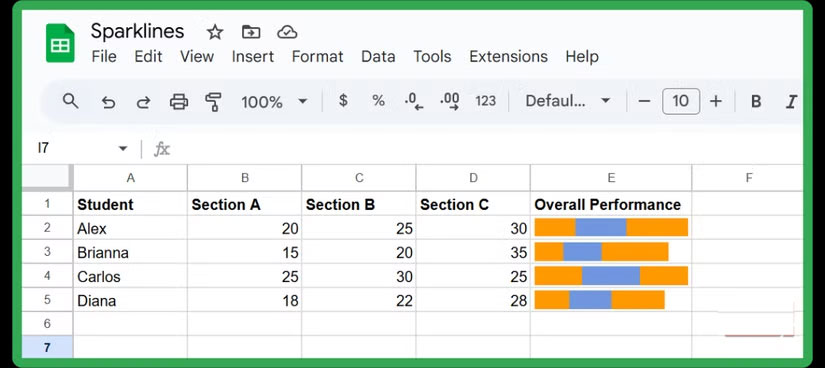
This creates a neat little bar right inside the cell, with each segment sized relative to its value. It's a quick way to compare metrics like employee performance metrics, budget allocations, or survey responses without cluttering up your spreadsheet with full-size charts.
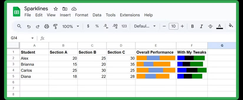
Of course, you don't have to stop at the default:
=SPARKLINE(B2:D2,{"charttype","bar"; "max",80; "color1","blue"; "color2","black"; "color3","green"; "empty","ignore"; "rtl",false})In this formula, max sets the scale. Here, the bar is capped at 80 points. The color1, color2 , and color3 arguments let you assign a color to each segment. You can add more color arguments if you have more categories. The empty argument tells Sheets what to do with empty cells (here, we ignore them). The rtl (right-to-left) argument controls the order of the bars. Setting it to false makes the chart run naturally from left to right.
Insert a column Sparkline chart
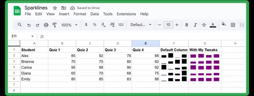
Sometimes you want to highlight the highs and lows more clearly. That's where column Sparkline charts come in. They're perfect when you're dealing with values that vary a lot, like monthly revenue, test scores, or daily steps. Each value in the range becomes its own little column, neatly nested inside the cell:
=SPARKLINE(B2:E2,{"charttype","column"})This way, you can instantly see which months are performing best or which are falling short. You can take it a step further by setting a fixed scale and personalizing the columns with your favorite or brand colors:
=SPARKLINE(B2:E2,{"charttype","column";"ymin",50;"ymax",100;"color","purple"})In this case, the bars are plotted between 50 and 100, making the comparison more consistent, and the purple color makes the chart stand out more.
Insert Win/Loss Sparkline Chart
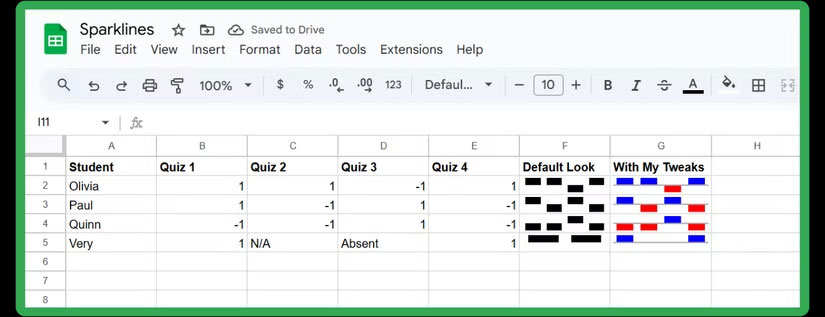
Now, if your data is binary (like a goal met vs. a goal not met, or a yes/no survey result), the Win/Loss Sparkline chart is even more powerful. Instead of showing magnitude, it simply tells you whether each event was a win (positive) or a loss (negative). Here's the basic syntax you can use:
=SPARKLINE(B2:E2,{"charttype","winloss"})Any positive values will show up as a bar above the axis, while negative values are below. This makes it easy to quickly scan for successes and failures. And like other Sparklines, you can customize them further:
=SPARKLINE(B5:E5,{"charttype","winloss"; "color","blue"; "negcolor","red"; "nan","convert"; "axis",true})In this version, wins are colored blue, losses are colored red, non-numeric values are treated as 0 (thanks to the nan argument), and a line runs through the graph for added clarity.
Was this article helpful?
Your feedback helps us improve.
Related Articles
 How to align spreadsheets before printing on Google Sheets3 minutes read
 Tricks using Google Sheets should not be ignored7 minutes read
 How to create graphs, charts in Google Sheets4 minutes read
 How to link data between spreadsheets in Google Sheets4 minutes read
 5 Best Google Sheets Add-ons to Make Data Analysis Easier4 minutes read
 How to use Filter function on Google Sheets3 minutes read
Reader Comments 0
Sign in with email or Google to join the discussion.