Instructions on how to plot stacked columns in Excel
Draw a stacked column chart in Excel to represent data with images to give you a more intuitive look. In this article, TipsMake.com will guide you to create a stacked column chart in Excel for an existing data table.
Draw a stacked column chart in Excel to represent data with images to give you a more intuitive look. In this article, TipsMake.com will guide you to create a stacked column chart in Excel for an existing data table.

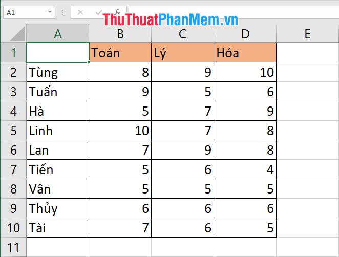
For example, we have the following data table, which is very suitable for the superposition bar chart category: Math Physics Chemistry Score table for students. Because the data of the same category is scores, it can be combined into one column and overlapped.
First you need to open the Insert ribbon on the toolbar.
Then you find the Charts section of this ribbon. The Charts section contains functions for inserting different chart types into your Excel document file.
Because we need to insert a bar chart, click the Insert Column or Bar Chart icon in the Chart section .

There are many types of column charts you can use, 2D column chart types and 3D column chart types.
In each form, there are data chart types and% chart types. You will get a preview of the legend and a temporary display of the chart when you just click on the icon of the chart.

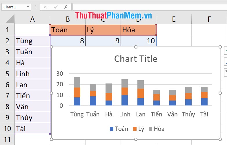
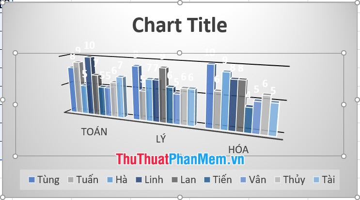
The chart to be inserted is displayed above the contents of the Excel file. The current stack column chart is only in the default stub form, you also need to adjust it to suit the shape you need.
The quickest way to adjust the format and composition of a stacked column chart is the navigation buttons just to the right of the chart. You can use it to add different elements to the chart like the image below when you add tick marks to Data Labels , the specific data of the stacked column arrays will be displayed right on the column.

Or else you can use two ribbon functions dedicated to the chart: Chart Design and Chart Format .
You can change different formats, such as the style of the stacked column chart in the Chart Design ribbon .

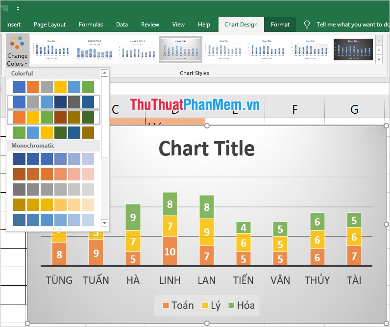
Changing the colors for the columns of the overlapping column in Change Colors also belongs to the Design ribbon . Available in different sets of colors to choose from.
Besides, there is an Add Chart Element to be able to add different elements to the chart. As the example below when adding Data Table , you can create more data tables just below the chart.

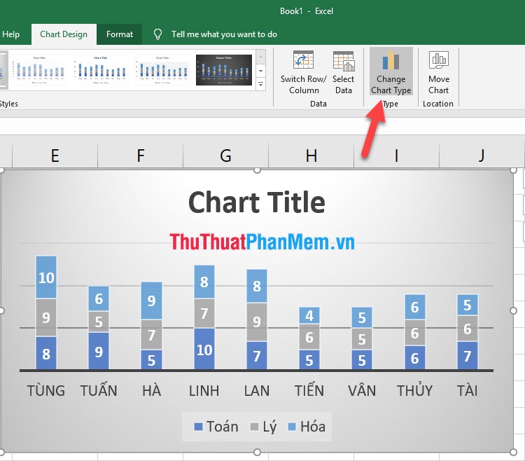
If you want to change the overlay column chart type, then click the Change Chart Type icon on the same ribbon.
There are different types of stacked bar charts that you can review and change. Available in 2D and 3D, you can preview images in the Preview below. After making a satisfactory choice, click OK to change.
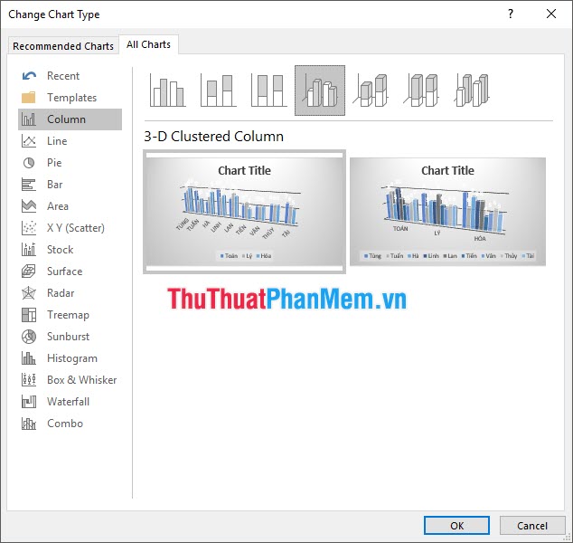
As you can see the bar graph will change according to what you choose.
Thank you for reading our article TipsMake.com on how to plot stacked columns in Excel. Wish you can do it successfully!
Was this article helpful?
Your feedback helps us improve.
Related Articles
 How to convert columns into rows and rows into columns in Excel2 minutes read
 How to fix columns in Excel3 minutes read
 How to combine 2 columns Full name in Excel does not lose content4 minutes read
 How to delete, add columns in Excel3 minutes read
 How to fix columns and headlines in Excel3 minutes read
 Instructions for separating column content in Excel7 minutes read
Reader Comments 0
Sign in with email or Google to join the discussion.