Instructions on creating data comparison charts in Gemini
Using Gemini to support teaching is no longer unfamiliar to teachers. And with its data comparison feature, teachers can instantly create visual charts that are easier to read than traditional data formats..
Using Gemini to support teaching is no longer unfamiliar to teachers. And with data comparison features, teachers can create visually appealing charts that are easier to read than traditional data types. Below is a guide on creating data comparison charts in Gemini.
How to create illustrations for data comparison charts in Gemni
Step 1:
First, you need to prepare the data comparison content, or a data comparison table.
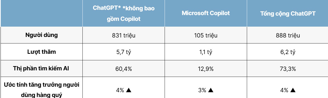
For example, use the comparison table shown below. The table shows the number of ChatGPT users as of March 2026, including standalone ChatGPT (website + app), Microsoft Copilot (powered by ChatGPT), and a combination of both.
Then, in Gemini, paste the entire comparison content into the chat box . Next, enter the following command .
Dựa vào nội dung, tạo hình ảnh minh họa dạng biểu đồ dạng so sánh ChatGPT và Microsoft Copilot qua các mục phân tíchIn the Tools section , select Create Image and choose Pro to use it.

Step 2:
Then we get the illustrative chart comparing the data you need.
If you're not satisfied with the illustration of the comparison chart, you can recreate it. Below is an illustration of a comparison chart.