Reasons to use PivotCharts instead of PivotTables in Excel
PivotTables are a familiar data analysis tool, but they often leave you staring at rows of numbers looking for patterns. Now, many people have turned to PivotCharts..
PivotTables are a familiar data analysis tool, but they often leave you staring at rows of numbers looking for patterns. Now, many people are turning to PivotCharts. They turn the same data into clear visuals, revealing trends and insights you might otherwise miss.
Understanding Excel PivotCharts
The Smart Side of PivotTables
PivotCharts are visual representations linked to a PivotTable in Excel that summarize the underlying raw data. When you create a PivotChart, Excel automatically creates a corresponding PivotTable, and the two are dynamically linked. Any changes made to one PivotTable—whether it's filtering data or rearranging fields—are immediately reflected in the other PivotTable.
The main difference from standard charts, however, is interactivity. While standard charts display fixed ranges of data, PivotCharts include drop-down filters and field buttons directly on the visualization itself. This allows you to slice and dice data without leaving the chart view.
PivotCharts excel at revealing relationships, trends, and comparisons that might otherwise be hidden in a table. While PivotTables might display quarterly sales figures as rows of numbers, PivotCharts converts that same data into trend lines, clearly showing growth patterns or seasonal fluctuations.
Building your first PivotCharts
No formula needed, just drag and drop
PivotCharts don't require any formulas. Instead, you simply rearrange your data visually. Creating a PivotChart follows the same logic as building a PivotTable:
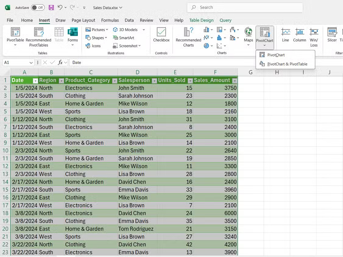
- Select your data range, then click Insert .
- Then, select PivotChart from the Charts group .
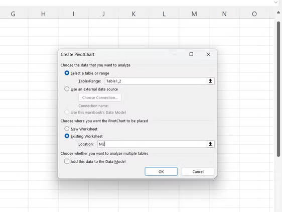
- In the dialog box that appears, confirm your data range and choose to place the PivotChart in a new or existing worksheet.
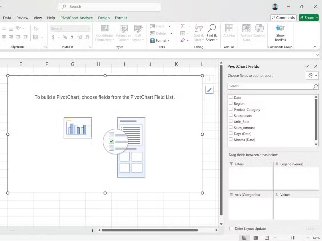
- The PivotChart Fields panel will appear on the right. Drag the fields you want to analyze into those areas.
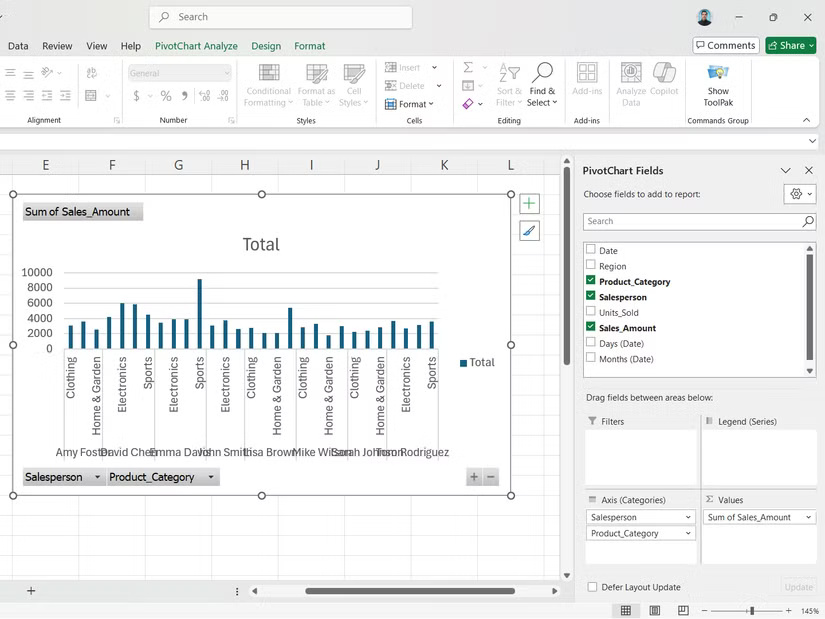
You will find the following field areas in the PivotCharts fields:
- Filters : Control what data appears in your chart. Add fields here to create drop-down menus that let you show or hide specific categories without rebuilding your chart.
- Values : The numeric data you're measuring, such as sales or sales numbers. Excel automatically applies the SUM function , but you can change it to COUNT , AVERAGE , or other essential Excel functions.
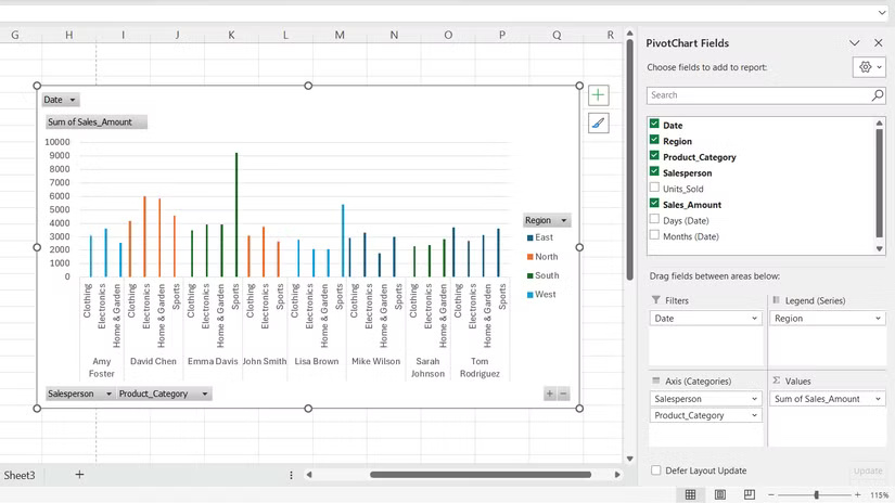
- Legends : Categories create different colored data series in your chart. Dragging a Salesperson here will display each person's sales as a different colored line or bar.
- Axis : The horizontal reference that organizes your data. Typically, this axis contains dates, product names, or other category information that forms the basis of the chart.
When you drag and drop these fields, your PivotCharts and linked PivotTables are built instantly.
Create PivotCharts Your Own Way
Chart colors, styles and types
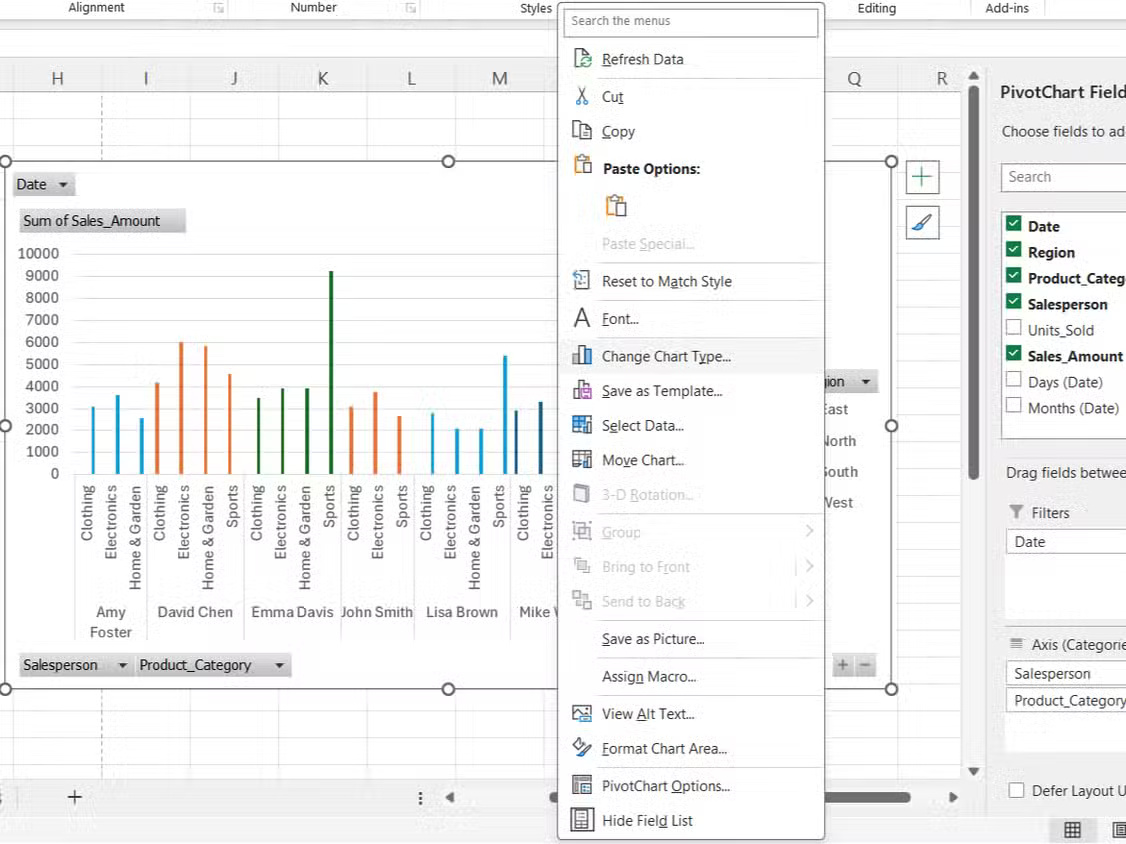
PivotCharts lets you tweak everything from colors to chart types until the visualization matches exactly what you're trying to convey.
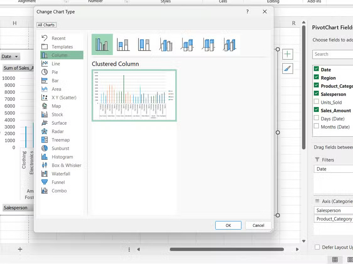
The Chart Tools ribbon appears when you select a PivotChart. You can switch between a column chart, line chart, pie chart, or combo chart, depending on the data you want to display. Additionally, you can:
- Select Change Chart Type to explore different visualization options.
- Use Format Selection to modify the color, border, and style of data points.
- Add or remove chart elements such as the legend, data labels, and gridlines from the Chart Elements menu .
- Adjust axis scale and spacing to emphasize specific data ranges.
Note : While PivotCharts supports most standard chart types, they do not support scatter (XY), stock, or bubble chart types.
Color coding makes a big difference in readability. Instead of Excel's default color scheme, choose colors that match your company's branding or use contrasting shades for easier comparison - similar to how you visually refresh your Excel spreadsheets.
You can also combine chart types. A combination chart can show both sales volume as columns and profit margin as lines, showing different relationships.
Interactive Filtering with PivotCharts
Makes data exploration much easier
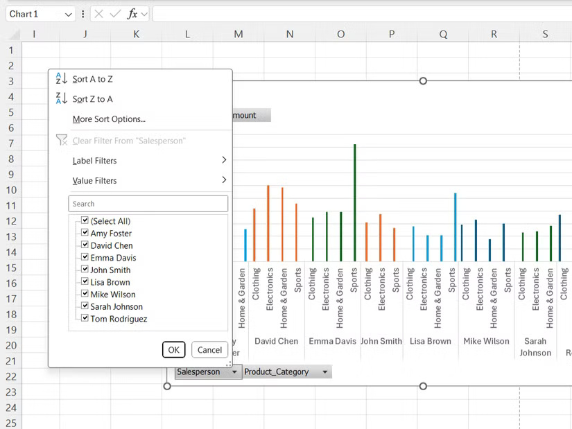
Static charts show everything at once, which can be difficult when you're trying to focus on specific segments. PivotCharts includes built-in filters that let you drill down into the data you need.
For example, consider a sales dataset with a combination of regions, product categories, and salespeople, filtering by Electronics would show which regions drive technology sales. You could then further filter by a specific salesperson to see how each salesperson performed in that region and product category.
Filter buttons appear directly on the chart, rather than being hidden in menus. This can help spot trends—like whether a particular salesperson is doing well in a certain product line.
Note : Unlike PivotTable filters that affect the entire worksheet, chart filters only affect the visualization. This way, you can have multiple charts that show different filtered views of the same data set.