Excel's Quick Analysis menu is a useful shortcut that people often overlook.
Microsoft Excel has a useful feature that most people probably overlook - the Quick Analysis menu.
Table of Contents
Microsoft Excel has a useful feature that most people probably overlook – the Quick Analysis menu. If you've ever created a chart by hand, written a formula to calculate totals, or spent time formatting cells to highlight trends, there's a much faster way to do all of that. The Quick Analysis menu appears when you select data and gives you access to formatting, charts, totals, and more with just a click or two.
It's not hidden in a confusing menu or buried under settings. It handles repetitive tasks and lets you focus on cleaning up messy Excel spreadsheets.
How to access the Quick Analysis menu
Look for the icon in the bottom right corner
Accessing the Quick Analysis menu couldn't be simpler. Select any range of cells in your spreadsheet, whether it's a small table or a larger data set. Once you select it, a small icon will appear in the lower right corner of the highlighted area. It looks like a lightning bolt inside a square.
Click that icon and the Quick Analysis menu will open. You'll see a toolbar with several tabs, including Formatting, Charts, Totals, Tables, and Sparklines. Each tab gives you different options for working with your data.
If the icon doesn't appear, it may be disabled in your settings. To enable it, go to File > Options > General and make sure the box next to Show Quick Analysis options on selection is checked.
There is also a keyboard shortcut, Ctrl + Q . Select your data and press those keys, the menu will appear immediately. This shortcut saves you from having to use the mouse every time and becomes familiar once you start using it regularly.
Here are all the ways you can use the Quick Analysis menu!
The Quick Analysis menu isn't just one feature. It's a collection of tools that handle different tasks. Instead of digging through ribbons and menus, everything you need is in one place.
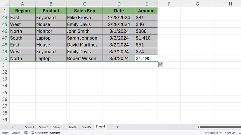
Apply conditional formatting instantly to see trends
The Formatting tab is where you'll find conditional formatting options. Conditional formatting can help you quickly spot patterns, outliers, or trends in your data without having to manually scan through multiple rows and columns.
Select your data, open the Quick Analysis menu, and click Formatting . You'll see options like Data Bars, Color Scale, Icon Set, and Greater Than. Hover over any of these options and Excel will show you a live preview of what your data will look like.
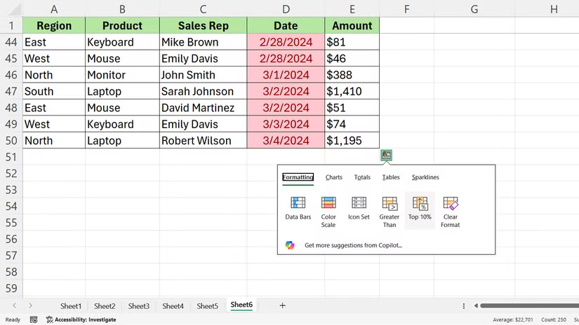
Create the perfect chart with just one click
The Charts tab creates visual representations of your data. Here, Excel analyzes your selections and suggests chart types that match the structure of your information.
Click the Charts tab , and you'll see options like Clustered Column, Line, Pie, and Scatter. Hover over each chart to preview what your data will look like in that format. Click the type of chart you want, and Excel will drop it into your spreadsheet.
Once the chart is inserted, you can still customize it. Clicking on the chart will open the Chart Design and Format tabs, from which you can control the colors, labels, and layout.
Calculate sum without writing formula
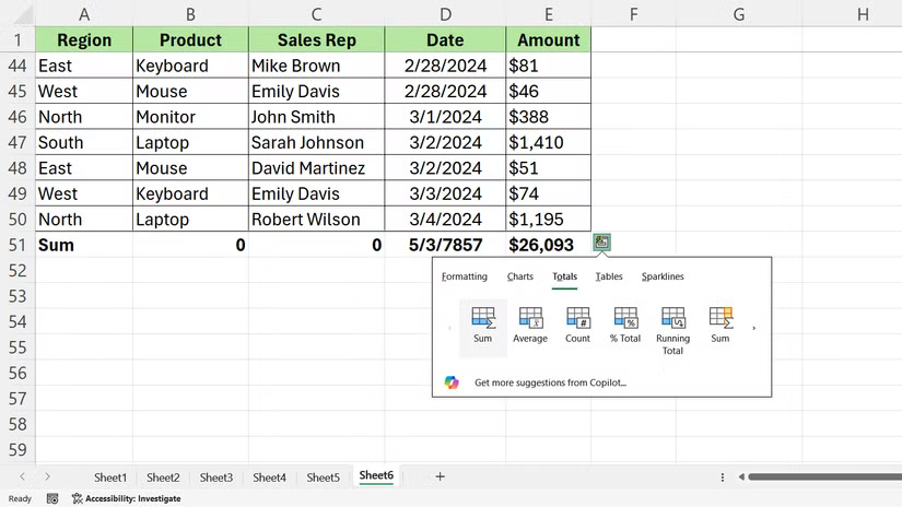
The Totals tab handles common calculations. It's handy when you just need a quick sum, average, or running total.
Select your data, open Quick Analysis, and click Totals . You'll see options like Sum, Average, Count, % Total, and Running Total. Each option shows a preview when you hover over it.
Totals all the values in a column or row and puts the result in a new cell at the end. Average calculates the average value. Count tells you how many cells contain numbers. % Total displays each value as a percentage of the total.
Convert data into tables and PivotTables
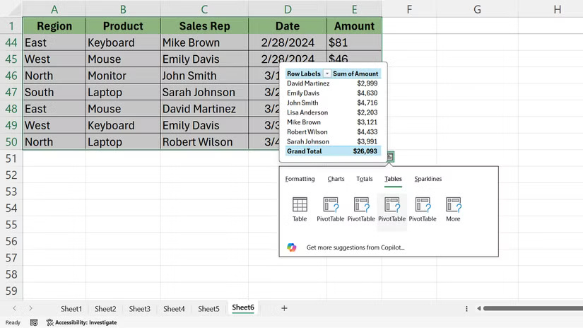
The Tables tab gives you two powerful options: Convert your data into an Excel table or create a PivotTable.
When you click Table , Excel converts your selection into a structured table with sortable headers, banded rows, and built-in filtering.
If you need to analyze large data sets, click PivotTable . Excel will open a new worksheet and create a PivotTable based on your selection.
Use Tables for ongoing data sets where you have to continually add rows. On the other hand, PivotTables are more useful when you need to summarize and compare data across multiple dimensions.
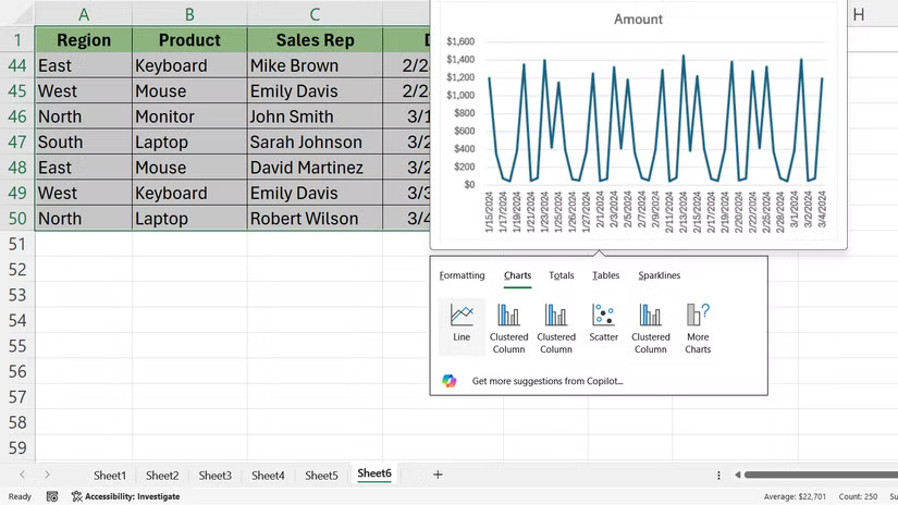
Add mini charts in cells called Sparklines
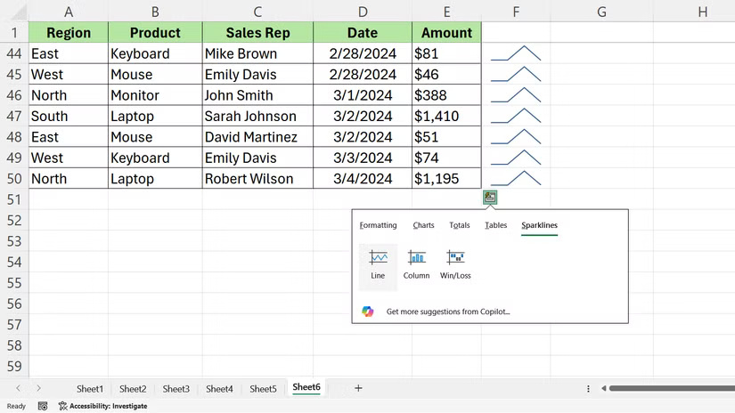
The Sparklines tab lets you insert small charts directly into cells. Sparklines don't float on top of your spreadsheet—they sit in individual cells alongside your data.
When you want to visualize your data, open Quick Analysis and click Sparklines . You'll see three options: Line, Column, and Win/Loss. Each option creates a sparkline that fits inside a single cell.
Was this article helpful?
Your feedback helps us improve.
Related Articles
 Quick shortcut for Coc Coc web browser1 minutes read
 How to use Quick Analysis in Excel5 minutes read
 How to customize Quick Access menus in Windows 10 and 88 minutes read
 How to use the new 'Quick Settings' menu on Windows 113 minutes read
 How to add folder shortcuts to the Start Menu on Windows 112 minutes read
 How to Add a Website Link to the Start Menu5 minutes read
Reader Comments 0
Sign in with email or Google to join the discussion.