Table of Contents
This practical guide explains how to use quick analysis in excel with clear steps and useful context. It also covers common requirements, potential problems, and the details that can help you get better results.

The Quick Analysis tool in Excel allows you to quickly analyze and visualize data in a spreadsheet. It gives you access to common data analysis features, without the need for complicated formulas or functions.
By selecting the data you want to analyze, you can access the Quick Analysis tool by clicking its icon in the lower right corner of the selection or right-clicking and choosing Quick Analysis from the context menu.
Options in Excel's Quick Analysis Tool
The Quick Analysis tool provides 5 categories with different analysis options.
- Formatting provides data bars, color scales, and icon sets. You can apply conditional formatting rules to highlight cells based on specific criteria.
- Charts allows you to create a variety of chart types, including line, pie, group, and more.
- Totals offers the option of calculating data statistics, like total, average, count, min, max, percentage.
- Tables provides options for handling tables in Excel.
- Sparklines allow you to create sparklines that show trends, data models.
Some Examples of How to Use Quick Analysis in Excel
Sum Multiple Columns or Rows
Let's say you have a budget spreadsheet with different spending categories like rent, utilities, groceries, and entertainment. Each category has a different monthly spend value. To get the total spend for each category, do the following:
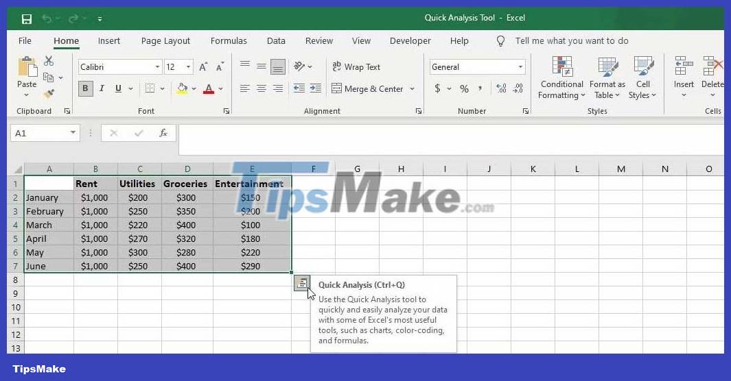
- Select the entire range of cells.
- Click the Quick Analysis icon in the lower right corner of the selected range.
- In the Quick Analysis menu, go to the Totals tab.
- Select the first Sum (in blue). A new row will be added and will show the total spend for each item.
- To calculate total spending by month, select Second Sum (yellow).
You'll see a new column showing monthly spending.

Calculate Percentage Sum for Row/Column
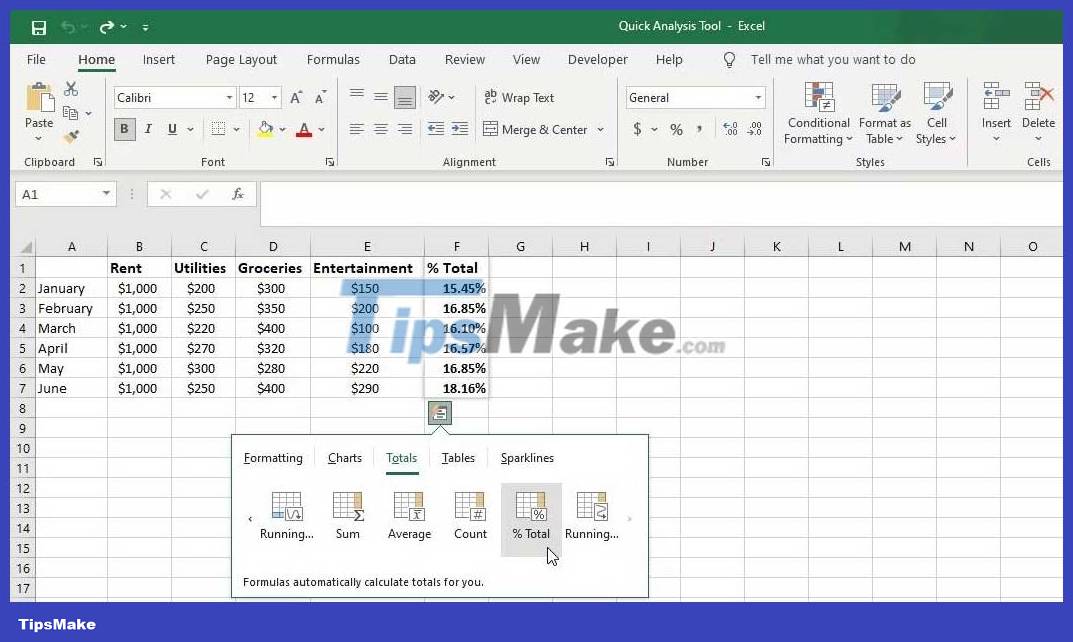
Using the budget spreadsheet from the example above, let's say you want to calculate the total percentage for each spending item. Follow these steps:
- Select dataset .
- Click the Quick Analysis icon.
- Go to the Totals tab and select the first % Total.
- To calculate a percentage of the total for each month, select % Total (yellow).
Format Cells Containing Specific Text
Suppose you have a dataset containing a list of employees and their respective departments. You want to use the Quick Analysis tool to identify employees in the Engineering department.
- Select the range of cells you want to analyze.
- Click the Quick Analysis icon or press Ctr+Q on your keyboard.
- In Formatting format, select Text Contains .
- In the dialog box that appears, type Engineering , and then click OK .

Cells containing Engineering text will now be highlighted in a predefined format.
Identify Cells That Contain Values Greater Than a Specific Value
Suppose you have a list of students with their respective test scores. You want to identify and highlight students with scores above 75. Follow the instructions below:
- Select the range of cells that contain the checkpoint.
- Click the Quick Analysis icon or press Ctrl+Q on your keyboard to open the Quick Analysis tool.
- Click the Formatting tab and select Greater Than .
- In the dialog box that appears, enter a threshold value (eg 75) and specify the format.
- Click OK to apply the format. This action will highlight all cells containing scores above 75.

Insert Chart
For example, you have data containing the number of monthly web visitors in different marketing channels. You can use the Quick Analysis tool to quickly create graphs that illustrate web traffic trends over time. Do the following:

- Select the range of cells you want to chart.
- Click the Quick Analysis icon.
- Go to the Charts tab. You'll see chart suggestions for the data.
- Select More Charts to see all available charts.
- Preview the chart and when satisfied, click OK to add the selected chart.
Above is how to use the Quick Analysis tool in Excel . Hope the article is useful to you.
Conclusion
Understanding Quick Analysis in Excel makes it easier to compare options, avoid common mistakes, and apply the information in this guide more effectively. Review the relevant requirements before making changes or choosing a solution.
FAQ
How do you use quick analysis in excel?
Follow the steps in this guide in order, confirm the required settings or tools, and verify the result before making additional changes.
Is it safe to use quick analysis in excel?
It is generally safe when you follow the recommended instructions, use trusted tools, and avoid changing settings you do not understand.
What should you do if the process does not work?
Recheck the requirements, restart the device or application when appropriate, and review each step for missed settings or compatibility issues.
Related Articles
 Excel's Quick Analysis Menu Is a Useful Shortcut That People Often Overlook7 minutes read
 Excel 2019 (Part 28): What-if Analysis8 minutes read
 How to Use Excel for Financial Analysis: Complete Guide7 minutes read
 How to Run Regression Analysis in Microsoft Excel4 minutes read
 ChatGPT and Its Excel File Analysis Capabilities8 minutes read
 8 Best Features in Excel 2013: Microsoft Excel 20136 minutes read
Reader Comments 0
Sign in with email or Google to join the discussion.