How to use Sparklines in Excel 2010
The main Sparklines is a mini chart that you can put inside the cells to be able to observe data and charts on the same table.
Network administration - Microsoft Excel 2010 allows users to analyze information in many ways than previous Excel versions. The main difference is Sparklines. So what are Sparklines and what does it do for you in analyzing information?
First to go into detail, we need to know that Sparklines is a mini-chart that you can put inside cells to be able to see data and charts on the same table.
Below we will show you how to insert Sparkline charts in an Excel spreadsheet page.
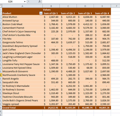
Let's start with a very common spreadsheet page - in the example below, we used a sales report template from Excel 2010 but you can also use it with any Excel spreadsheet that has digital data.

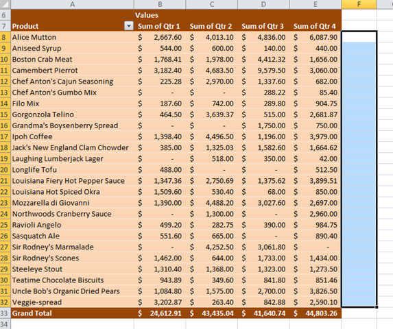
Select the cells you want sparkline to appear. Put it next to the board to make it easier to see.

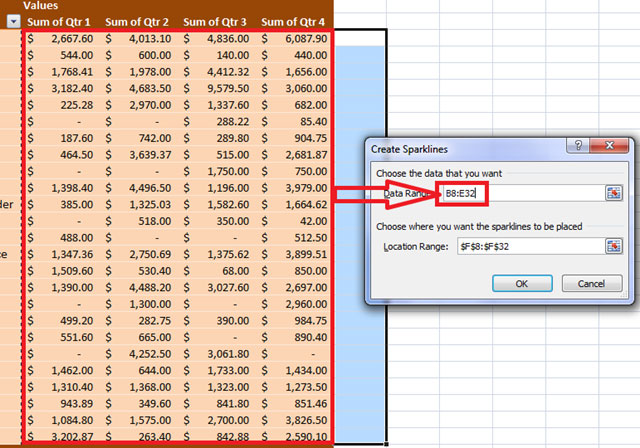
Click the Insert menu from the ribbon, then select 'column' under the Sparklines group.

Selecting and entering the cell range will be the data source for the chart.

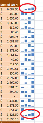
The charts will appear on the side of the board.

At first glance you can see the trend of sales going up or down. For example, circled cells are in a growing trend.

Using the right Sparklines, data analysis will be faster and more oriented and you will certainly have a simpler view when observing information and making decisions.
Discover more
Excel 2010 charts ExcelShare by
Kareem WintersYou should read it
- How to change worksheet size in Excel
- How to print an Excel spreadsheet in a page
- Complete guide to Excel 2016 (Part 9): Working with multiple spreadsheets
- How to create 2 Excel charts on the same image
- Instructions on how to create charts in Excel professional
- The Quiet Details That Make a Sports Betting Platform Feel Reliable
- Instructions on creating toy set images with ChatGPT AI
- How are AI agents changing the journalism industry?
- Tips for manipulating Excel 2007 and 2010
- 10 good and useful Office tips
- Add gadgets to Gmail