5 tips to turn messy Excel data into beautiful results in just minutes
5 simple tips that can turn even the messiest spreadsheet into a neat, clean spreadsheet in just minutes..
Raw data used to be so intimidating that many people would put it off until they actually had to process it. That changed when they started using these five simple tricks that can turn even the messiest spreadsheet into a clean, neat spreadsheet in just minutes.
5. Clean up text with TRIM, CLEAN and PROPER
The first thing to do with raw data is to fix the basic errors: random spaces, strange characters, and inconsistent capitalization. Luckily, Microsoft Excel has three built-in functions that can handle all of these.
Did you know that copying and pasting content from emails or PDFs often results in awkward spaces? With TRIM , you can remove all spaces except single spaces between words, making your data look clean and consistent.
CLEAN goes one step further by removing invisible, non-printing characters. These characters can also appear when you import data from external sources. They can mess up your formulas and filters, but CLEAN quietly removes them.
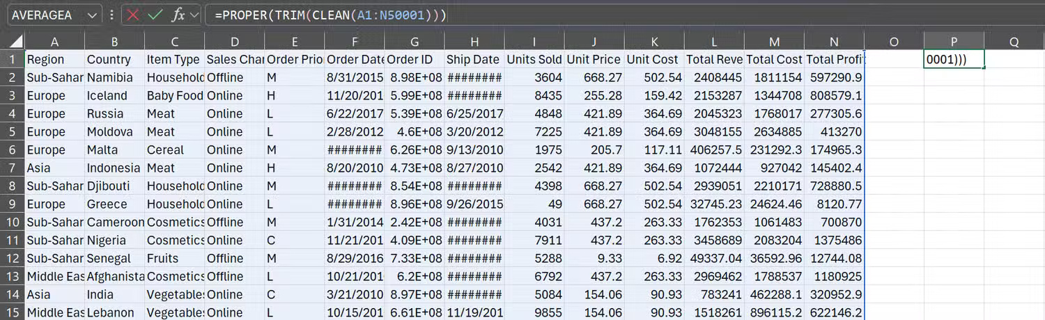
Finally, PROPER takes care of capitalization. Whether someone types "ADA" in uppercase or "ada" in lowercase, the PROPER function will convert it to the correct uppercase "Ada." This keeps your text looking professional and consistent across your entire spreadsheet.
You don't need to run each function separately. You can combine them into one formula to handle spaces, hidden characters, and uppercase all at once:
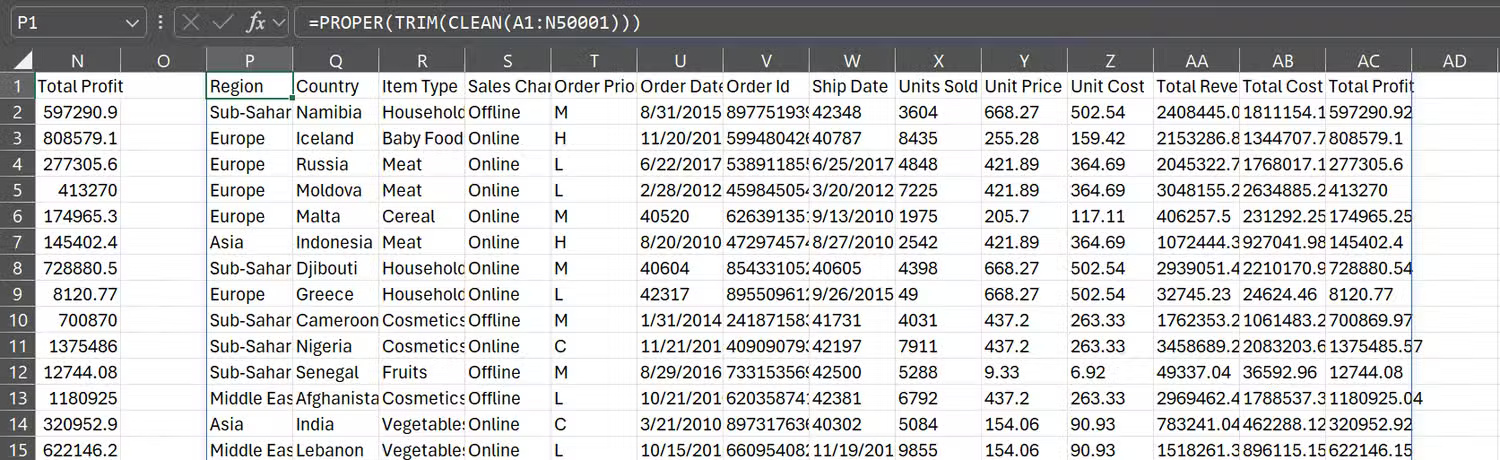
=PROPER(TRIM(CLEAN(A1:N50001)))4. Apply consistent styles to table and cell formatting
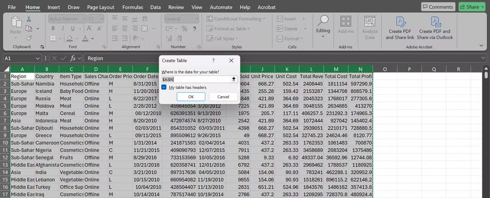
Once the text is cleaned up, it's time to make your spreadsheet look pretty. Start by selecting the data range, then go to the Home tab and click Format as Table . Choose a design you like, confirm the data range, and check the My table has headers box if it has one.
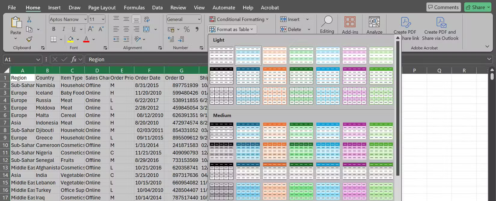
Instantly, your spreadsheets will look more professional—with built-in filters, alternating row colors for easy reading, and data areas that automatically expand as you add new data.
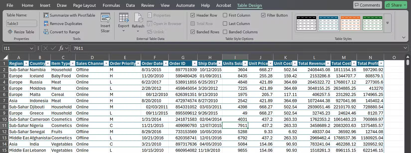
But formatting doesn't stop at table design. Consistent number formatting is essential to avoid confusion: Currency should actually look like currency ($1,234,567.89), percentages should appear as percentages (25.5%), and dates should follow a standard format (like MM/DD/YYYY or whatever format your team prefers). That way, no one has to stop and wonder whether the "5" on your spreadsheet means $5, £5, or just the number 5.
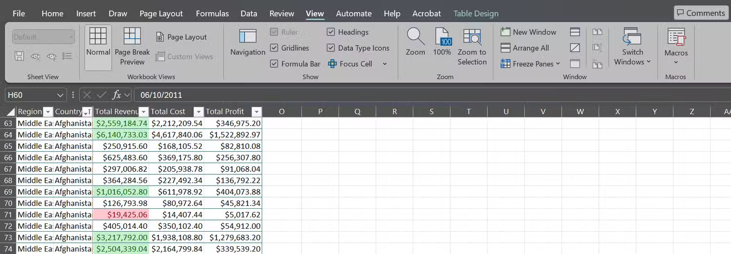
3. Highlight what's important with Conditional Formatting
Numbers are useful, but pictures and graphics are often quicker and easier to work with. With Conditional Formatting in Excel, you can make sure key information is highlighted as soon as you open your workbook.
For example, let's say you want to spot high sales right away. You can use color scales to colorize values that exceed a certain threshold. If you want to find anomalies, you can try using data bars or icon sets to see which values are above or below your threshold.
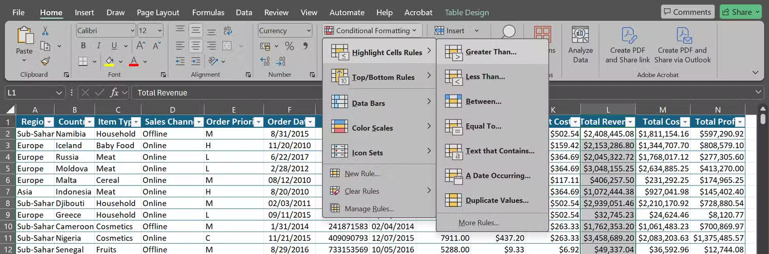
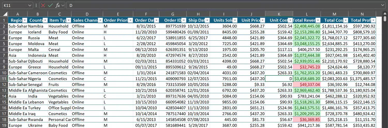
In one workbook, the author highlighted the revenue column so that cells with values greater than $1,000,000 displayed in light green with dark green text and cells with values less than $50,000 displayed in light red with dark red text.
Thanks to the colors, you can immediately see where the business is thriving (in which product lines and regions) and where intervention is needed.
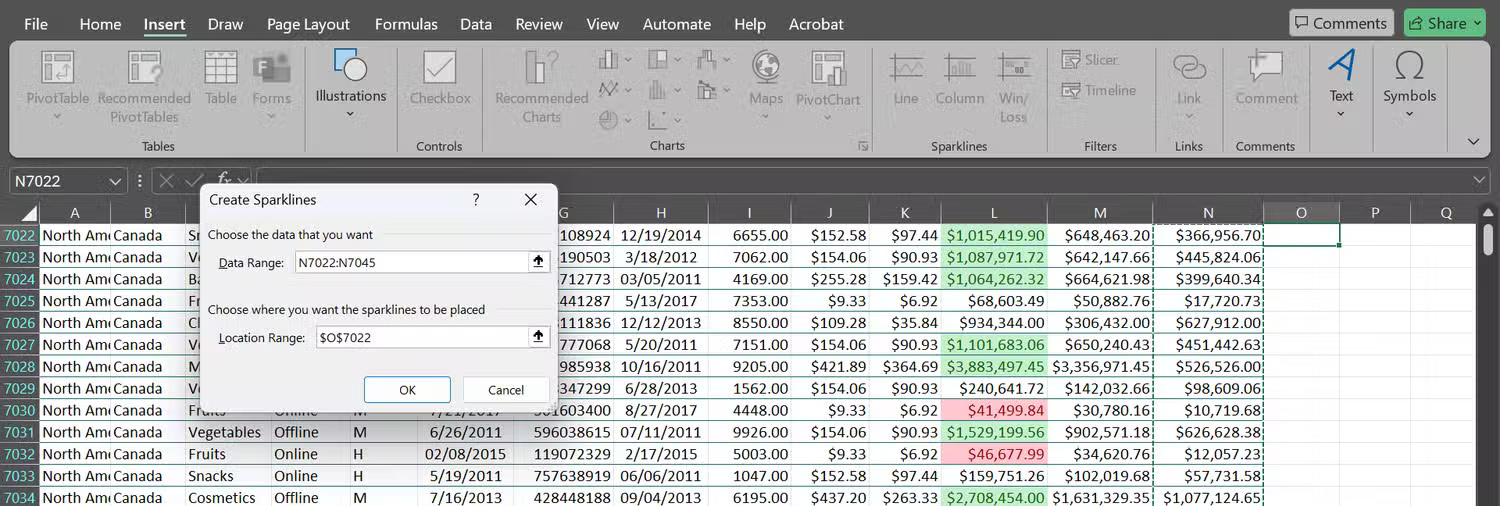
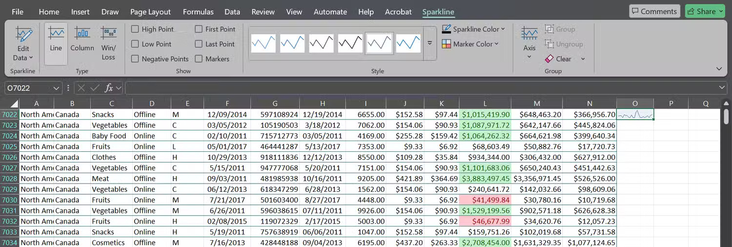
2. Show instant trends with Sparklines
Charts are useful, but sometimes they take up too much space, cluttering up your spreadsheet and disrupting the layout you're envisioning. Instead of charts, simply drop Sparklines directly into cells on your Excel spreadsheet to get a quick overview.
Let's say you've filtered your data to show sales records from Canada and want to see profit trends by product. Go to the Insert tab , click Sparklines > Line , select your data range (e.g. N7022:N7045), and select the cell where you want the Sparkline to appear (e.g. O7022). You'll immediately see a small line chart inside that cell, showing the peaks and valleys across your records.
1. Freeze cells and use filters for a cleaner view
Even the best-formatted spreadsheet will be frustrating if you can't navigate it easily. Try scrolling through 5,000 rows without fixed headers, and you'll lose track of what each column means in seconds.
The fix is simple: Highlight the header row (and any other Excel rows or columns you always want to show, like employee IDs or product statuses). Then, go to the View tab > Freeze Panes .
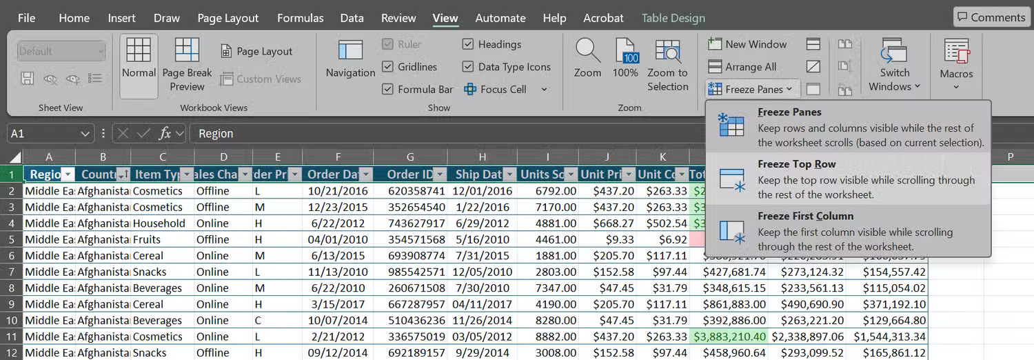
Now, no matter how far you scroll, the header (as well as any other rows and columns you've selected) will stay the same so you always know what you're looking at. Combine this with filters, and you'll be able to manage your data. If your data is already formatted as a table, filters are ready to use.
Use these 5 tips as your first steps in any spreadsheet! They will help you overcome your Excel fear. The next time you're staring at a raw data sheet, don't panic. Just clean up, format, highlight, highlight, and freeze to get a spreadsheet you'll actually enjoy working on.