5 Excel dashboard tricks that will save you hours when you're just starting out
What most people don't realize at the time is that just a few simple techniques can save countless hours and make the whole process a lot less difficult.
Table of Contents
Remember the first time you tried to create a dashboard in Excel ? You stared at rows of data, fiddled with formulas, and struggled with chart placement, only to end up with a messy spreadsheet that was nearly unusable. What most people don't realize at the time is that a few simple techniques can save countless hours and make the whole process much less daunting.
Pivot Table
Summarize thousands of rows in seconds without formulas
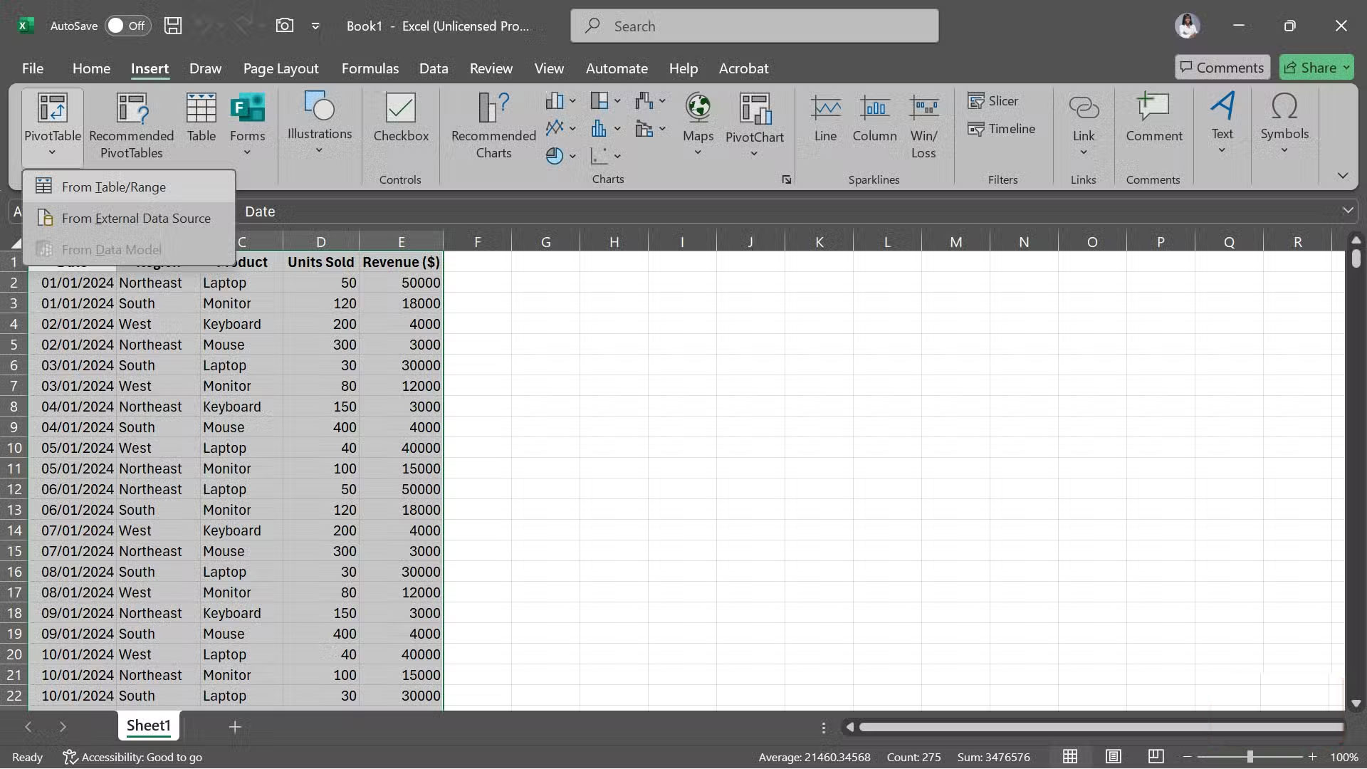
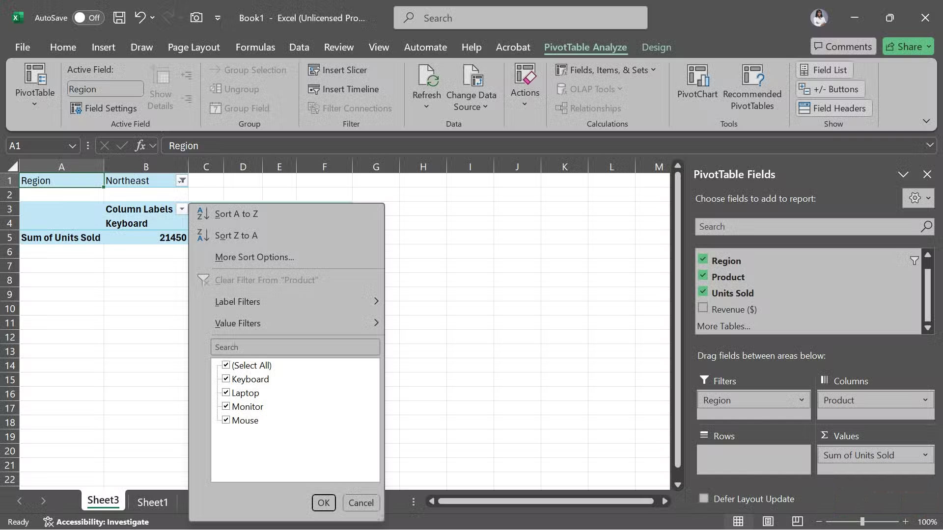
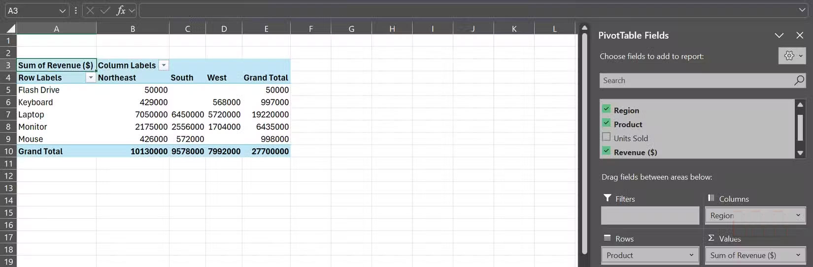
Pivot Tables may sound confusing, but they're one of Excel's most powerful tools for working with large data sets. Instead of writing complex formulas to calculate sums, averages, or counts, you can simply drag and drop fields into place.
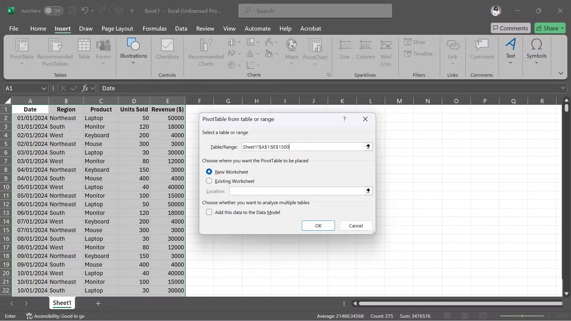
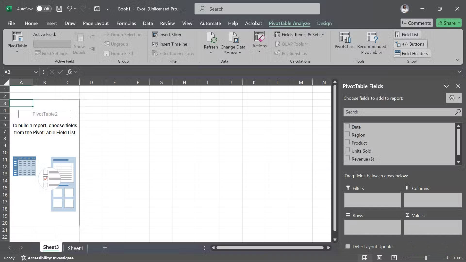
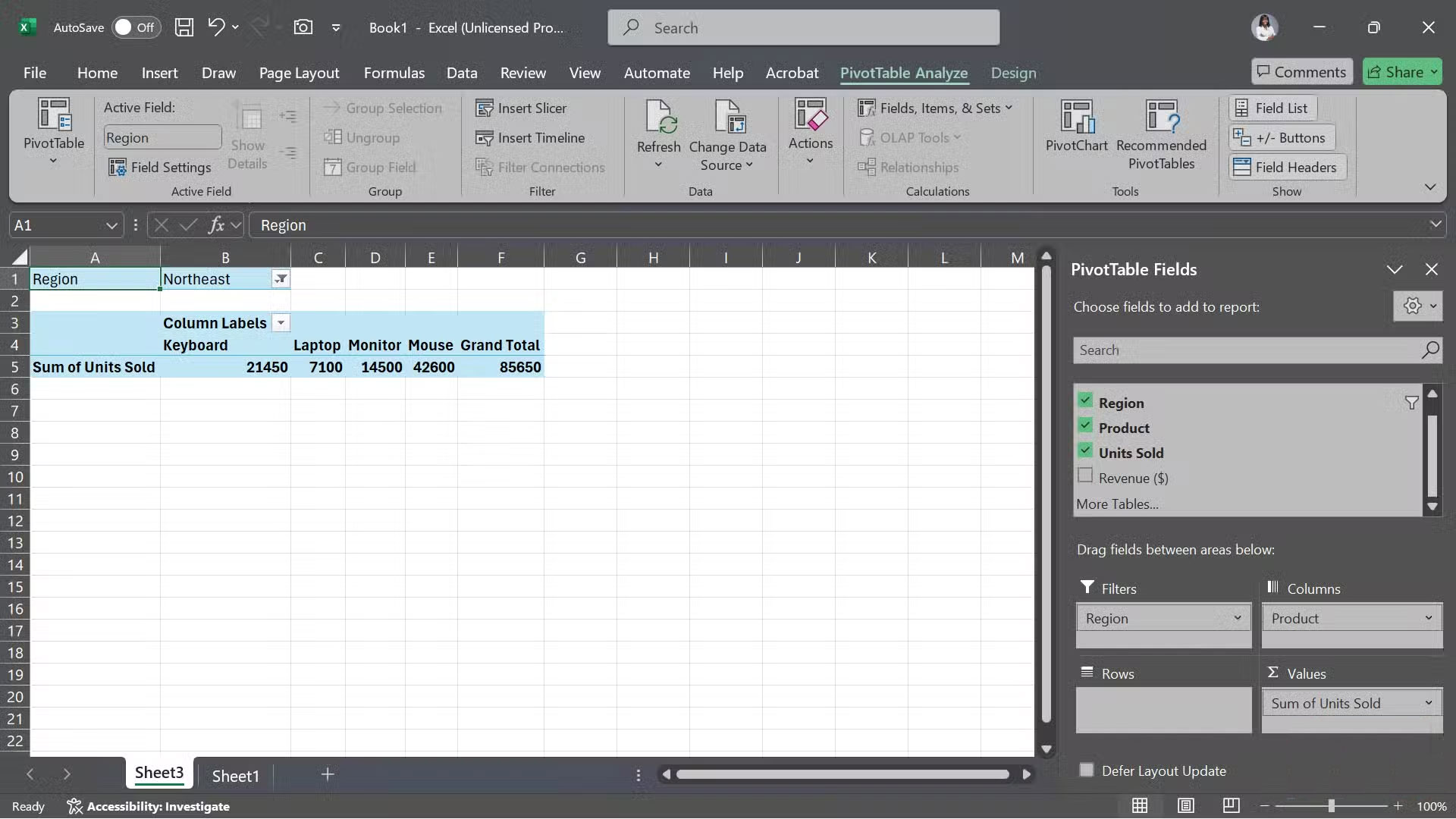
To create a Pivot Table, start by selecting your data range. Then, go to Insert > Tables > PivotTable > From Table/Range . When Excel asks where to put it, people often choose New Worksheet . On the new worksheet, you'll see the column headers in the right-hand pane. From there, just drag them into the Rows , Columns , Values , or Filters areas, depending on how you want to analyze your data.
Pivot Chart
Visualize PivotTable data with just one click
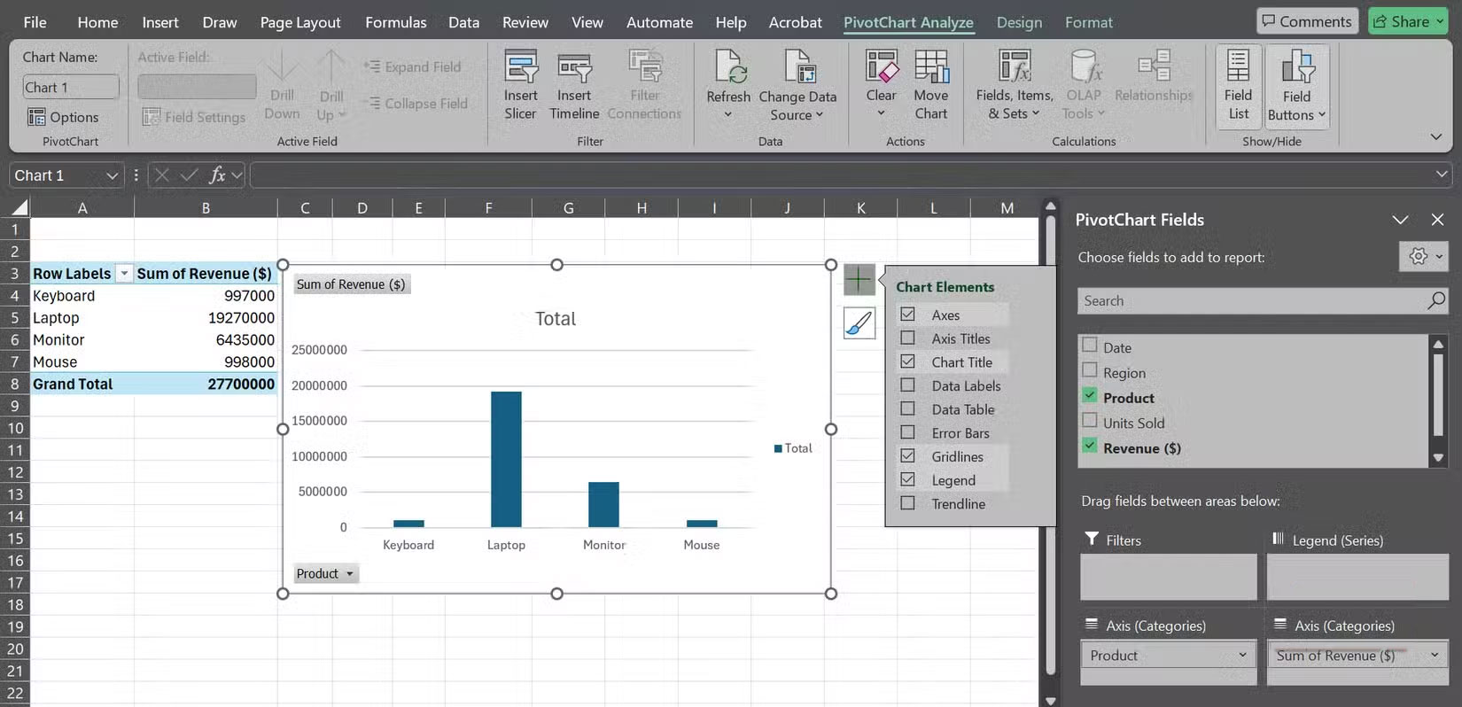
Once you've built a PivotTable, converting it to a chart is almost too easy. Just click anywhere inside the table, go to Insert > PivotChart , and select the type of chart you want. You'll even get suggestions for the best chart for your data.
Once you select the appropriate type, Excel will immediately create a dynamic chart that automatically updates whenever the PivotTable changes. You'll see a plus icon and a paintbrush icon next to the chart. Click on them and you'll be able to adjust the axes, labels, styles, etc. to suit your dashboard.
Helper Sheet
Keep raw data and complex calculations out of the main dashboard view
When first starting out with dashboards, many people try to cram everything—raw data, formulas, charts, and formatting—into a single sheet. The result is messy, confusing, and nearly impossible to troubleshoot when things go wrong.
That's where Helper Sheets come in. By separating your background work from your polished dashboard, you keep things much more organized and easier to maintain. Helper sheets are different from helper columns, which are extra columns you add inside your data set to make formulas easier to understand.
An efficient setup is to have one sheet for raw data, another sheet for calculations, and a final sheet for the dashboard itself, which only displays the charts, key figures, and slices.
Slicers and filters
Quickly focus on relevant records
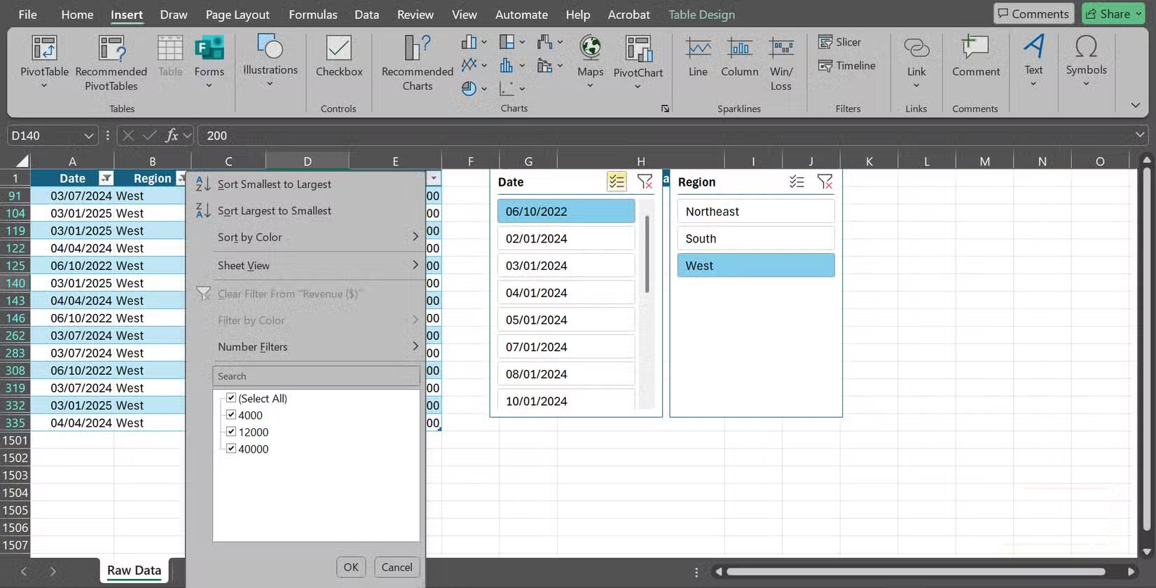
Slicers are visual filters that let you explore data without writing any formulas. They are especially powerful when combined with Pivot Tables and Pivot Charts, as you can filter and compare results instantly. However, they also work with regular Excel tables.
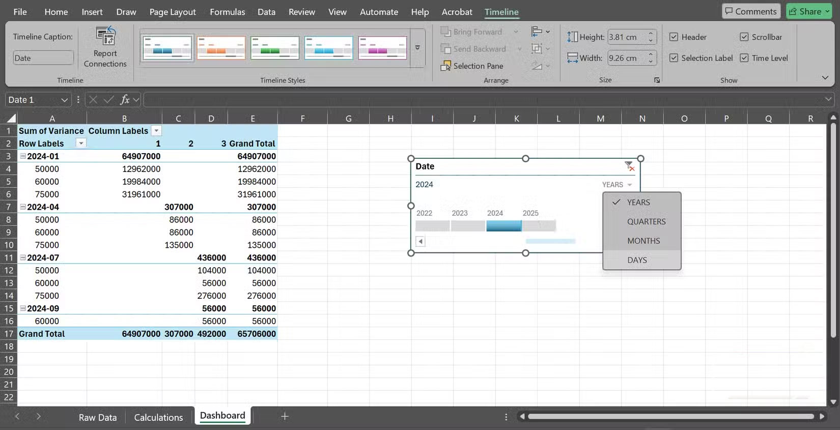
To add a slicer, click in your table or Pivot Table, go to Insert > Slicer , and select the fields you want to filter by (region, date, etc.). Excel will create a panel of buttons that act as filters. If you only want to see Q1 results for the West region, just click the region and quarter buttons. For time-based data, you can also insert a timeline slicer ( Insert > Timeline ) to move between years, days, quarters, or months with just one click.
However, traditional filters still play an important role.
Conditional formatting
Highlight data with visual alerts
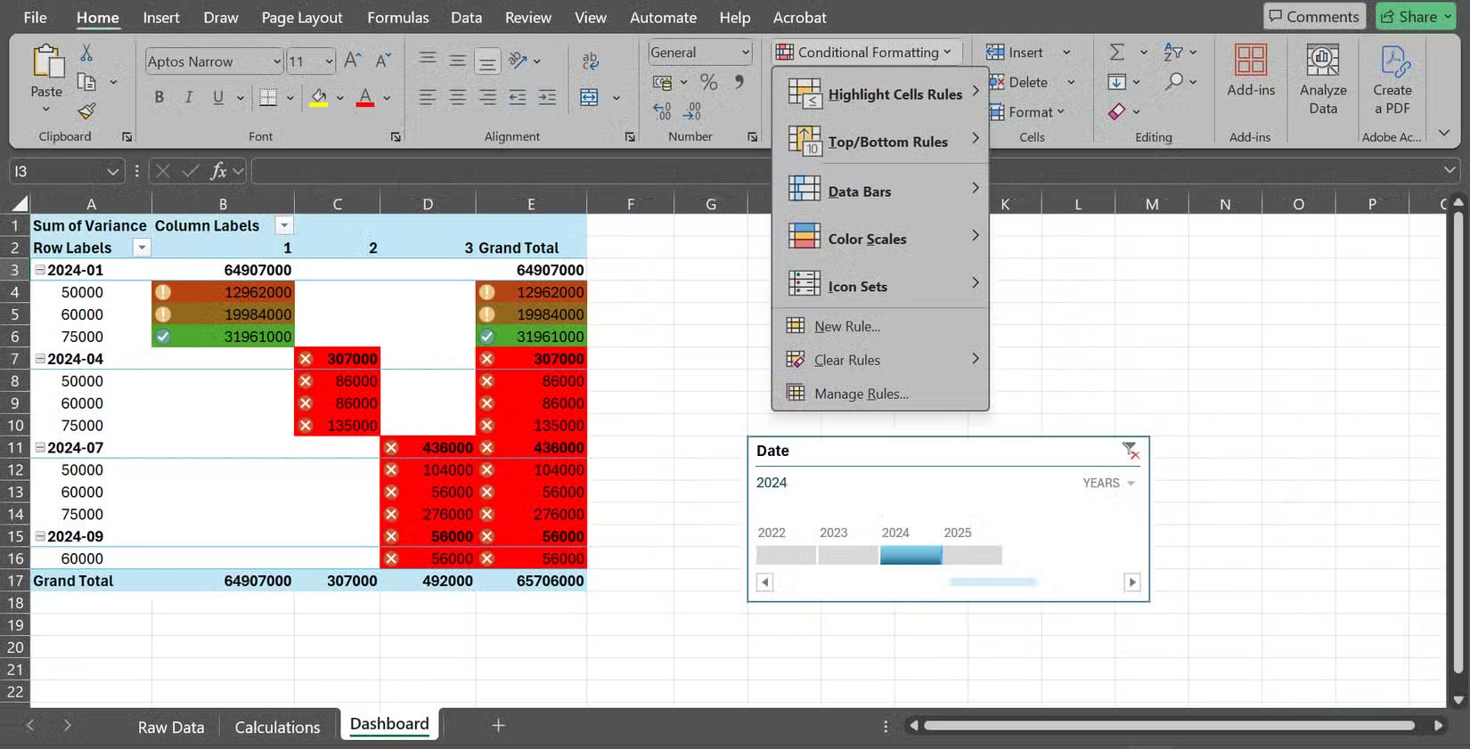
Numbers alone can be boring. Conditional formatting adds colors, icons, and data bars to instantly highlight patterns.
For example, you can turn a simple table into a heat map in seconds. Select your cell range, go to Home > Conditional Formatting > Color Scales , and choose a color scale. High values might appear green, low values red, and all the values in between have shades that show exactly where they are. Instead of scanning rows of numbers, your eyes will go straight to the hot spots.
However, it's important to use these features sparingly. Too many formats will create visual noise rather than clarity. Reserve them for the most important figures or exceptions, so the correct information stands out when needed.
Was this article helpful?
Your feedback helps us improve.
Related Articles
 Instructions for creating Dashboard on Excel10 minutes read
 What is dashboard? What is Dashboard? Dashboard definition5 minutes read
 How to convert hours to minutes in Excel3 minutes read
 3 data visualization tools to replace Excel's outdated charts.6 minutes read
 How to convert time in Excel6 minutes read
 Google Dashboard - Everything Google knows about you2 minutes read
Reader Comments 0
Sign in with email or Google to join the discussion.