Instructions for creating Dashboard on Excel
Excel can be a very powerful program, but sometimes a simple sheet format is not attractive enough for readers to approach it. One of the ways to make your data and tables more attractive is to create a dashboard - an environment that retrieves all the most important information from your document and presents it as a format. ' easy to digest'.
Table of Contents
Excel can be a very powerful program, but sometimes a simple sheet format is not attractive enough for readers to approach it.One of the ways to make your data and tables more attractive is to create a dashboard - an environment that retrieves all the most important information from your document and presents it as a format. ' easy to digest'.
Function of Excel Dashboard
The main function of Excel Dashboard is to convert a lot of information into a management screen.What you choose to put on the screen is up to you, but this tutorial will show you how to present different types of Excel content into a single environment and serve many purposes. As different as tracking your project progress or financial situation.
So let's start!
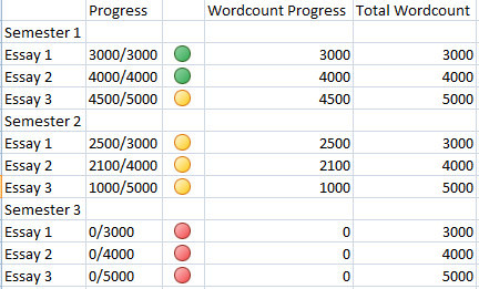
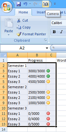
The first thing you need is to create the data you want to present.In the example below shows data about the learning process of a student.And the last dashboard was created to give students an overview of their learning over the past year.
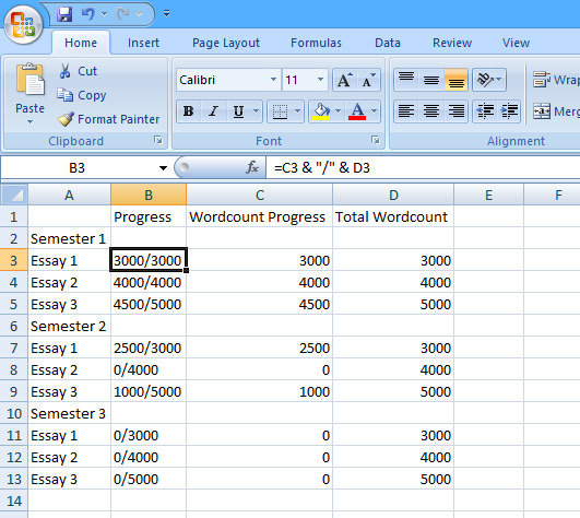
In the above example, create the ' Progress ' column from two ' Wordcount Progress ' and ' Total Wordcount ' columns with a simple function, which allows users to quickly modify the data as they progress and are reflected in last dashboard You need to use the SUM function to sum up for " Wordcount Progress " and " Total Wordcount" - to do so, enter the following formula in cell C15 without quotes' = SUM (C3, C4, C5, C7, C8, C9, C11, C12, C13) ', then pull out from the bottom right corner of the cell to cell D15 to copy the same formula for " Total Wordcount".
Add color
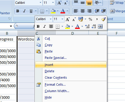
Now it's time to make this information more "dashing." Dashboard gives you instant access to a range of high-level information, so use a "traffic light" method ( traffic lights will be very effective, first, you need to right-click on the top of the column that contains " Wordcount Progress " and select 'Insert'to add an empty column.
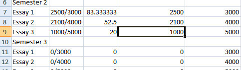
To use the "traffic light" method, turn the data in " Wordcount Progress" into a percentage using a simple formula. Enter ' = (D3 / E3) * 100 ' without quotes in cell C3, then drag the bottom right corner of the cell down to cell C13 to copy the formula, cells C6 and C10 will not work because they are table header rows, so just delete the formula from these cells. Check your formulas by changing the values in the ' Wordcount Progress ' box in column D and if column C changes too, your formula is correct.
You will now use conditional formatting to change the percentages into clear icons.Select the entire column C, then click ' Conditional Formatting ' in the ' Styles ' section in the ' Home ' bar, then select ' Icon Sets ' from the drop-down menu and select one of the three colored icon sets. In the type of information you want to display, you will choose the appropriate format, here, the important details are individual essays that are completed, in progress, or not started, so format 'traffic lights. "will be more suitable.
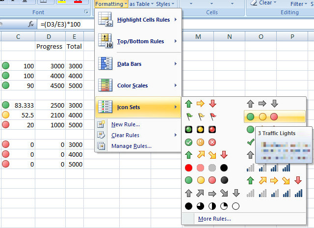
Now, we just need to make some customizations to your icon format.Select column C, then click 'Conditional Formatting ' and ' Manage Rules ' in the drop-down menu. There are some rules there, so select it and click ' Edit Rule '. Here, you change the value assigned to the green icon to 100, and yellow to 1 - this will mean any completed essay will show green, those Any essay in progress will display yellow and any essay that has not yet started will appear in red. Finally, click ' Show Icon Only' in the box to not show the percentage.
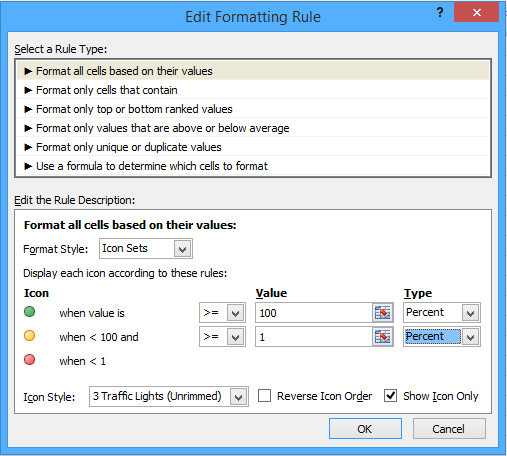
After finishing, you will see column C showing the appropriate icons for each value in column B. You should leave the icons in the middle and resize them appropriately to look more neat.
Thermometer chart
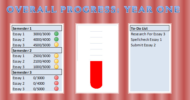
Next, create a version of the Thermometer Chart, allowing someone to view this dashboard to see the work done throughout the year with one glance.There are many ways to create a chart like this, but the following method will make the chart continuously update according to the changed values in the ' Wordcount Progress ' box.First, you need to create a data for the chart as shown in the image below.
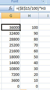
The figures in the right column represent the percentage of thermometer increments and enter only the integer spreadsheet.The left column is the total number of words corresponding to percentage values.Thus, the formula is entered once in the first box and then copied below it by dragging the bottom right corner of the cell down.
Next, enter '= $ D $ 15 ' without quotes in cell I3 and drag from the lower right corner to cell I13 to copy the formula. These cells are filled with the current data of the ' Wordcount Progress ' cell that collects from all the individual values in column D. Next, we will use the conditional format again to turn the This value into a thermometer chart.
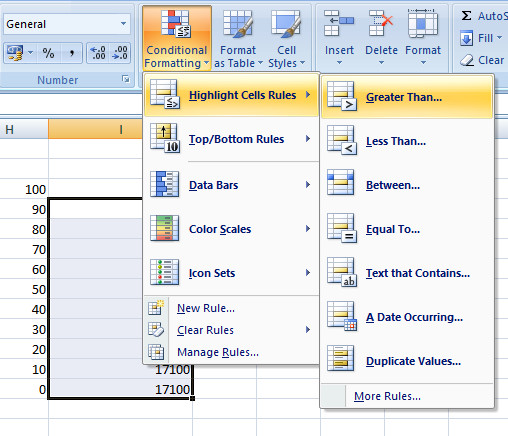
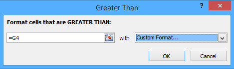
Select cells I4 through I13 - skip to cell I3 - then select the option'Greater Than ' from ' Highlight Cells Rules ' in ' Conditional Formatting '. Type = G4 in the 'Greater Than' dialog box , then select " Custom Format" from the drop-down menu on the right. On the next screen, select the 'Fill'tab, and then choose red - you can choose a different color depending on your preference.
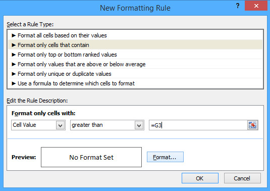
Now, some of the boxes at the bottom you chose turned red - but a few more steps need to be done before completing the thermometer chart.First, just select cell I3 and repeat the above steps, this time select 'Highlight Cells Rules ' then ' More Rules '. Here, you should choose ' greater than or equal to' from the drop-down menu, enter ' = G3'without quotes in the right field and format the cell with red as you did above.
Next, do not give the values shown in these cells themselves.Highlight from cell I3 to cell I13, right-click and select 'Format Cells '. Select' Custom 'from the list and enter' ;;; 'without quotes in the field marked' Type 'Click OK and your numeric value will disappear, leaving only the red color of the thermometer.
However, we can do more with simply being able to turn cells into a color bar.Select the'Shapes' tool from the 'Insert' tab and then select 'Freeform' from the small group of ' Lines'.Use this feature to draw the outline of the thermometer containing the red bar.
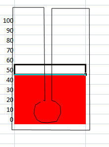
You can draw shapes like the illustration above or whatever image you want with this tool.Use the 'Shape Styles'menuto change colors accordingly.
Merge tables into a dashboard table
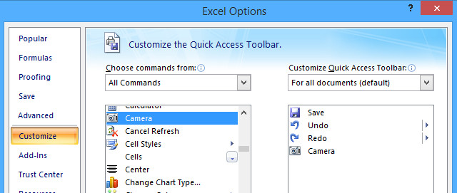
After you have completed all the tables on a sheet, the final step is to merge them into a dashboard table.First, rename the sheet you are working with as'Data' or similar, then switch to another sheet and rename it to 'Dashboard'.Next, we will use the Camera function, if you have not added it to the Quick Access Toolbar, you should add it now because it is very handy.
To do this, access the Excel option and select'Customize'.From here, add the Camera command from the left column to the right column.Now you will be able to easily access the Camera from the Quick Access toolbar to merge dashboard tables together.
Using the Camera is very simple, just check the boxes you want to display elsewhere, then click the Camera icon to copy them.From here, the "picture" of those cells will update as they change.
Use the Camera tool to quickly capture progress charts with your traffic lights and thermometers, transfer them to the ' Dashboard ' sheet, and now you can sort and format things that suit you or any more. In this example, a simple task list is added by creating it on the ' Data ' sheet and using the Camera to transfer it through the ' Dashboard ' sheeet.
Using these techniques, you can make a similar dashboard for any kind of work.
I wish you all success!
Was this article helpful?
Your feedback helps us improve.
Related Articles
 5 Excel dashboard tricks that will save you hours when you're just starting out5 minutes read
 What is dashboard? What is Dashboard? Dashboard definition5 minutes read
 Instructions for creating Macros in Excel3 minutes read
 Instructions for creating Excel formulas using AI2 minutes read
 3 data visualization tools to replace Excel's outdated charts.6 minutes read
 Instructions on how to create Hyperlink in Excel3 minutes read
Reader Comments 0
Sign in with email or Google to join the discussion.