10 useful tips for you when presenting with PowerPoint
Here are some small tutorials that will help you make professional presentations with concise content, avoiding the most common mistakes. Please refer to 10 useful tips when presenting with PowerPoint!
- Instructions for installing and using Office 2016
- Create beautiful slides for PowerPoint presentations with 8 tips
- How to insert text into images in PowerPoint
It is not necessary to decorate colorful, effects and slides, you can still easily create an attractive and attractive presentation slide set with very simple notes below. . Hope this article will help you in your study and work.
Presentations , whether made with PowerPoint or any other tool, are a great way to support the presentation, visualize complex situations or focus on the topic.

While a " bad " slide presentation can give you the opposite effect. Slides are poorly designed with wall of text or oversized graphics can distract or annoy viewers. Sometimes, PowerPoint can be just a mistake tool in impressing.
Here are some small tutorials that will help you make professional presentations with concise content, avoiding the most common mistakes.Please refer to 10 useful tips when presenting with PowerPoint!
Design
The first thing that shows the professional connection to present about anything is the design part. It is the first thing that viewers will pay attention to and will leave a good or bad impression on them.
1. Prepare the slide carefully
Do not copy & paste slides from different sources . Surely you won't want your presentation to look like a ragged carpet, right? What you aim for is consistency . This will help viewers focus on essential content, speeches and events that you are highlighting in presentation slides.
To finish, use a basic template or do something of your own . PowerPoint comes with a selection of presentation templates, but you can also find free online templates online.
Select font-face to display readability . It is hard to do this. Unless you are a designer, don't use simple font and face by using colors, safe font sizes.
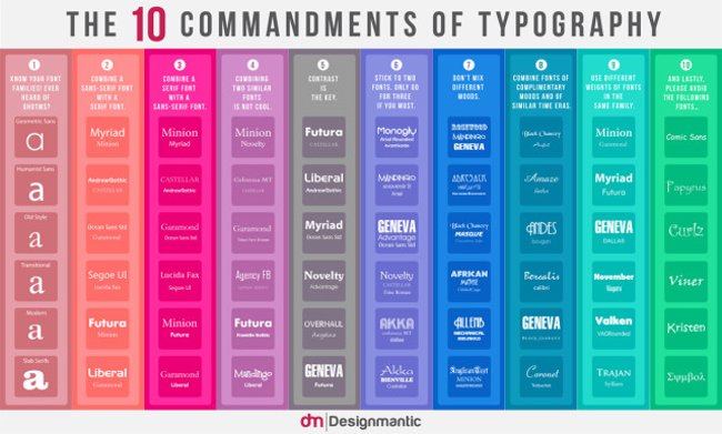
Font-face is used for all languages from Vietnamese, English, Korean, Japanese, Chinese, Arabic, Thai, etc. But Font-face for Vietnamese is not much. Because of this, when you use other fonts that do not support Vietnamese, the font will be small, not according to the original font.
Choose font size for title and text accordingly . On the one hand, you don't want to create a text wall and distract the audience. On the other hand, you want the audience to read the text that you think is important. So make your font big enough.
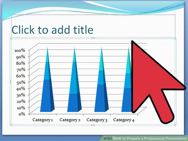
Make room for highlights , such as images or messages you want to send to listeners. There are several factors you should highlight. So try to avoid " burying " them in background noise, providing gaps if necessary. It can be a single quote, a quote or a single image for each page with nothing except a simple title and a simple background.
Little decoration but quality . If you have good content, you won't need too much decoration. Your existing slide templates will be fully decorated.
2. Use consistency
Use consistency in font-face and font size for all slides . This you can use the template templates. If you choose a professional template, the designer will be interested in this aspect. Remember that!
Suitable colors . This is the point where many presentations failed. You can choose a bizarre pattern and get stuck with the designer's colorful profile, then ruin it all with ugly Excel tables.
Take the time to match images with your slide show design.
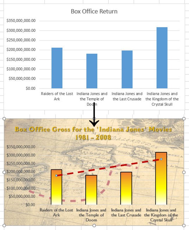
You can use the company logo, highlight the titles, create a special frame for the image or the entire slide, but don't overdo the slides with these elements.
Color
Poor selection of colors can ruin the presentation.
3. Use contrast
Black text on a white background will always be the best, but also the most boring option. You are allowed to use different colors but use them responsibly.
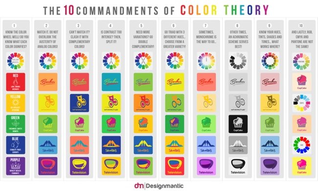
Helps to observe easily and always keep the contrast in mind . If you have color problems, use one of many online tools to choose a nice color palette. Or just use an available template.
4. Apply vibrant colors
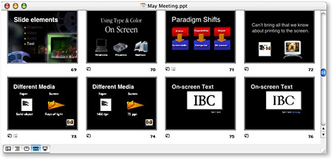
Be careful in using colors to highlight your message! Color is your friend. They can highlight the number or Take Home Message ( the message the author wants to send to the reader ).
Do not reduce the color effect by using too many colors in the examples . Special effects only work if used sufficiently. Try to limit the pop color ( black and white, but the subject retains the color to give the image an impression ) in each slide.
Choose wisely: suitable for the color of the design and good contrast to highlight your message. Use a professional color palette to find out which colors will best represent your topic.
See also: Beautiful free PowerPoint slides for office workers
Document
5. KISS
KISS is the abbreviation for the phrase " Keep It Straight and Simple ". That means systems will work best when they're simple instead of complex . And so, simplicity is the central purpose of the design, and the complicated ones need not be avoided.
- Only include keywords that appear on the slide.
- Do not use complete sentences.
- Do not read your entire slide.
Remember that your slide pages are only for support, rather than replacing presentations ! You want to tell a story, describe the data or interpret the situation, just give the main points through your slides. If you reread all the information on your slide pages, you will show people the weakness and the audience will feel embarrassed for you. Worse, they will stop listening and watch their phones instead.

6. Take Home Message
Always summarize your main point in a message to convey to the listener. Ask yourself, if you are an audience, should you learn or remember one thing from this presentation? That is Take Home Message .
Take Home Message gives your important message, a summary of data or stories. If it's an hour-long presentation, you can actually give some Take Home Messages. That's fine! Just make sure to convey what you think is important, really important to the audience.
Make your Take Home Message memorable . Your responsibility is to let the audience get something valuable. Help them " get it " by making your Take Home Message stand out, visually or through the way you arrange words.

Image
Images are a key element of each presentation. Audiences can hear and see, they want to see what you are talking about and a visual look will help them better understand the message you want to convey.

7. Add photos
Use multiple images instead of letters . Image is your friend. The human brain is able to process images faster, they can illustrate the points you want to mention and support the message you need to convey to help listeners learn more easily and remember longer.
In addition, when you use a lot of images, it is easy to know what you are talking about instead of making them read through a bunch of long words. Let's start by replacing phrases with images, for example: instead of saying ' phones are very well developed today ', look for images of a smartphone put on a slide. Or instead of saying ' Windows is the most popular operating system for PCs today ', you just need to put the Windows logo in. Of course, you also need to study who the audience is to choose the image accordingly.

Do not use pictures to decorate ! Using poor quality images only distracts listeners.
Images can reinforce or add the information you want to convey to the listener. So use images to visualize or explain your story.
"A picture is worth a thousand words " ( Temporarily translated: "A photo is worth more than a thousand words" ). In other words, if you don't have time to express in writing or words, use pictures!
Animation & Media
Animation is an indispensable part of today's design and later, it becomes a creative environment for different and unique things - an indispensable element life becomes meaningful and interesting.
In animation, there is a way to express the beauty between humor and professionalism. Besides, animation can be a powerful tool to visualize and explain complex problems. A good animation not only enhances understanding, but it can also transmit power to the audience.
8. Don't be silly
Limit the use of animations and media . You should only use them in one of two cases:
- To attract attention, such as Take Home Message.
- To clarify a model or emphasize and effect.
Embed the media in your presentation and make sure it works in presentation mode, otherwise you will look silly.

Goals and content
Your goal, ie the audience, determines the content of the presentation. For example, you cannot teach children to learn about complex economic problems, but you can explain to them what the economy brings and why it is important.
9. Know the purpose of the PowerPoint presentation to entice audiences
Before embarking on a presentation, prepare an idea, determine what you want to present, what you want to present to your audience. When you make a presentation, ask yourself the following questions:
- What do my listeners need to know?
- What to say to them?
- What do they expect?
- What will be interesting to them?
- What can I teach them?
- What will keep them focused on your presentation?

Answer these questions and write down the essentials on your slide page. In the presentation, describe the essentials in an exciting way and use professional skills; as well as impressing on how to express, ie text, image and animation wisely ( mentioned above ).
If you don't achieve your goals, it will no longer matter how you designed them or how you choose colors and keywords. If you lose the audience's attention, then everything is gone.
The important thing here is: don't get your audience bored and go to work, focus, but don't be too heavy, comfortable and put into your presentation to bring good results .
10. Practice

Take the time to prepare for what you will say. Slide is no longer used in the view of the slide so you need to think about what it is that you will say, how you will develop it and guide the reader. Best, you need to understand the problem you are presenting to be able to speak without tripping or forgetting.
Lean on the slide as a rib and compose in your head the sentences. If you forget it, use the Note function of PowerPoint or Slides as a reminder tool ( because when you project, a screen will show only the slide, the other screen will show you notes and counters ).
Don't pick up the paper , it is extremely unprofessional, you will look like a robot that can read more than a convincing speaker. Even when practicing, you just write down the things you need to say according to the main point list, but don't write them all and then memorize them because you forgot one word to make you worry and don't show it smoothly. howl later.

Stay calm and do as if you are telling your friends, colleagues to hear a good story you've just discovered, not doing a mandatory task. So attracting listeners and listeners understand what you are sharing.
A thorough, hands-on presentation will help you convince the audience and keep their attention. Here are some key points of a good conversation:
- Understand your slides
- Speak comfortably
- Speak with confidence - loud and clear.
- Don't talk too fast.
- Keep in touch with your audience.
Final
Above, the author has shown you how to prepare through the entire presentation, from choosing design to talking to the audience. This is a useful secret: Don't be too mindful of the way the listener performs outside. Just assume that they are concentrating and taking notes.
You tried your best to bring a great presentation and the audience wanted to learn it from you. What shows on their faces is not a doubt or a mistake. That is concentration! Obviously, you are an expert and they are the ones who want to learn. If you think so, you can relax and perform best.
That's all you need to keep in mind when preparing a PowerPoint presentation. If this article is useful to you, share it to your friends and relatives!
See also: 9 steps to build a perfect "elevator presentation"
Having fun!


 15 Facts About Presentations That You Should Know
  11 secrets of Steve Jobs presentation
  3 core elements of a successful presentation
  9 steps to build a perfect 'elevator presentation'
  Create beautiful slides for PowerPoint presentations with 8 tips
  Tips to reduce the size of PowerPoint files should be known