Instructions for using PowerPoint effectively
Please help the viewer get comfortable and follow the simple instructions below to help your presentation 'more soulful'.
QuanTriMang - A popular presentation creation software Microsoft has been used and 'abused' by many people, from middle school students to scientists. PowerPoint has been created for a long time and along with tutorials to help people learn and use this software.
Your customers are anywhere and can sit and watch boring product slideshows. Please help the viewer get comfortable and follow the simple instructions below to help your presentation 'more soulful'.

Engage your audience and 'score'
Your presentation is over and everyone stands up and leaves the room. What do you want them to think? Remember that you are the first speaker and the person who ends the presentation.
Remember that you are the leader, not the slides. See all the parts on each slide as a graph - like letters and photos. Avoid using full sentences, use simple words and short phrases to express ideas and present them through bullet points or bullet points.
Basic slice structure
Remember the contrast: dark on the morning; morning in the evening. Use 2 or 3 font sizes and sizes and they should not be too small, making it difficult for remote viewers to read. Besides, you should not use italic, underlined or flashing letters. You should also use less shadows and other text effects.
Create it safely by embedding everything in your presentation: fonts, images and other graph patterns. This will increase the size of the presentation file, but we don't have to worry because there are lots of software and solutions that can solve this problem.
Also, keep the charts simple. If a table or graph has too many items, break it down or think of another solution: print them out and distribute them to people in the form of leaflets or post them online.
Time is a very important factor - keep it fast, but not too fast when playing a slide. The key to maintaining a consistent speed is practice, practice and practice. You should avoid fatigue for viewers by keeping about 2 or 3 slides per minute.
A notable exception to this tutorial is also one of the habits of creating PowerPoint presentations we have ever seen: Slides with a single word, combined with the presenter's voice can be made into great work. The effect is like hypnosis. Have you ever seen such cases happen?
Use videos and photos to highlight the message you want to send
One of the proverbs of senior speakers is performance, not speaking. Photos - whether static or animated - will draw the viewer's attention and may affect any presentation. However, be careful because they can also distract you, diverting people's attention from the points you are trying to hit.
PowerPoint 2010 adds new features for photo and video editing. Two of these features are the ability to remove background from photos and compress photos and videos. However, you cannot attach links to videos on a 64-bit version of Microsoft Office website. Users will have to download the file and attach it to their presentation.
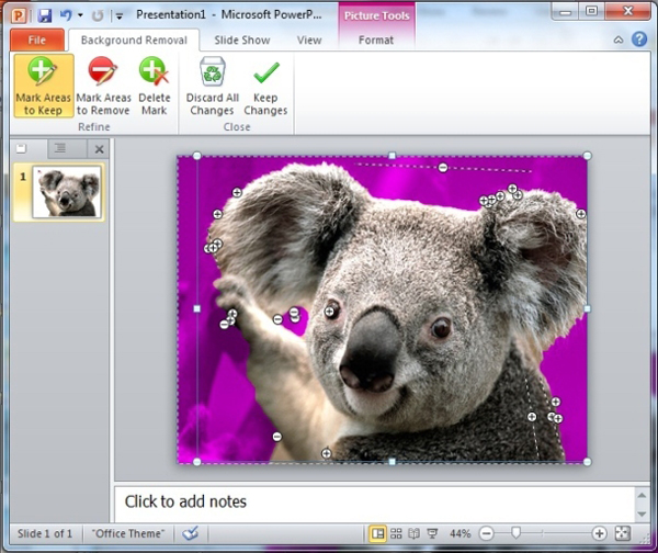
Background cut of an image is now done almost automatically when you use the very smart feature Remove Background of PowerPoint 2010. Users simply select the image, select the Format tab under Picture Tools and click Remove Background in the item. Adjust .
Users can also manually edit the background cut by dragging the outline of the selected part of the PowerPoint image for you, and use the Mark Areas to Keep and Mark Areas to Remove buttons. This feature is not as accurate as Adobe Photoshop or other photo editing software, but for most presentations, it is still enough to satisfy users.

The Remove Background feature of PowerPoint 2010 may require some manual adjustments to select the area of the image you want to remove.
To create the cropped image into the background of the slide, right click on it and select Send to Back . You can then have the text dialog appear at the top of the image. Make sure there is enough contrast between the text and the background image so anyone can easily read them.
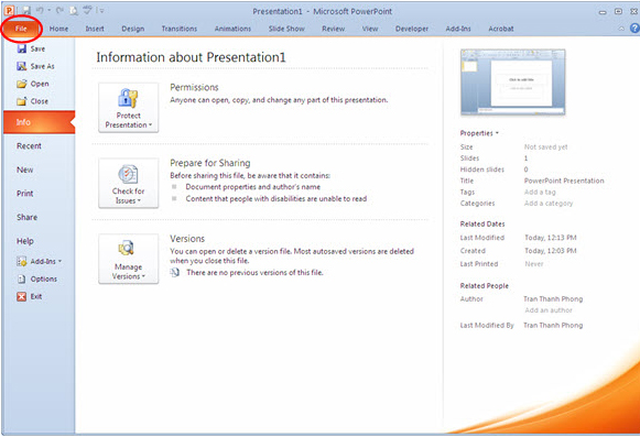
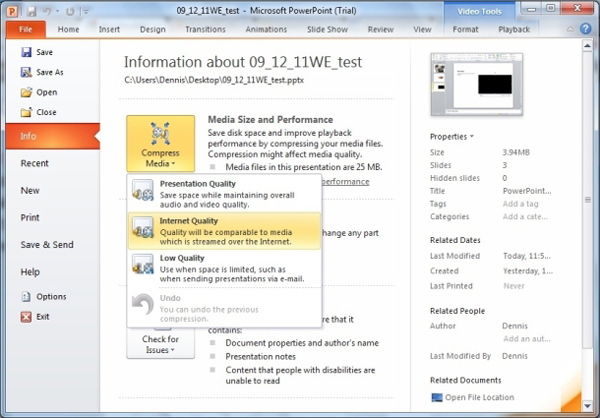
In addition, users can reduce the size of the presentation by using PowerPoint's Compress Media option: Select File → Info → Compress Media and choose one of the three quality options given. If PowerPoint finds a multimedia file in a presentation that is likely to cause incompatibilities, selecting Optimize Compatibility from the Info tab will resolve this issue.

Choose one of 3 compression levels to reduce the size of videos, photos and other graphic files in a PowerPoint presentation.
Don't forget to try it out
Even if the slideshow runs 'smoothly' when preparing, users should still check them out before the 'adventure' actually starts right on the storage device you use to show. Think about the people who sit the farthest and closest and on both sides of the showroom.
Sometimes, comprehensive preparation does not prevent errors from occurring. Regularly have a backup plan in mind in case the presentation fails. You may also have to make eye contact with the listener. This is what you should do when you practice rehearsing in front of a mirror.
- Instructions for using Microsoft Power Point
- Instructions for creating charts on PowerPoint
- 10 awesome PowerPoint templates make the presentation 'shine'
- Summary of useful shortcuts in PowerPoint
- 50 alternative slideshow applications for PowerPoint
- How to make PowerPoint - Instructions for making reports and presentations using PowerPoint


 15 Facts About Presentations That You Should Know
  11 secrets of Steve Jobs presentation
  3 core elements of a successful presentation
  9 steps to build a perfect 'elevator presentation'
  Create beautiful slides for PowerPoint presentations with 8 tips
  Tips to reduce the size of PowerPoint files should be known