How to visualize a trend in an Excel cell
Instead of having to strain your eyes to look at numbers or draw a separate chart, Excel has a built-in feature that shows trends right in a cell..
Say you're scrolling through rows of quarterly sales data, trying to figure out which regions are trending up or down. Instead of having to strain your eyes to look at the numbers or draw a separate chart, Microsoft Excel has a built-in feature that shows the trend right in a cell.
Spot patterns instantly with Sparklines (mini charts) in cells
Excel Sparklines are small charts that fit in a single cell, giving you a quick visual representation of your data. With just a glance, you can answer questions like "Is this product selling better over time?" or "Is performance down last quarter?".
You can choose from 3 types of Sparklines: Line, Column, or Win/Loss. Each type is best suited for different purposes:
|
Chart Type |
Describe |
|---|---|
|
Road |
To show trends over time, such as tracking sales over months. |
|
Column |
To compare values, such as monthly scores or profits |
|
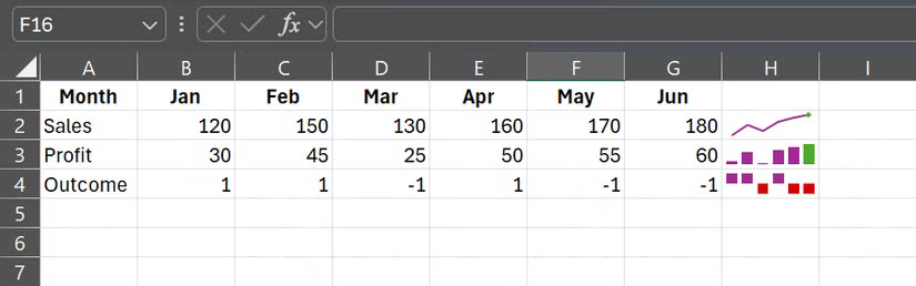
Win/Loss |
To display results as yes or no, such as whether the monthly sales target was achieved (1) or not achieved (-1). |
Once you've chosen the right Sparkline for your data, the next step is to get it into your spreadsheet without cluttering it up.
How to Add Sparklines Without Messing Up Your Spreadsheet
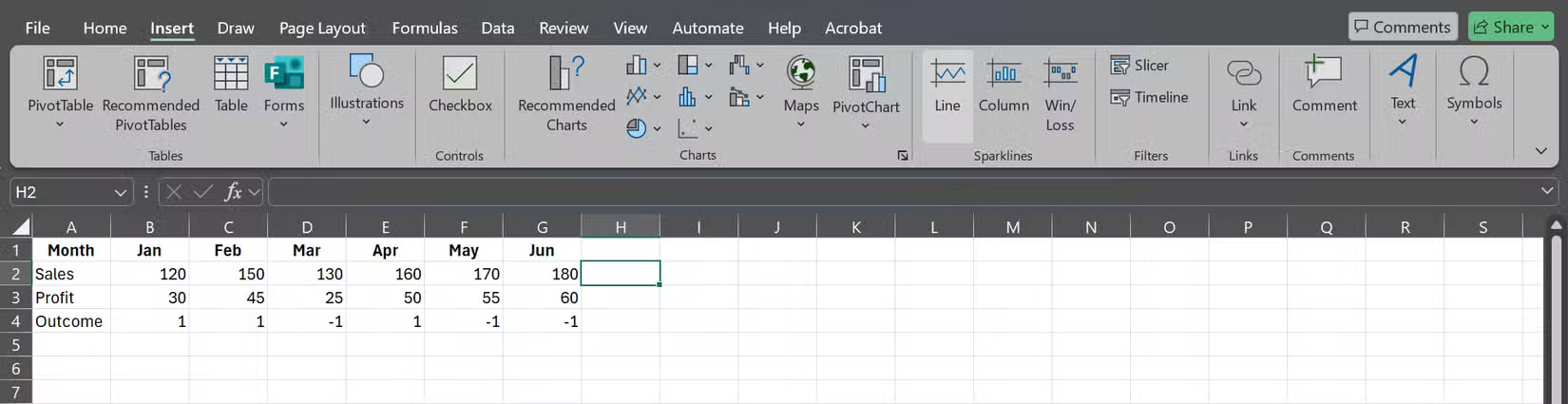
Creating a Sparkline takes about 5 seconds. Start by selecting the cell where you want the trend to appear. Go to Insert > Sparklines and choose Line, Column , or Win/Loss.
When Excel asks for a data range, select the cells whose values you want to display.
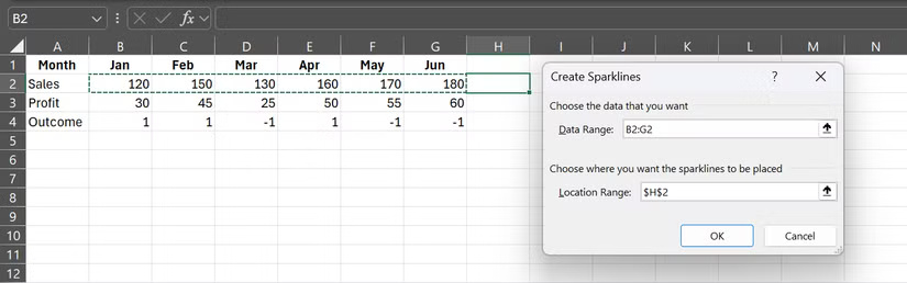
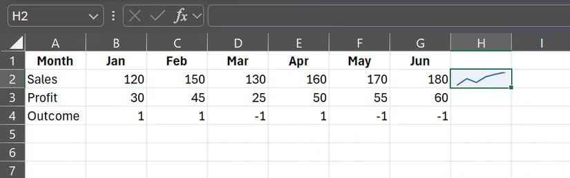
As soon as you click OK , the Sparkline will appear in the cell you specified.
Sparklines work just like regular cell content: You can copy-paste them, and they'll automatically adjust the references. However, they don't always show cell references perfectly, so people prefer to create Sparklines manually.
The formatting options are also very robust for such a small chart. Clicking on a Sparkline brings up the Sparkline tab , with options like Sparkline Color , Marker Color , etc.
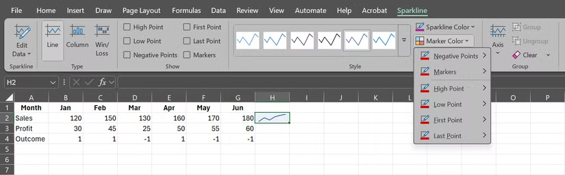
With Marker Color, you can highlight specific points, such as peaks and troughs, with contrasting colors. For column and Win/Loss sparklines, you can even set different colors for positive and negative values.
Here are some tips to keep your spreadsheets neat and easy to read:
- It is best to place the Sparkline in the last column of each row.
- Keep row heights constant so that rows are not stretched or compressed.
- If your data spans multiple months or years, set the same minimum and maximum values to avoid confusing spikes. You can do this by clicking Axis in the Sparklines tab .
- You can hide gridlines in your worksheet or use a bright cell color to highlight the Sparkline.
These are small tweaks, but they will help your spreadsheet look a little cleaner and more professional.
Add these formulas to make Sparklines smarter
By default, Sparklines use a fixed data range, but with a little Excel trickery, you can automatically update them as you add data to your spreadsheet.
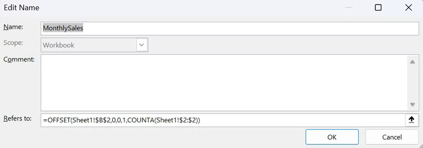
Let's say you're tracking monthly sales and you add a new number each month. Instead of manually updating the Sparkline range, you can create a dynamic named range in Excel using the OFFSET function. Here's an example:
=OFFSET(Sheet1!$B$2,0,0,1,COUNTA(Sheet1!$2:$2))This formula starts in cell B2 and expands to include all non-blank cells in row 2. For example, let's name our formula MonthlySales .
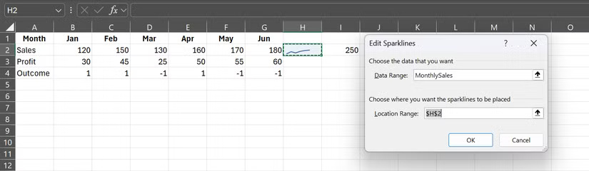
When setting up a Sparkline, simply enter a named range (e.g. =MonthlySales ) into the data range cell.
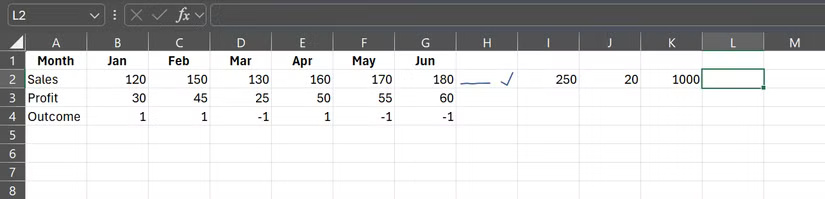
From then on, every time you add a new month with new figures, the Sparkline will automatically adjust.
You can do the same with drop-down lists or specific rows/columns, combining formulas like INDEX or MATCH to target exactly the data you want. The key is to specify the range correctly. Once done, the Sparkline will always reflect the latest numbers.
If you haven't tried Sparklines, you're missing out on one of Excel's quickest ways to spot trends. Next time you're buried in numbers, drop a little chart right into a cell. You may never look at raw data the same way again.