Experience the Material Design 2 interface for Chrome, you can activate it
With the Material Design 2 interface, Google Chrome browser will get a completely different interface with the main blue, sharp and sharp lines on the menu bar, browser tabs replaced by the interface round and round corners.
In early March, Google launched Android P version, soon after this technology company introduced its completely new Material Design 2 design. Currently, Google is testing this new design interface in Chrome browser.
With the Material Design 2 interface, the Google Chrome browser will have a completely different interface with the main green color. In Android P, Google used to design everything and the company continued to bring this design on the Material Design 2 interface on Chrome, sharp and sharp lines on the menu bar, browser tabs were replaced replace it with a circular interface and round the corners.

If you want to experience the Material Design 2 interface on Chrome, follow the instructions below to activate this interesting Google test.
Step 1: Visit the address below to download the latest version of Google Chrome Canary. Google Chrome Canary has the latest Chrome features.
- https://www.google.com/chrome/browser/canary.html
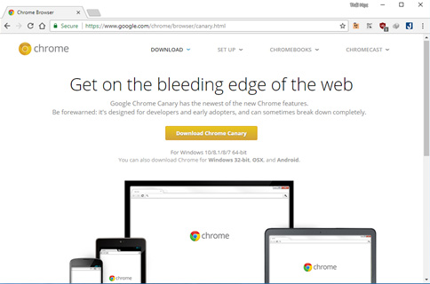
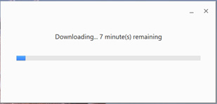
Chrome Canary computer installation process requires an Internet connection.
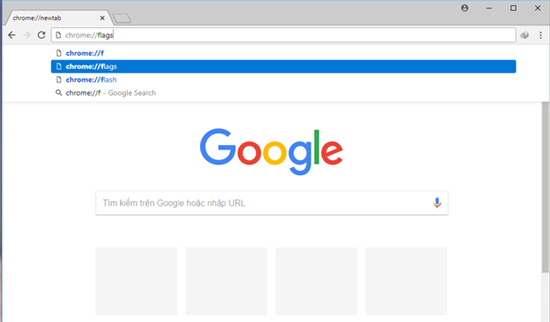
Step 2: After installation is complete, start the browser and then visit the Chrome Canary hidden feature page at ' chrome: // flags ' address.
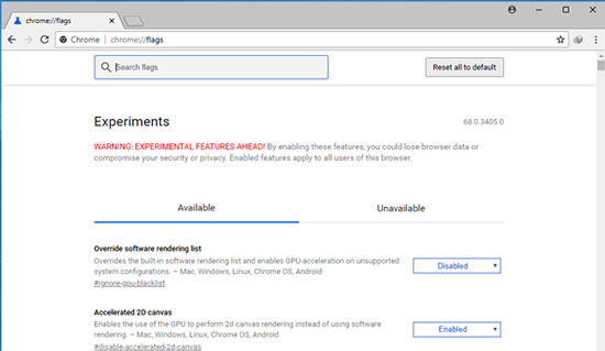
Step 3: In the search box type in the keyword ' Material ' -> the list of options related to Material will appear.
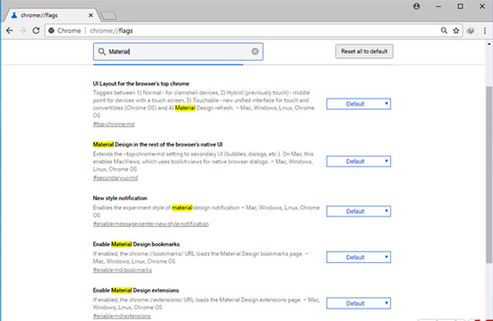
Step 4: At ' UI Layout for the browser's top chrome ', select the change option to ' Refresh '.
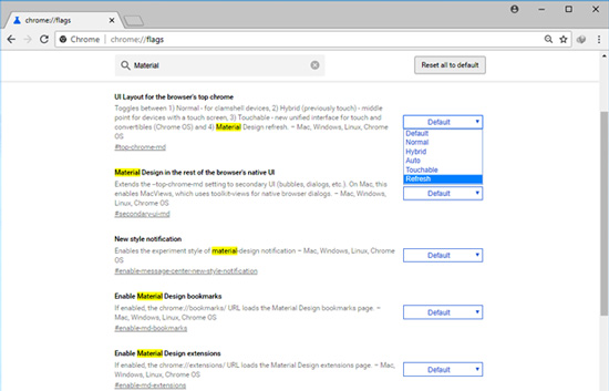
The remaining options change to 'Enable'.
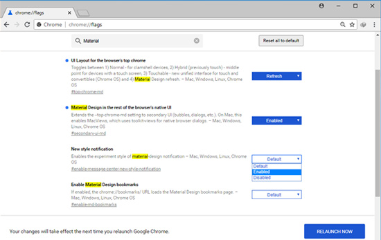
Step 5: Click on ' RELAUNCH NOW ' to save the changes and restart the browser.
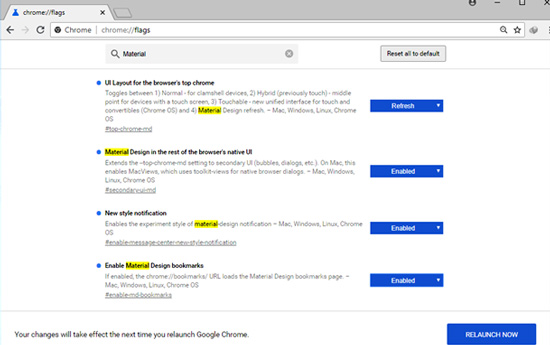
And below is the Chrome Canary browser interface has switched to Material Design 2. This new interface focuses on rounding and rounding everything from sharp and sharp lines on the menu bar to tabs Browser.
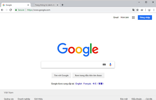
The icon for the Google account is moved down and placed at the end of the address bar.
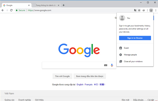
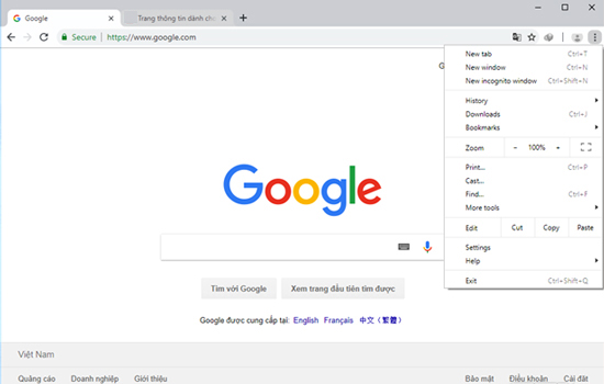
The drop-down menu bar is like a 3D image due to changing effects and making it appear more floating.
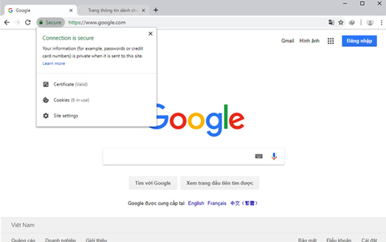
The security key is no longer separated from the domain name by a vertical brick as it was previously placed in an oval shape. The browser tabs above are no longer trapezoidal, but instead rounded corners.
See more:
- How to remove the "junk" search bar from Chrome and Firefox browsers
- Invite to download Macro, new extension to control Google, YouTube, Messenger, GitHub with shortcuts on Chrome
- Flickr, extension helps you get a beautiful and unique picture every time you open a new Tab on Chrome
- 9 Chrome Flags you should activate to have a better browsing experience
- How to install Material Design interface into Firefox
- Google Chrome browser on Android has a new interface, invite experience
- Designed with the Material Design 2.0 interface, how will Google applications change?
- How to change the position of New Tab button on Chrome
- Experience Google 's new Gmail interface quickly
- Google Photos has a beautiful Material Design 2.0 interface, invite download and experience
- How to turn on Chrome's Material Design on iOS
- YouTube on Android uses Material interface
- Google updates the Material guide for programmers
 How to fix The installer error uncompress archive on Chrome
  How to dual boot Chrome OS and Windows 10
  How to Fix Google Sheets 'Still loading ...' error in Chrome
  How to enable uBlock Origin and Manifest V2 extensions on Chrome
  How to browse multiple websites with the same Chrome tab
  Download ARChon 2.1.0: Android emulator for Windows PC