What is the difference between iOS 11 and iOS 10?
iOS 11 according to reviews has many new features, improved interface than iOS 10 version.
At the WWDC Conference 2017, Apple officially announced the time for iOS 11 to be released. According to the report, iOS 11 changed the interface, provided more new features. We can mention as Siri virtual assistant smarter with increased number of recognizable languages, redesigned Control Center (Control Center) interface, special control bar for iPad, . So compared to iOS 10, iOS 11 how have changes from interface to features?
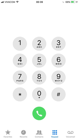
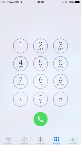
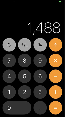
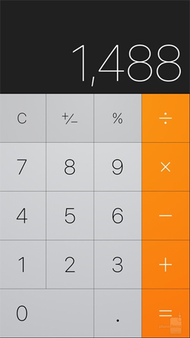
The following article will give you an overview of the major changes on iOS 11. The left picture is in iOS 11 and the right picture of iOS 10 .
- How to upgrade iOS 11 on iPhone / iPad
1. The Home screen main screen changes:
It is easy to see in iOS 11, the network signal has been changed to show the way to the column. The battery status has also been changed to a green, more compact design than the iOS 10 version.
The Dock bar underneath the folder names, makes the screen look cleaner. In addition, the font of the application icons is also designed to be more bold, easier to read on the bright screen background.


2. Lock screen lock screen:
Notification Center and lock screen on iOS 11 version are combined as one, when users have direct access to notifications. The message will appear by sliding your finger up on the screen, not down the screen. Notifications will appear in the middle of the lock screen interface.


3. Control Center Control Center:
This is considered the biggest change point on iOS 11 compared to iOS version 10. The new control center completely changes the arrangement, 3D operation can help you turn on or turn off options and control music . You can see the brightness and volume adjustment bar located on the right side of the interface.
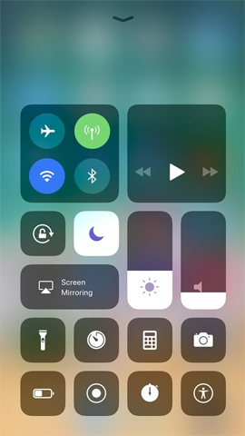
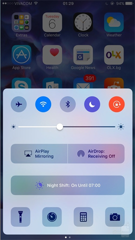
In addition, Control Center also allows users to customize the settings, using more features options, applications than iOS 10 version.
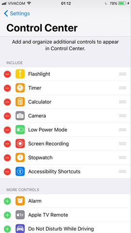
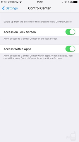
4. Change on App Store:
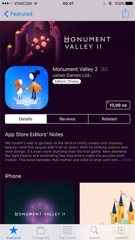
The App Store has also been changed a lot after the Control Center. The design of the App Store's interface is more prominent when using larger illustrations. Information in each application or game is also provided clearly, users can easily capture information about the application.
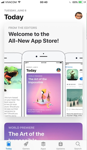
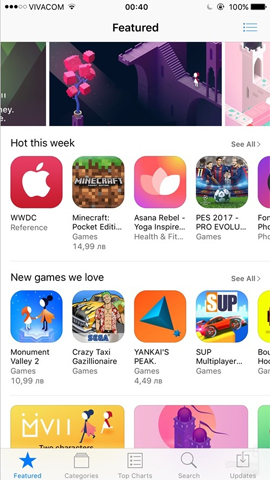
In addition, applications are now classified by Today items, Games and Apps. 2 Updates and search bars remain in place.

5. Settings area:
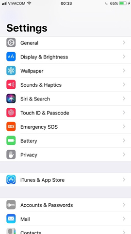
The most recognizable is the Settings menu name that appears at the top with a much larger font size. The Search bar is redesigned and matches the general theme of the Settings application, unlike the design at the top of the interface like iOS 10 version.
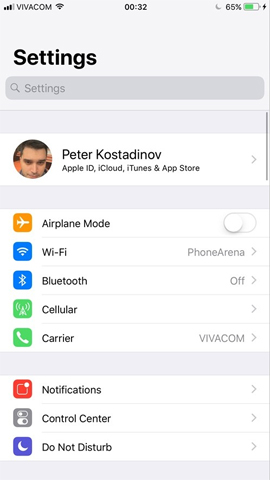
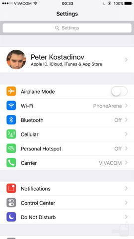
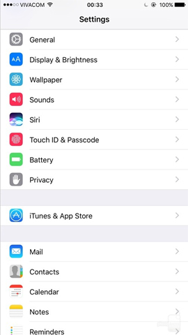
When exploring down to the menu below, there are 2 new items added: Accounts & Passwords and Emergency SOS. The Sounds & Haptics section is added to reflect more comprehensive content.
6. Changes on iOS 11 Camera:
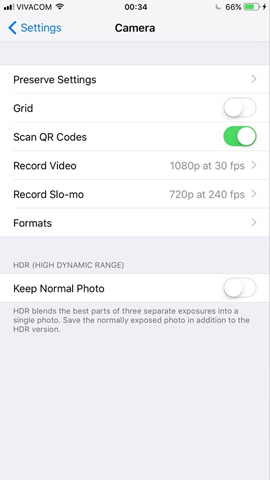
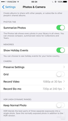
Unlike the old interface, Camera has been separated from Camera & Photos menu, providing the main settings to adjust the Camera. You can see the optional Scan QR Codes option for scanning QR codes, along with a number of other settings. Besides, users can also choose between HEIF / HEVC and JPEG / H.264 file formats.
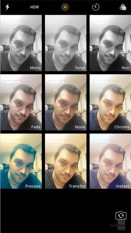
In addition, iOS 11 also displays thumbnail images of the shooting modes for known users, or zoom in on the current shooting mode.

7. Memory in Storage:
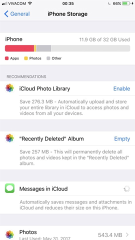
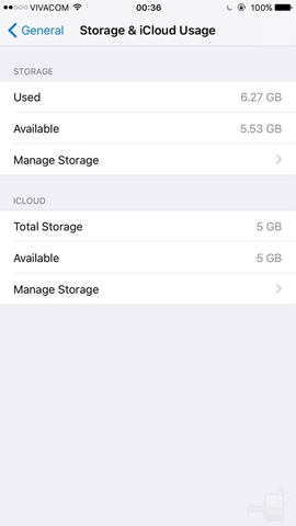
In order for users to better understand the capacity of the device in use, iOS 11 has provided more operation diagrams to take up storage space on the device. The list of archives is also improved with more detailed and complete information than the iOS 10 version.
8. List of calls:
The iOS 11 version has added Recents to the application menu, with a more prominent font. The information in the menu, the number in the directory is also larger, darker, easier to see than the old version.


9. Dialer on iOS 11:
The keyboard interface is text and numbers bold than the iOS 10 version.
10. Safari browser:
Safari doesn't change much, it's the address bar is lower than the old version.


11. Calculator Calculator:
The digital panel interface is changed to a circular shape, instead of the adjacent square as before. This makes the spreadsheet look more intuitive and recognizable.
12. iMessage application:
IMessage messaging application is also changed when the toolbars appear at the bottom of the interface. When swiping on any icon, stickers will appear for users to choose.
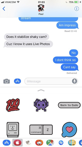
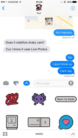
Above are some significant changes on iOS 11 compared to iOS 10. Most of the interface has been improved, the options are enlarged, bold and clearer. Try upgrading to iOS 11 to discover more new features.
Hope the above article is useful to you!


 How to delete iOS jailbreak using 3uTools
  How to share original quality photos via AirDrop on iOS 13
  Download iOS 13 wallpapers for iPhone and iPad
  How to update iOS 13 for iPhone using 3uTools without a Macbook
  Latest iOS 14 wallpaper
  Should iPhone X upgrade to iOS 15?