Apple made iOS 26 hard to read, but this tweak will fix that!
iOS 26 may be the most beautiful iOS release ever, but that beauty comes at a price.
iOS 26 has some really impressive features this year, but the highlight is clearly the new Liquid Glass design language. It's definitely one of the best looking versions of iOS Apple has ever released.
iOS 26 may be the most beautiful iOS release ever, but that beauty comes at a price.
iOS 26 makes reading harder than ever
Beautiful at first, unpleasant later
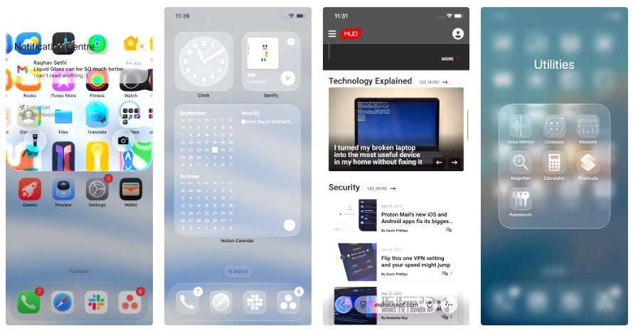
The Liquid Glass design certainly wins in terms of aesthetics, but using it makes it difficult to read on a daily basis. The biggest problem is contrast, or rather the lack of it. Just having a light-colored wallpaper in the background is enough for text to start to blend into it, making menus and labels look disjointed and unfinished. This problem is exacerbated in apps that have dark and light elements side by side.
As you scroll, iOS constantly switches text between black and white to keep it easy to read, but instead of helping, it just makes the whole interface flicker and distract. Sometimes there's just too much going on at once.
Notifications aren't much better. I used to love swiping down on the lock screen to see what I missed, but now those notifications pop up on top of whatever you're doing.
These iOS 26 tweaks finally fixed the problem
Back to function over form
Fortunately, there are a few fixes that can significantly improve readability. However, you shouldn't turn them all on at once. Instead, start with one and see how it goes, then add another if you're still having trouble.
Enable reduce transparency feature
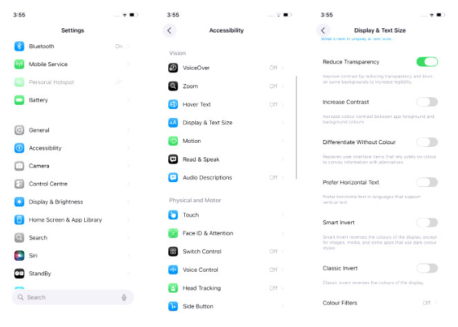
This is the biggest fix. Sure, it comes at the cost of a slightly more basic interface, but many people don't really mind losing a little visual flair in exchange for much better readability. You can enable it by opening the Settings app , going to Accessibility > Display & Text Sizes , and turning on Reduce Transparency .
Change wallpaper
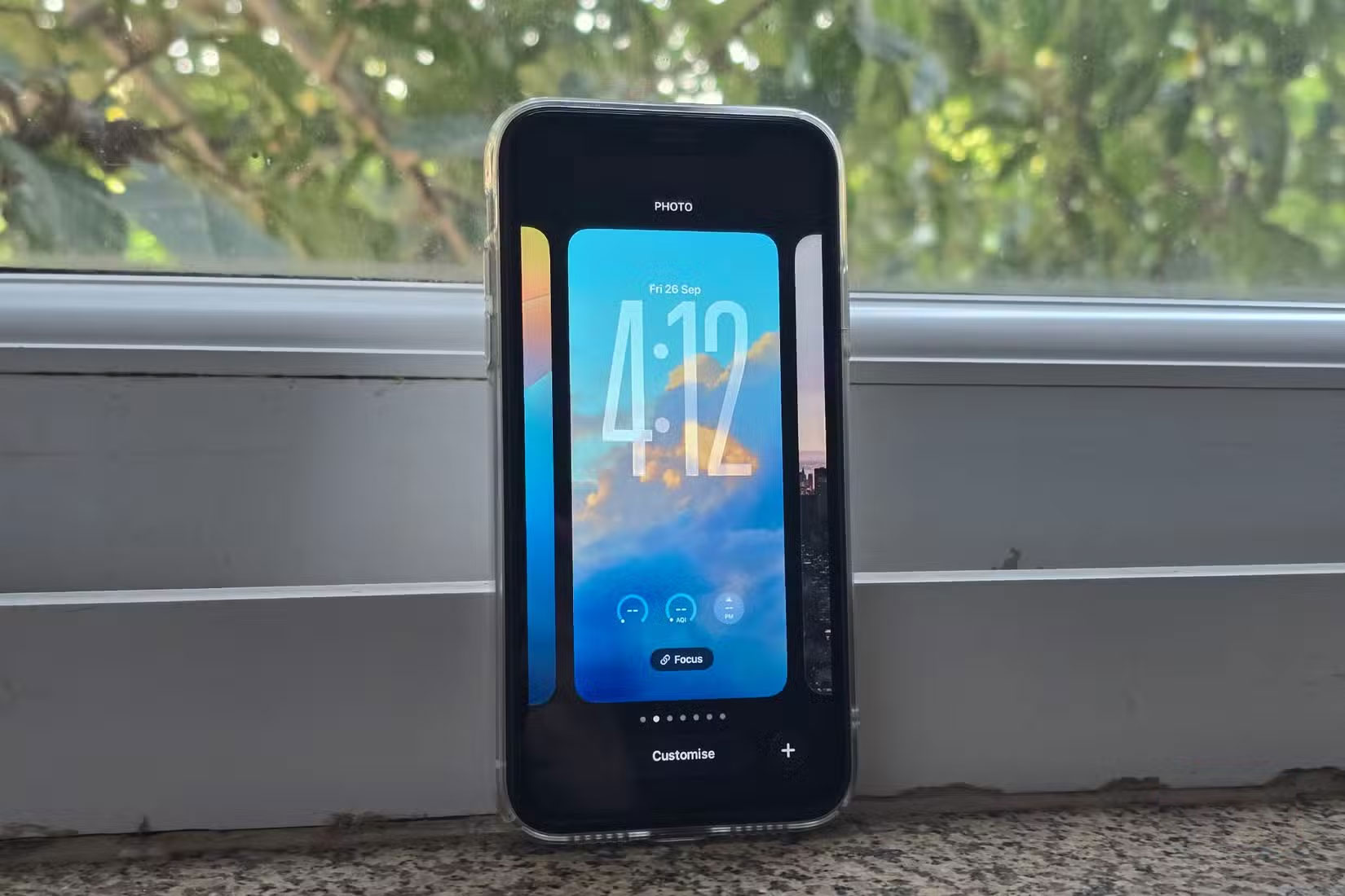
If turning on Reduced Transparency is too much, try switching to a simpler wallpaper. While it may be tempting to stick with your favorite wallpaper, choosing a neutral, darker wallpaper can make a big difference. Text becomes harder to read when the wallpaper has both dark and light elements mixed together, so choosing a simpler wallpaper can help. Darker wallpapers often look better than lighter ones with a new design.
Enable bold text
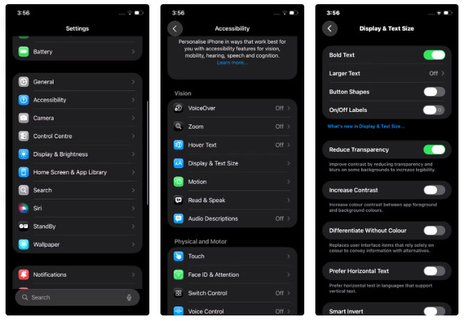
Many people didn't like having this option on, but it made a big difference for others who didn't like the Liquid Glass design. As the name suggests, this feature makes all the text on the iPhone bolder. This extra boldness provides better contrast and makes it easier to distinguish elements, although the overall look might not be to everyone's taste.
You can bold text by going to Settings > Accessibility > Display & Text and turning on the Bold Text option .
- How to Connect an External Hard Drive to a Macbook Pro
- How to Turn Off Read Receipts on Apple Messages
- iOS 14 has overcome one of the most annoying issues on iPhone
- Apple Needs to Fix These 4 Problems on Apple TV
- What is a 7200rpm hard drive? Which is better, 7200 or 5400 hard drive?
- Fix BAD hard drive with HDD Regenerator
- 8 Apps Made by Apple That Don't Come Pre-Installed on iPhone
- How to quickly remove tweak like the application on iPhone
- How to make app icons transparent on iOS 26
- How to fix common errors in iOS 26 on iPhone and iPad.
- Instructions on how to disable Liquid Glass in iOS 26 on iPhone
- Apple's latest update may fix a frustrating issue with iOS 26.
- Apple officially discontinues Clips video editing app after 8 years of operation
- iOS 26 tips to solve the problem of iPhone battery draining quickly
- How to use Live Translate feature on Airpods
- How to use the Screen Messages from Strangers feature on iOS 26
- 8 Most Annoying iPhone Problems That iOS 26 Quietly Solved
- iOS 26 Launches Today - 5 Things You Need to Do to Prepare Before Upgrading


-
 How to check AI activity on Windows by application
-
Guide to inserting images under text in PowerPoint - Changing image position
-
Guide to converting images to text using Google AI
-
What are the keyboard shortcuts Ctrl C, Ctrl X, and Ctrl V in Word? What are their functions?
-
How to fix spaced-out text in Word
-
How to Warp, bend text in Adobe Illustrator
 How to check AI activity on Windows by application
 Guide to inserting images under text in PowerPoint - Changing image position
 Guide to converting images to text using Google AI
 What are the keyboard shortcuts Ctrl C, Ctrl X, and Ctrl V in Word? What are their functions?
 How to fix spaced-out text in Word
 How to Warp, bend text in Adobe Illustrator