What is contrast?
What is contrast ?. Contrast is not only an English word, Contrast is also a term used a lot in some fields, especially graphic design. If you do not understand what Contrast means, please refer to the following explanation..
Contrast is not only an English word, Contrast is also a term used a lot in some fields, especially graphic design. If you do not understand what Contrast means, please refer to the following explanation.
What is contrast lexicographically?
According to the English - Vietnamese dictionary, Contrast is defined:
* Verb:
- Compare in opposing contexts to show or emphasize differences.
For example: An essay that contrasts city and country life (an essay giving a contrast between urban and rural life).
* Noun:
- Actions that create contrast.
- Contrast status.
For example, red berries standing in vivid contrast against the snow (red berries contrast vividly against the snowy background).
- A difference, especially a strong difference, between entities or objects to be compared.
For example, the contrast between Northern and Southern speech patterns (the differences between speech patterns in the North and the South).
- A very different thing from similar entities of the same type.
For example: My new school was a welcome contrast to the one before ( My new school is a welcome contrast to itself before).
- The use of opposing elements, such as colors, drawings, etc. to create an enhanced effect in a work of art.
- Differences in brightness between light and dark areas of a photo.
What is contrast in graphic design?
According to the dictionary definitions above, you can see a meaning of Contrast related to the field of graphics, which is the difference in color or brightness. It's true that color is an essential element when it comes to contrast, but there are still many other factors that create contrast, such as typography, position alignment, or size. These principles all play an important role in determining whether or not you have a successful design.
Contrast in size
In the image below, you can see a very simple example of the size contrast. Your eyes are almost glued to the big text. That is only natural; When something big is placed next to something small it usually shows that the big side is much more meaningful. Having contrasts in dimensions adds a visual interest to the work, and will help you set up the key elements of your composition to make sure your audience is focusing on the right area.

Contrast size not only applies to text, but also to images. It is essential that you know which areas of your design need a focused audience. Try to catch the eye of the viewer by resizing. If your entire layout consists only of text and other elements of similar size, it's almost no fun.
Contrast in color
The contrast of colors is said to be one of the main principles of design. Can take a very simple example, if you take a white background and drop on it a black text, the contrast between the white and black values is quite clear. However, in reality you will have to work with more complex contexts than just black and white.
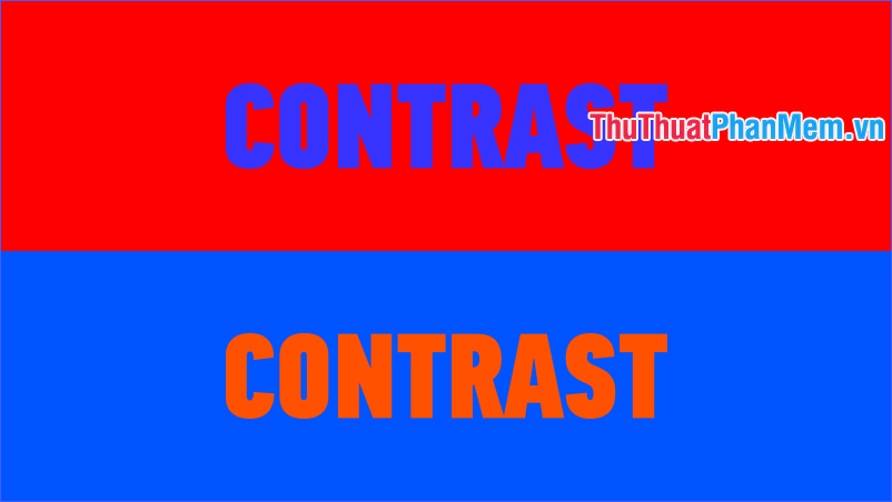
Setting contrast for colors can make a breakthrough, but it can also wreak havoc on your designs. You will not want colors to conflict with each other in a way that makes them difficult to understand and uncomfortable to look at. For the image below, your eyes may start to ache after staring at it for even a few seconds.
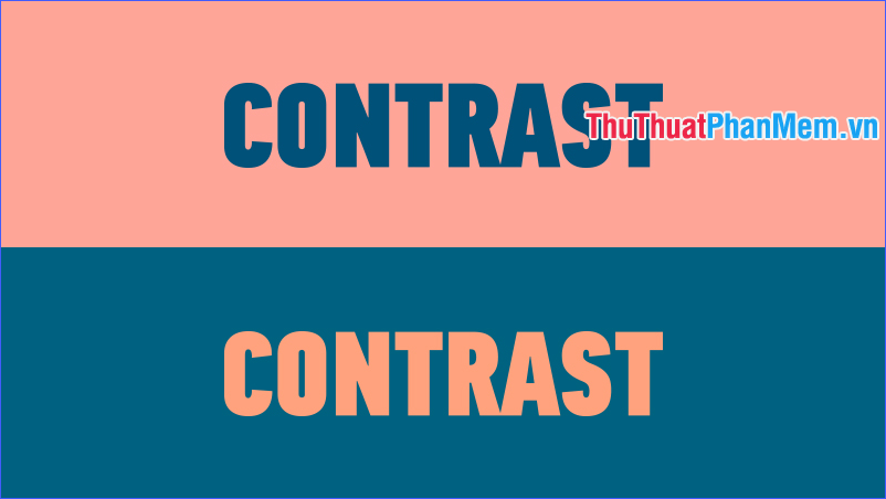
On the other hand, the next image below shows a great level of contrast, the background color and the text color are pleasing to look at. The colors chosen are simply different shades of the previous image, but these colors work much better together. It is important that you work with colors that are not offensive to your eyes. You should also not use similar colors, such as red and orange.
Contrast to the picture
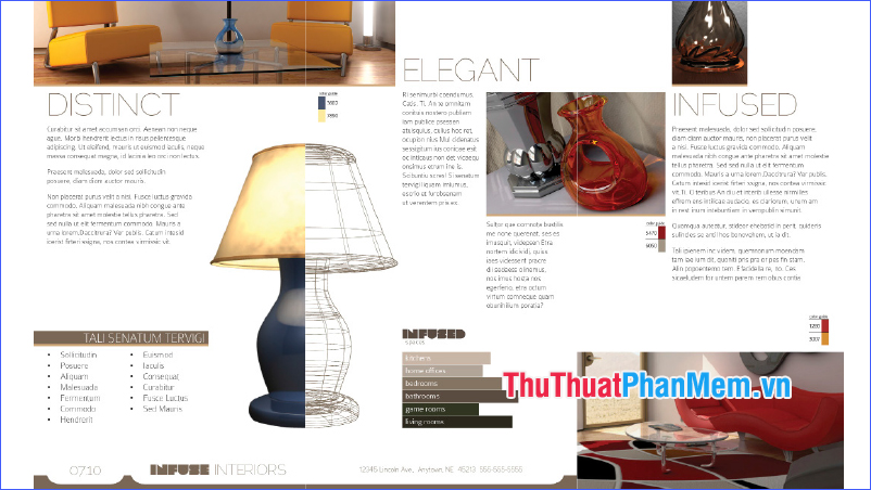
Using image contrast in designs can really help make things stand out. It will allow you to accentuate key elements in your design by making a noticeable difference in shape compared to the rest of the composition. Depending on the aesthetic eye, you can create extremely high levels of contrast to attract more attention to a given area. For example, if you have a layout in which all elements are designed in a rectangle, but right in the middle is a circle, the viewer's attention will be directed to that circle because it different from the rest. For example, the lamp in the following picture:
Contrast typography
No matter what design you are creating, you'll probably have to use a number of different typefaces. When working with a layout, you never want a typeface to be used for the entire design. Instead, look for places where you can create variations, such as the areas that matter most. For example, you can use the same font but differentiate between bold and stroke. That helps bring you contrast, but also keeps the consistency of your design, because it shouldn't apply too many different typefaces to each piece of text.
In summary, in the field of graphic design, contrast is one of the most important principles, its range is much wider than what people often think - only including light and dark values. . All of these contrasting elements should work together in a layout or design to help achieve a final look. Remember that not all things need a large level of contrast to stand out; sometimes it takes subtlety and harmony to make the final work truly appealing.
Through the article above, I have explained to you what Contrast means. If you're following the design path, wish you soon become proficient in Contrast and become a talented designer in the future!