Tips for using contrast in Photoshop
This article will teach you the basics of contrast in Photoshop, GIMP and Paint.NET.
Table of Contents
This article will teach you the basics of contrast in Photoshop, GIMP and Paint.NET.
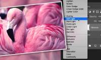
>>>Create contrast in Photoshop
While brightness and contrast are fundamental concepts in image processing techniques, using these tools well and achieving the desired effect is not a simple thing. This article will provide you with useful information about Level , Curve and Histogram concepts in the three major image processing programs that are Photoshop, GIMP and Paint.NET.
What is Histogram?
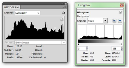
Histogram is a rather confusing concept but gives users a lot of information. In the illustration, on the left is the Histogram tool in Photoshop ( Windows > Histogram ), on the right is GIMP ( Colors > Info > Histogram ). Paint.NET does not have a standalone Histogram tool, but it is integrated into other tools that we will discuss later.
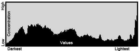
To make it easier to understand, you can imagine Histogram as a simple algebraic model that contains information about your picture. The horizontal axis (X-axis) represents the value zone, from the darkest to the left, to the brightest on the right. Vertical axis (Y axis) shows the level of those values in the image. The higher the peak, the more colors there are in the image. The highs on the right indicate that the picture is bright in color, otherwise it will be dark if there are many peaks on the left.

Histogram can be applied to any color system, or combine these systems together. Remember that all pictures are made up of color channels, all of which have their own unique values, but can be combined to form the overall picture. Thus, you can get a lot of useful information when analyzing how values are distributed in the picture.
Tools to adjust brightness and contrast
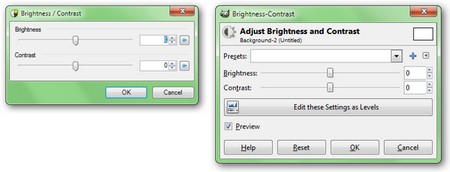
Brightness and contrast are easy tools to capture in image processing. They provide the basic ways to edit a photo like stretching or distorting the original values, adjusting the values you want in the Histogram . The image above is a brightness and contrast adjustment tool in Paint.NET. (left) and GIMP (right).
An ideal, well-proportioned image should have a balance between light and dark, as well as the appropriate value zone between these two extremes, no area is too dominant in the middle. The light and contrast correction tool will simply 'drag' the entire area of the value to make the image look brighter, increase the gap in the Histogram without losing details in the light or dark areas.
In the following section, we will learn about Level and Curve concepts.
Was this article helpful?
Your feedback helps us improve.
Related Articles
 Create contrast in Photoshop11 minutes read
 49 smart Photoshop tips you need to know (Part 1)12 minutes read
 What is contrast?7 minutes read
 49 smart Photoshop tips you need to know (Part 2)9 minutes read
 49 smart Photoshop tips you need to know (Part 3)15 minutes read
 Setting up Photoshop Action batch image processing4 minutes read
Reader Comments 0
Sign in with email or Google to join the discussion.