Table of Contents
Overview
This guide explains how to create high-contrast black-and-white photos in Photoshop in clear, practical terms. It covers the key concepts, recommended steps, common limitations, and useful checks so you can make a better-informed decision.
This tutorial will show you how to instantly convert a high contrast black and white photo in Photoshop using Gradient Maps. There are many ways to convert a photo to black and white, but Gradient Maps are one of the best because they are fast, easy to use, and produce great results. This article will show you how to use Gradient Maps and the secret behind why Gradient Maps give black and white photos such a high contrast look.
How to Convert Image to Black and White Using Gradient Map
So let's compare the result from the Desaturate command with the result we got when using Gradient Map.
Turn off the Desaturated layer by clicking on its visibility icon:

Step 1: Reset Photoshop's Foreground and Background colors
Before adding a Gradient Map, make sure that in the toolbar your Foreground and Background colors are set to default, with black for the Foreground and white for the Background:

The reason is that by default, Gradient Maps use gradients based on the current Foreground and Background colors. So if your color is set to something else, click the little Reset icon above. Or press the letter D (dèault) on your keyboard:

Step 2: Add Gradient Map adjustment layer
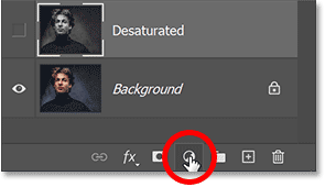
Then, to add a Gradient Map, go back to the Layers panel, click the New Fill or Adjustment Layer icon at the bottom:
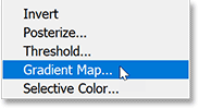
And select a Gradient Map adjustment layer from the list:
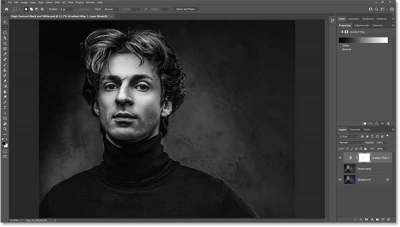
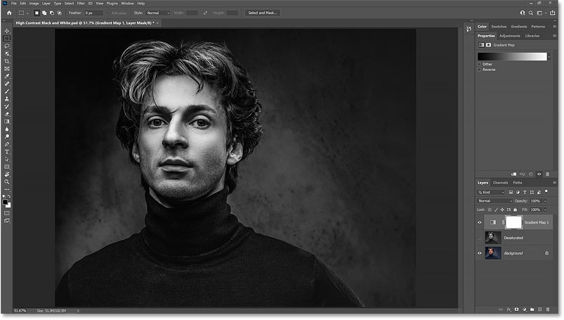
Immediately, we get a much higher contrast black and white image, with darker shadows, brighter highlights, and more detail overall:
Compare the results
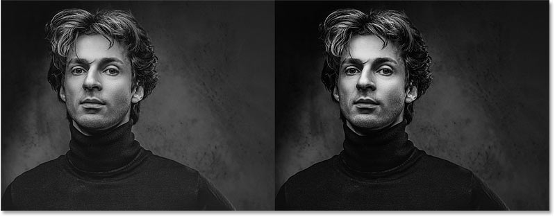
Here is a comparison of the results from the Desaturate command (left) and the Gradient Map (right).
You can easily see how much better the black and white version of the Gradient Map looks, despite taking the same amount of time. The higher contrast makes the image pop, with more detail in the model's face and hair, and clearer patterns on the sweater and in the background:
How do Gradient Maps convert images to black and white?
So why are Gradient Maps so effective at creating high-contrast black and white images? There are actually two reasons. The first is because of the way Gradient Maps work: Gradient Maps take the original colors in an image and replace them with colors from a gradient.
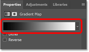
In the Properties panel, we'll see the gradient that the Gradient Map is using. By default, this gradient is based on the Foreground and Background colors, which is why we'll reset them to black and white:
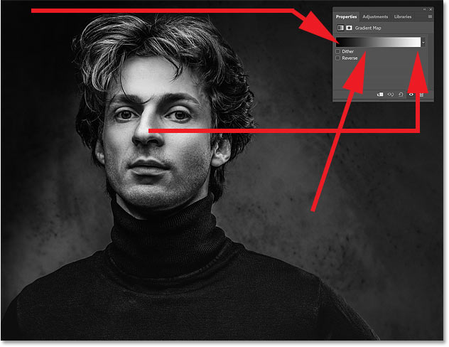
Gradient Maps replace colors based on their brightness. So, since we're using a black to white gradient, the darkest colors in the image will be replaced with black or dark gray. The lightest colors are now white or light gray. And the colors with brightness in between now have shades of gray from the intermediate tones in the gradient:
Why do Gradient Maps produce high contrast images?
So that's why the image is converted to black and white when the Gradient Map is added. But why is the black and white image so high contrast? Why is the contrast of the Gradient Map higher not only than the desaturated version, but also higher than the original image? The reason is because of an option in the Gradient Editor.
Open Gradient Editor
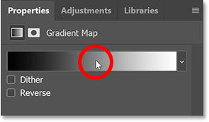
To open the Gradient Editor, click the gradient in the Properties panel:
Smoothness Options
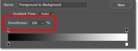
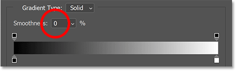
And here in the Gradient Editor, just above the gradient preview bar, there's an option called Smoothness. By default, Smoothness is set to 100%. That means Photoshop is trying to smooth out the transitions between different colors, or in this case, different shades of gray, in the gradient:
How does smoothness affect contrast?
But this smoothing feature also increases the contrast in the gradient. It increases the difference between dark and light tones by pushing dark tones towards black and light tones towards white. And this is what gives black and white images their higher contrast appearance.
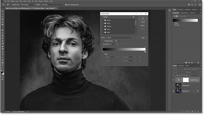
Let's see what happens to the image if we reduce Smoothness to 0%:
The high contrast is lost and the black and white image now looks more like the result from the Desaturate command:
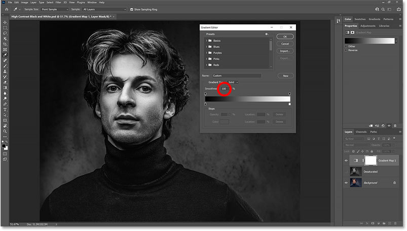
But when Smoothness is increased back to 100%, the higher contrast returns:
Expand and contract dark and light areas
If you pay attention to the gradient preview bar as you increase and decrease the Smoothness value, you can actually see what's happening to the gradient. Notice how the darkest shades on the left and the lightest shades on the right extend inward toward the midtones with Smoothness set to 100%:
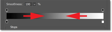
But when you reduce the Smoothness value, those darkest and lightest shades are pushed back toward the edges, brightening the midtones. And at 0% smoothness, we get a more natural transition from black to white:
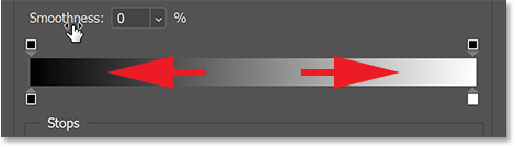
Leave Smoothness at 0% for now and click OK to close the Gradient Editor.
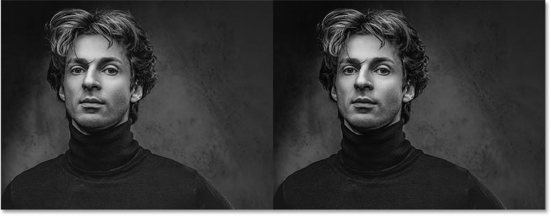
And here's a comparison between the desaturated version (left) and the Gradient Map with Smoothness set to 0% (right). Now that we've removed the advantage of the Gradient Map by reducing the smoothness, the two versions look more similar, although the Gradient Map still looks a little better:
Of course, the purpose of using a Gradient Map is to get that high contrast effect. So, open the Gradient Editor again and reset the Smoothness to 100%. Then, click OK to close it. And now, we're back to our high contrast black and white image:
Key Takeaways
Use the guidance above as a practical reference for convert to high contrast black and white photos in Photoshop. Check compatibility, follow the steps carefully, and verify important details with official documentation when software, security, accounts, health, or purchases are involved.
FAQ
How do I create high-contrast black-and-white photos in Photoshop?
Follow the steps in this guide in order, confirm each setting before continuing, and save, restart, or reconnect the device when the instructions require it.
What should I check before I begin?
Confirm the correct device, account access, software version, compatibility, and a current backup whenever the process could affect files, settings, or security.
What should I do if the process does not work?
Repeat the steps carefully, check for model or version differences, install available updates, and consult the manufacturer's official support documentation.
Related Articles
 How to Convert Color Photos to Black and White Photoshop4 minutes read
 How to Convert Black and White Photos to Color Photos Using Photoshop3 minutes read
 How to Convert a Color Image to Black and White Using Photoshop3 minutes read
 How to Reduce Computer Eye Strain by Switching to High Contrast2 minutes read
 Make Artistic Black and White Photos with Photoscape3 minutes read
 How to Convert Black and White Photos to Color Images with4 minutes read
Reader Comments 0
Sign in with email or Google to join the discussion.