Design Layout - Website layout in CSS
Layout can understand how we layout the main components on a web page.
Table of Contents
Layout design or layout design is the first and very important step in the process of designing a website. There are a number of ways to design websites with CSS, but the technique is being used in a popular and highly effective way now is to combine HTML Div with CSS. Using this way, your website will run smoothly, meeting certain user requirements. So let TipsMake.com learn more about this method through the following article.
Layout - Website layout
Layout can understand how we layout the main components on a web page.
In the Layout design, tags
A website is usually divided into sections including header, menu bar, content and footer.

There are many types of website styles, TipsMake.com will introduce more in the following sections. However, basically the structure above is most used. The article will analyze website design with the above layout.
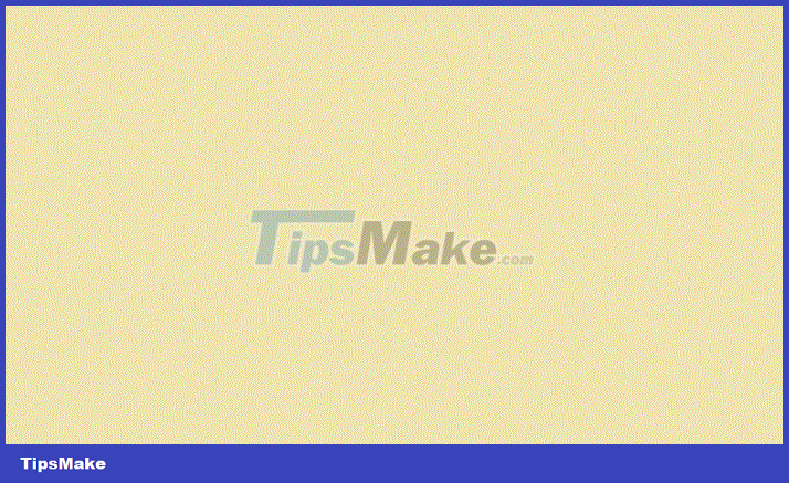
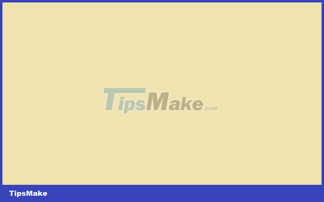
Header
Headers are usually located at the top of the site (or just below the top navigation menu). This section usually contains a logo or website name or some website slogans.
 .header {
  background-color: #e9d8f4;
  color: #58257b;
  text-align: center;
  padding: 20px;
 }

Full code:
Thiết kế Layout - Bố cục website trong CSS
Website TipsMake.com
Navigation bar
Navigation Bar - Navigation Bar , also known as menu bar, is used to navigate main items on the website.
 /* class thanh điều hướng */
 .topnav {
  overflow: hidden;
  background-color: #333;
 }

 /* link điều hướng */
 .topnav a {
  float: left;
  display: block;
  color: #f2f2f2;
  text-align: center;
  padding: 14px 16px;
  text-decoration: none;
 }

 /* Thay đổi màu liên kết khi di chuột qua */
 .topnav a:hover {
  background-color: #ddd;
  color: black;
 }

Full code:
Thiết kế Layout - Bố cục website trong CSS
Website TipsMake.com
  Làng Công nghệ
  Công nghệ
  Khoa học
content
The layout in this section usually depends on the user object. The common layout is one or a combination of the following:
- 1 column: usually used for mobile browsers.
- 2 columns: often used for laptops and tablets.
- 3 columns: often used for desktop browsers.

You can create a 3-column layout and change it to a 1-column layout on a smaller screen like this:
 /* Tạo ba cột bằng nhau, float cạnh nhau */
 .column {
  float: left;
  width: 33.33%;
 }

 /* Clear float khác sau các cột */
 .row:after {
  content: "";
  display: table;
  clear: both;
 }

 /* Bố cục linh hoạt: ba cột xếp chồng lên nhau thay vì cạnh nhau khi màn hình
 có chiều rộng dưới 600px */
 @media screen and (max-width: 600px) {
  .column {
   width: 100%;
  }
 }

Full code:
Thiết kế Layout - Bố cục website trong CSS
Website TipsMake.com
  Làng Công nghệ
  Công nghệ
  Cuộc sống
Technology Village
Stay up to date with the latest trends, discoveries, and research on science
technology.
Technology
including tips, instructions for using software, hardware, fixing errors
network, fix computer errors on many operating systems such as Windows, macOS, Linux,
Android, iOS .
Life
Life skills, job skills, leadership skills, life tips,
things you may not know, good sayings about life, sayings
famous of Jack Ma, Bill Gate, Steve Jobs .
Try changing the browser size, when the screen is less than 600px wide, the columns will overlap instead of lying side by side:

Tip: If you want to create a web layout with only 2 columns, set the width attribute to 50%, similar to 4 columns, then 25% .
Create unequal columns
Content is the largest and most important part of your website.
Most of a website, the layout of columns will not be equally divided, the content is the largest and most important part of the site, so it will occupy the most space. Secondary content (if any) is often used to switch to another link or specify information related to the main content.
By using CSS, you can change the column width as you like. Note that the sum of columns should be 100% valid.
 .column {
  float: left;
 }

 /* Cột bên trái và phải */
 .column.side {
  width: 25%;
 }

 /* Cột chính giữa */
 .column.middle {
  width: 50%;
 }

 /* Bố cục linh hoạt: ba cột xếp chồng lên nhau thay vì cạnh nhau khi màn hình
 có chiều rộng dưới 600px */
 @media screen and (max-width: 600px) {
  .column.side, .column.middle {
   width: 100%;
  }
 }
Full code:
Thiết kế Layout - Bố cục website trong CSS
Website TipsMake.com
  Làng Công nghệ
  Công nghệ
  Cuộc sống
Guide
You can share your article on the page if you have an account, you
You can view posted articles, view other members' posts and find
Find the article you care about on the page.
Introduce
TipsMake.com is a social network about science and technology, expanding content
to meet the needs of members in more technology areas such as
phone, smart device, electronics, computer security .
You can become a part of TipsMake.com by posting
write, experience your technology for the content management team of
Social network via email info@meta.vn
Contact
Address: 56 Duy Tan, Dich Vong Hau, Cau Giay, Hanoi.
Phone: 024 2242 6188.
Email: info@meta.vn.
Try changing the browser size, when the screen is less than 600px wide, the columns will overlap instead of lying side by side:

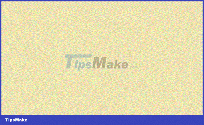
Footer
Footer is located at the bottom of the page, usually contains information such as copyright, contact information .
 .footer {
  background-color: #e9d8f4;
  color: #58257b;
  padding: 5px;
  text-align: center;
 }
Full code:
Thiết kế Layout - Bố cục website trong CSS
Website TipsMake.com
  Làng Công nghệ
  Công nghệ
  Cuộc sống
Guide
You can share your posts on the page if you have an account.
Introduce
TipsMake.com is a social network about science and technology, expanding content
to meet the needs of members in more technology areas such as
phone, smart device, electronics, computer security .
Contact
Phone: 024 2242 6188.
Email: info@meta.vn.
License No. 362 / GP-BTTTT. Ministry of Information and Communications issued on June 30, 2016.
Sample layout
Website TipsMake.com
Knowledge - Experience - FAQ
  Làng Công nghệ
  Công nghệ
  Cuộc sống
  Đăng ký
Form - Form in CSS
Quách Tỉnh, February 14, 2019
Forms are an integral part of any kind of website.
In this article, TipsMake.com will show you how to build the section
display interface of a basic form. This interface can be done
Pretty nice with CSS
Attribute Selector in CSS
Quách Tỉnh, 12/02/2019
Attribute selector is the way to select the elements you want to type in
HTML documents are based on the attributes of one or more HTML tags.
Attribute selector can select objects without having to
declare adding Classes or IDs into HTML tags and still be able to navigate
get to those components, make the code more neat and coherent.
Introduce
TipsMake.com is a social network about science and technology.
Highlights
Image
Image
Image
Follow Me
YouTube
License No. 362 / GP-BTTTT. Ministry of Information and Communications issued on June 30, 2016.
Previous post: Counter - CSS counter
Next lesson: Unit - Unit of measurement in CSS
Was this article helpful?
Your feedback helps us improve.
Related Articles
 Website design tutorial in Photoshop (Part 3): Create professional website layout9 minutes read
 TOP best AI tools for website design9 minutes read
 6 leading website design companies in Vietnam8 minutes read
 How to design a website in Photoshop (Part 1): Create a theme for the craft shop14 minutes read
 Top 11 leading UX and UI design tools9 minutes read
 Tips to help you create responsive layouts easily4 minutes read
Reader Comments 0
Sign in with email or Google to join the discussion.