Layout in HTML
Websites often display content in the form of columns (like in newspapers or magazines).
Table of Contents
Websites often display content in the form of columns (like in newspapers or magazines). HTML5 brings new grammatical elements to define and different parts of the site:
- define document title or section (section)
- The set definition contains navigation paths
- define a part in the document
- define an independent, self-contained article in itself
- define content next to another content (like sidebar)
- Footer definition for text or part
-
Detailed definition added
- Title definition for element

How to display on the page of the above elements
HTML page layout technique
There are four ways to create multiple columns in HTML, each with its own strengths and weaknesses.
- HTML table
- Floating properties of CSS
- Framework CSS
- Flexbox CSS
Which way should I choose to create multiple column layouts in HTML?
Use tables in HTML
Element which is not used for page layout. Its purpose is to display data in tabular form. So do not use the table to create a layout for the page because it will make the code very messy. Imagine a few months later going back to editing the page design and how difficult it would be.
Framework CSS
If you want to create a fast layout, you can use frameworks like Bootstrap .
Floating characteristic (float) of CSS
Designing the entire layout of the site with floating properties (float) in CSS is very common. Float is easy to learn - just remember how it works. But this also has the disadvantage that it attaches to the flow of documents, which can affect the flexibility of the page. Below is an example of CSS floating properties.
TipsMake.com
Technology
The TipsMake.com Technology category will include tips, instructions for using software, hardware, fixing network errors, and fixing computer errors on many operating systems such as Windows, macOS, Linux, Android, iOS, etc. .
Keep up to date with the latest tips and tricks to troubleshoot your readers.
Copyright © TipsMake.com
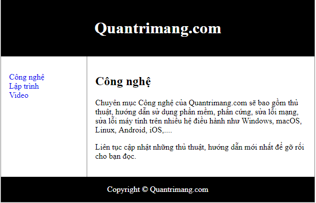
Results display page with the floating properties of CSS
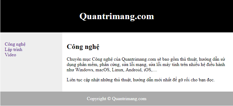
Flexbox CSS
Flexbox is the new layout mode in CSS3.
Using flexbox ensures that the elements work as expected when the page layout must adapt to different screen sizes and devices. But this way has a disadvantage of not working on IE10 and earlier versions.
This is an example of creating a page layout with flexbox.
TipsMake.com
Technology
The TipsMake.com Technology category will include tips, instructions for using software, hardware, fixing network errors, and fixing computer errors on many operating systems such as Windows, macOS, Linux, Android, iOS, etc. .
Keep up to date with the latest tips and tricks to troubleshoot your readers.
Copyright © TipsMake.com
When resizing an open HTML page, you'll see the page layout change:
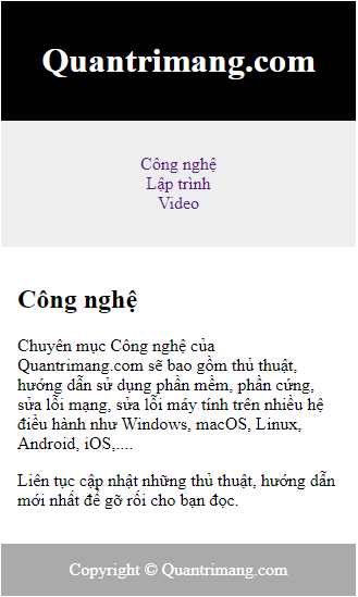
Page layout with flexbox
Previous article: Head element in HTML
Lesson: Designing websites running on multiple devices (responsive web) in HTML
Was this article helpful?
Your feedback helps us improve.


Reader Comments 0
Sign in with email or Google to join the discussion.