Check out the Liquid Glass design for Windows 12
A few months ago, a leaked report unexpectedly revealed Microsoft's plans to return to a cycle of delivering a major Windows version every three years.
Table of Contents
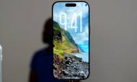
Everyone had their own opinion on Apple's new Liquid Glass design when the company unveiled it a few months ago. While this change in iOS 26 is the first major change to the look of iOS in over a decade, it also brings back memories of Windows Vista, which many people don't want to relive.
However, one online designer has imagined what Windows 12 could look like if it followed a similar philosophy. YouTube channel AR 4789's video Windows 12.2: The Next Evolution shows a mock-up of what the next Windows release might look like. And while the video doesn't specifically mention Liquid Glass, you can see traces of it around it.
Let's take a look at this design idea to see if Microsoft should pursue it.
Note : This video is for demonstration purposes only. You cannot download the ISO or install the design package to use it.
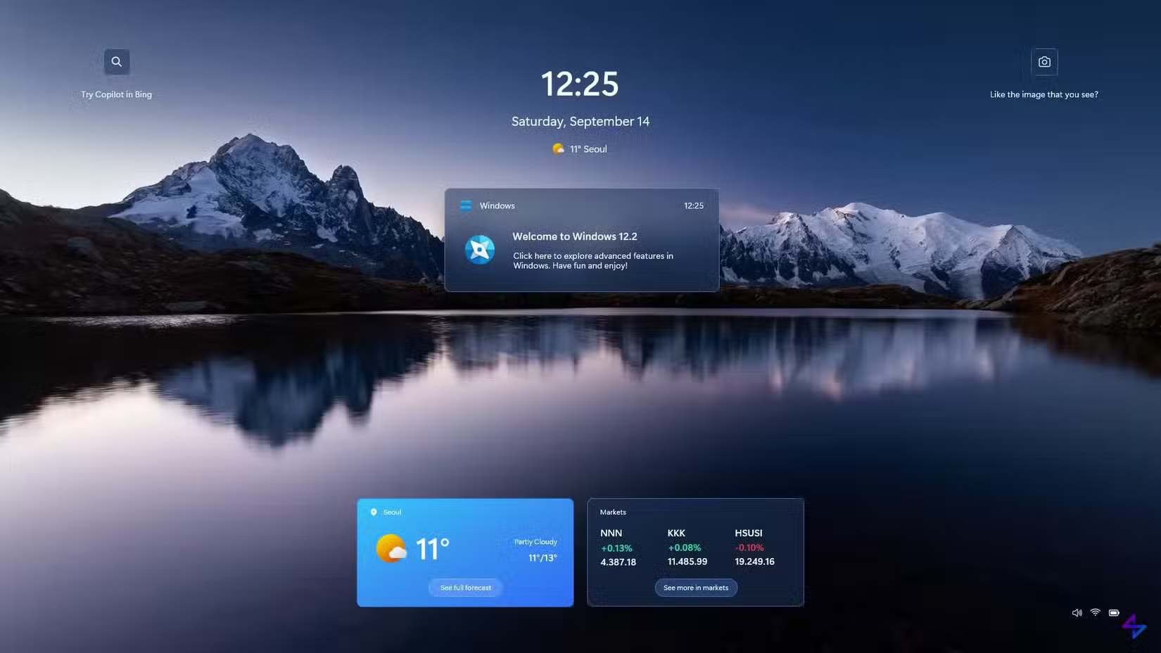
Initial setup and first impressions
The setup process isn't much different from how Windows works now, although it's much more visually pleasing. Switching between pages is smoother, nothing feels like a holdover from Windows 7, and everything feels more modern.
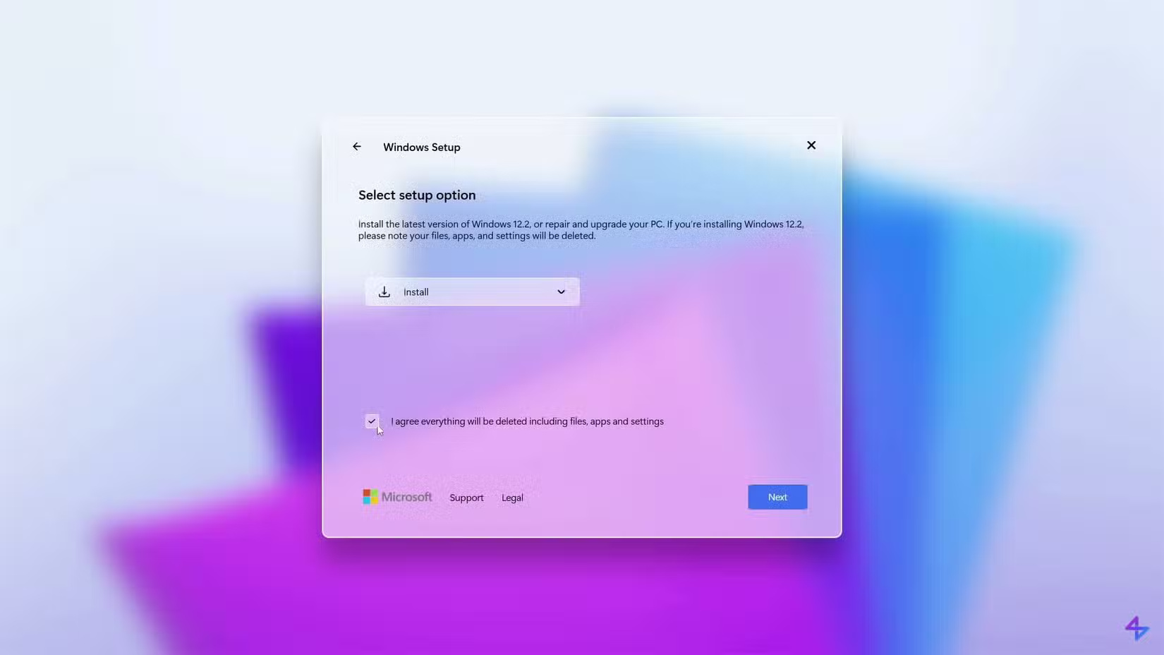
Choosing a wallpaper during setup is different, at least since the last time you installed Windows. This helps your computer feel like your own from the start, instead of having to set a different wallpaper later when you remember.
However, there are a few issues with the video setup. There are some spelling and grammar errors, which is understandable since this is just a simulation and not the final product. A big company like Microsoft will fix all of these before releasing.
Additionally, when asked about adding a second keyboard layout, the Skip button is located on the right and is used as the primary option, which is inconsistent with other options that have the Skip button located on the left.
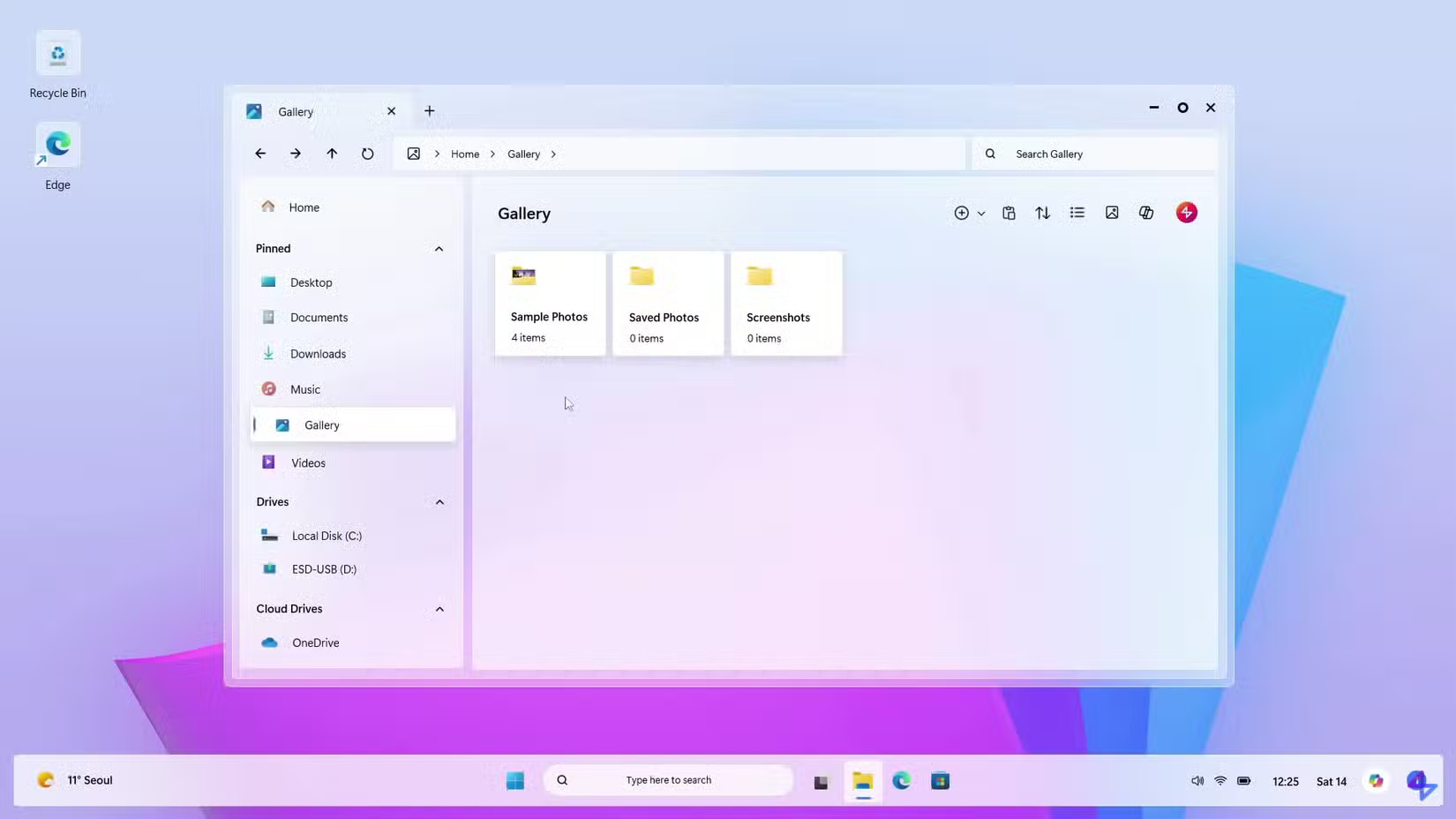
Explore the desktop and File Explorer
Aside from the wallpaper, the default desktop environment looks almost identical to Windows 11. The first thing that strikes you is the fact that the taskbar is not at the bottom of the screen, which looks more modern.
Many people don't like how desktop icons have ugly borders around them; it reminds them of using Android icon packs that don't have custom icons for some apps, so they have a generic white border.
The Start menu isn't bad; it looks similar to Windows 10, with the polarizing live tiles. Many people prefer that design over what Windows 11 offers.
File Explorer looks almost identical to the Windows 11 version, with some minor tweaks to match the visual style. This will remind you of the speed of File Explorer on a new computer, as it takes a long time to load anything on your computer.
The circular icon to maximize windows instead of the classic square is very different. This is neither good nor bad, but it is a noticeable change. What is not so good is that the icon does not change when the window is maximized, which is confusing. On Windows 11, maximized windows are replaced with two overlapping squares to indicate that clicking it again will return the window to a smaller size.
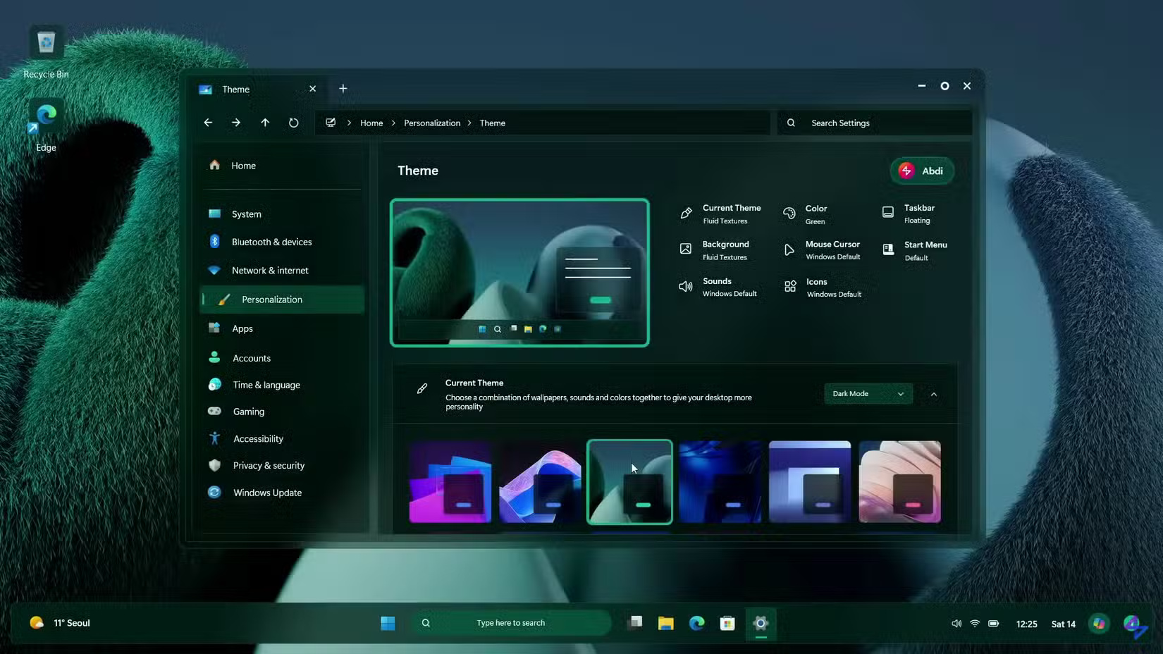
Settings and personalization
In this mockup, the Settings app has an address bar at the top, which could make it easier to navigate than the current version. With the number of items in the current Settings, it's easy to forget where you want to go.
The animation effect when switching from light to dark mode is interesting, the blurred green and blue wallpaper is also very popular. The colors applied to the desktop and taskbar look smoother than on Windows 11.
The Start menu search panel is less cluttered with random nonsense you don't want, similar to what it looks like after disabling web search results in Windows 11.
One-click customization is great. Being able to easily apply the Windows 7 style would be a fun way to change the look of your desktop. It's great that everything from notifications to File Explorer to icons changes.
It would be nice to have different interfaces across multiple virtual desktops. It would make it easier to tell them apart. But Microsoft probably won't do that, since the company wants everyone to use its latest version. Still, the idea is interesting.
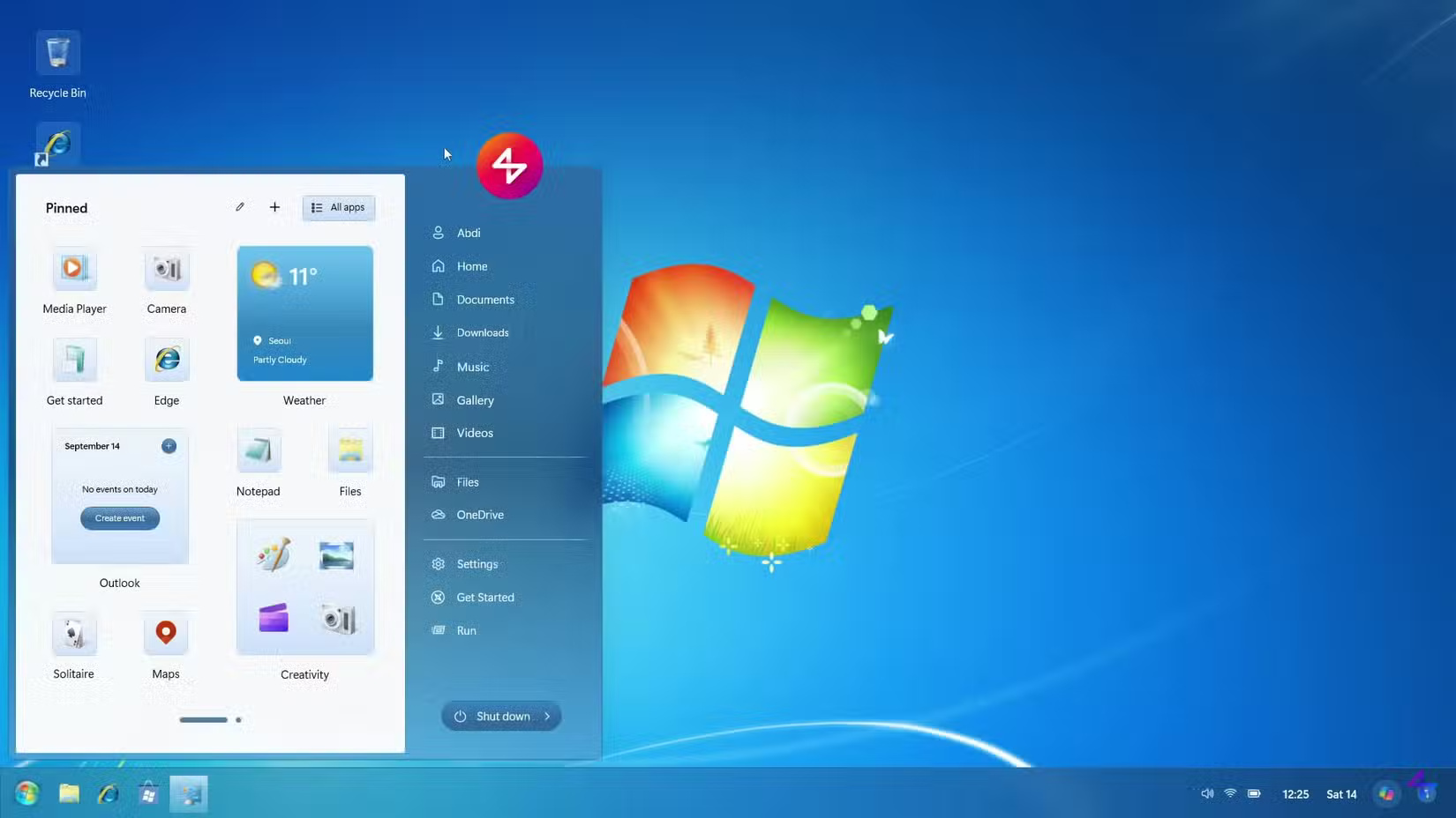
People especially like the different taskbar customization styles, like Compact and Mini. They're fun ways to experience an old part of Windows. Dragging widgets directly onto the desktop is fun, since this feature isn't supported by default in Windows 11.
The transition to the lock screen is pretty smooth, although I would like to see a fresher lock screen for Windows 12. It's too Windows 11-like and not very interesting. Plus, it's cluttered with Copilot ads and stock data you don't care about.
Is this what we expected?
Looking at the overall visual design of this mockup, it feels more consistent than the work-in-progress feel of Windows 11. There's no huge leap forward here, rehashing old ways, but it's easier on the eyes.
This demo doesn't show any of the old tools like Control Panel or Disk Management; those probably wouldn't be handled by the Liquid Glass interface. No one's going to try to install a visual package to make their computer look like this, but some of the ideas presented here are good steps toward the next version of Windows' interface.
Should Microsoft hire this designer to work on Windows 12, or should the next operating system go in a different direction? Share your thoughts in the comments below!
Was this article helpful?
Your feedback helps us improve.
Related Articles
 Instructions on how to disable Liquid Glass in iOS 26 on iPhone6 minutes read
 How to adjust Liquid Glass transparency on iOS 262 minutes read
 How to customize the Liquid Glass lock screen clock on iPhone2 minutes read
 Instructions for creating liquid glass effect on iPhone screen2 minutes read
 How to clean glass without leaving streaks6 minutes read
 All about iOS 2616 minutes read
Reader Comments 0
Sign in with email or Google to join the discussion.