How to Build an Offcanvas Sidebar in Bootstrap 5
Create accessible Bootstrap 5 offcanvas navigation that opens from any viewport edge, supports responsive layouts, scrolling and backdrop options, and dark color mode.
Fix Windows problems, troubleshoot devices, understand AI, secure your accounts and get more from your technology with tested step-by-step guides.
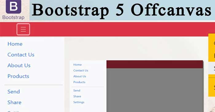
Create accessible Bootstrap 5 offcanvas navigation that opens from any viewport edge, supports responsive layouts, scrolling and backdrop options, and dark color mode.
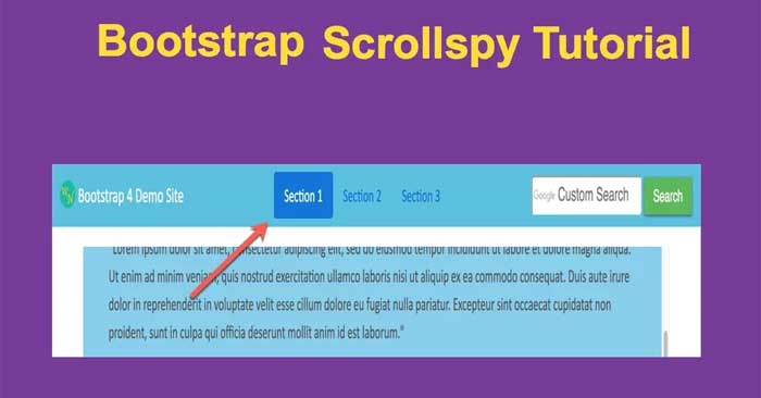
Build a working Bootstrap 5 Scrollspy that highlights navigation links as readers move through page sections, with accessible markup and troubleshooting tips.
Create Bootstrap 5 toast notifications with complete HTML and JavaScript, then control placement, timing, stacking, dismissal, and accessible announcements.
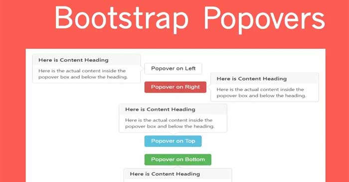
Create Bootstrap 5 popovers with proper initialization, placement and dismiss behavior, then handle disabled elements, custom styling, and accessibility.

Add Bootstrap 5 tooltips with correct JavaScript initialization, placement and styling, plus practical guidance for disabled controls and keyboard access.
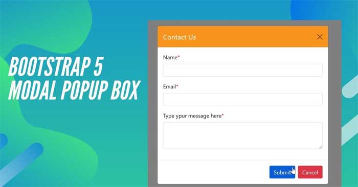
Build accessible Bootstrap 5 modal dialogs with complete markup, then control animation, size, fullscreen breakpoints, centering, scrolling, and JavaScript behavior.

Create a Bootstrap 5 carousel with accessible controls, indicators and captions, then configure autoplay, timing, crossfade, touch input, and JavaScript controls.
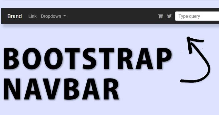
Build Bootstrap 5 navigation links, tabs and pills, align or stack them responsively, add dropdowns, and create accessible switchable content panels.

Show and hide content with Bootstrap 5 Collapse, set the initial state, create horizontal panels, control components with JavaScript, and build accessible accordions.
Build Bootstrap 5 dropdown menus with links, headers, dividers and states, then control direction, alignment, button groups, auto-close behavior, and accessibility.
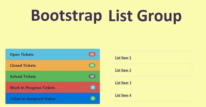
Build Bootstrap 5 list groups for static, linked, numbered, horizontal, colored, and badge-based content, with clear active and disabled states.
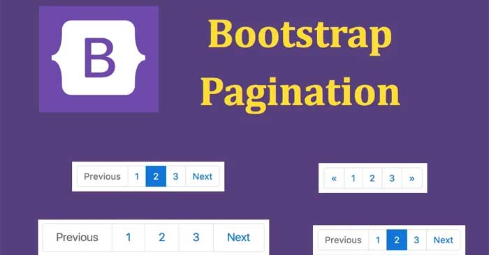
Build accessible Bootstrap 5 pagination with current and disabled states, size and alignment options, then distinguish page controls from breadcrumb navigation.
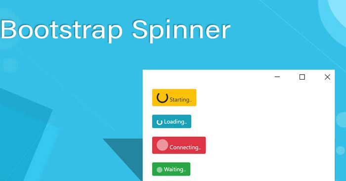
Create accessible Bootstrap 5 border and grow spinners, adjust their color, size and alignment, and add clear loading states to buttons and page sections.
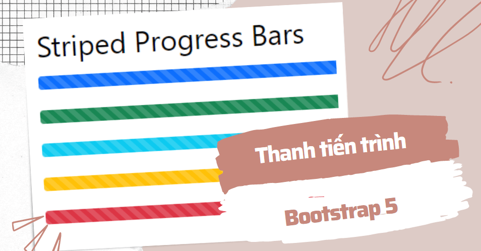
Create accessible Bootstrap 5 progress bars with labels, colors, stripes and animation, then set height, update values, and build stacked progress segments.
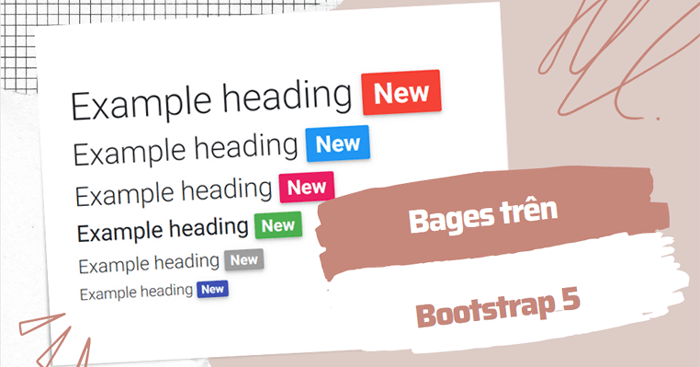
Create Bootstrap 5 badges for labels and counts, apply contextual colors and pill shapes, place badges in buttons, and add useful screen-reader context.

Group related Bootstrap 5 buttons horizontally or vertically, control group size, build accessible toolbars and toggle choices, and nest dropdown menus.
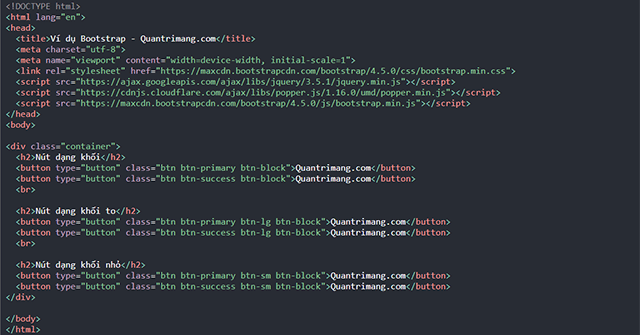
Create Bootstrap 5 buttons with solid or outline styles, choose semantic button and link markup, set sizes and full-width layouts, and handle disabled or loading states.
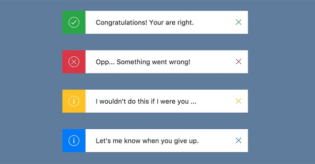
Create Bootstrap 5 alerts with contextual styles, links and icons, make them dismissible with a fade transition, and handle dynamic messages accessibly.
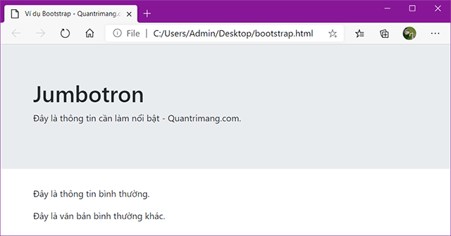
Bootstrap 5 removed the jumbotron component, but spacing, background, typography, container, and button utilities can recreate responsive hero and callout sections.

Create accessible Bootstrap 5 tables, then add striped or hoverable rows, borders, compact spacing, contextual states, dark headers, and responsive scrolling.