Table of Contents
Bootstrap 5 list groups display a related series of links, actions, status rows, or custom content in a compact bordered component. Start with list-group on the wrapper and list-group-item on every item, then add modifiers only when they support the content's meaning.
Create a basic list group
Use an unordered list for a static set of related items:
<ul class="list-group">
  <li class="list-group-item">Account details</li>
  <li class="list-group-item">Security settings</li>
  <li class="list-group-item">Notification preferences</li>
</ul>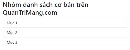
A list group is more flexible than a standard list, but semantic HTML still matters. Use list elements for a real list, links for destinations, and buttons for actions.
Mark the current item
Add active and aria-current="true" when one item represents the current selection or destination.
<ul class="list-group">
  <li class="list-group-item active" aria-current="true">
    Account details
  </li>
  <li class="list-group-item">Security settings</li>
  <li class="list-group-item">Notification preferences</li>
</ul>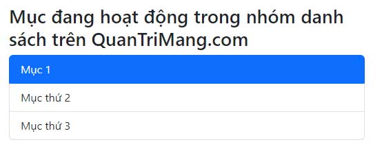
Use one active item only when the interface has one current choice. Color alone should not be the only cue; the ARIA attribute communicates the state to assistive technology.
Create linked or actionable items
Use anchors when each row navigates to a destination. Add list-group-item-action for interactive hover and focus styles.
<div class="list-group">
  <a class="list-group-item list-group-item-action active"
     aria-current="page"
     href="/account/">
    Account
  </a>
  <a class="list-group-item list-group-item-action"
     href="/account/security/">
    Security
  </a>
  <a class="list-group-item list-group-item-action"
     href="/account/notifications/">
    Notifications
  </a>
</div>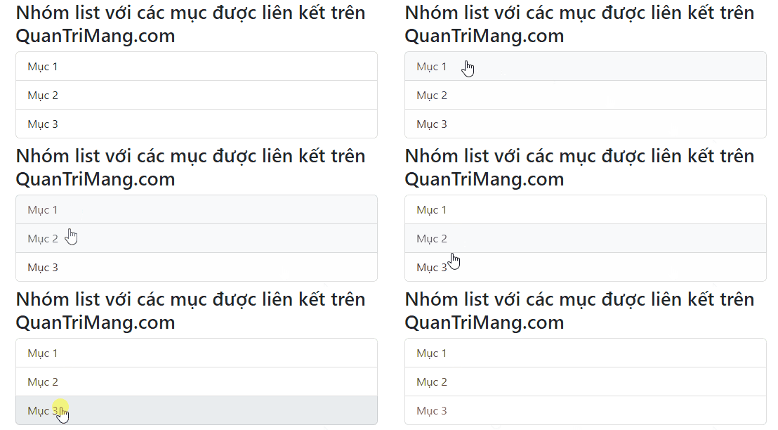
For actions that do not navigate, use buttons:
<div class="list-group">
  <button type="button"
          class="list-group-item list-group-item-action">
    Duplicate file
  </button>
  <button type="button"
          class="list-group-item list-group-item-action">
    Move file
  </button>
</div>
Do not add standard btn classes to list-group action items; the component supplies its own interactive styling.
Disable an item
A real button supports the native disabled attribute. Anchors do not, so an unavailable link needs disabled, aria-disabled="true", and application logic that prevents activation.
<div class="list-group">
  <button type="button"
          class="list-group-item list-group-item-action">
    Available action
  </button>
  <button type="button"
          class="list-group-item list-group-item-action"
          disabled>
    Unavailable action
  </button>
</div>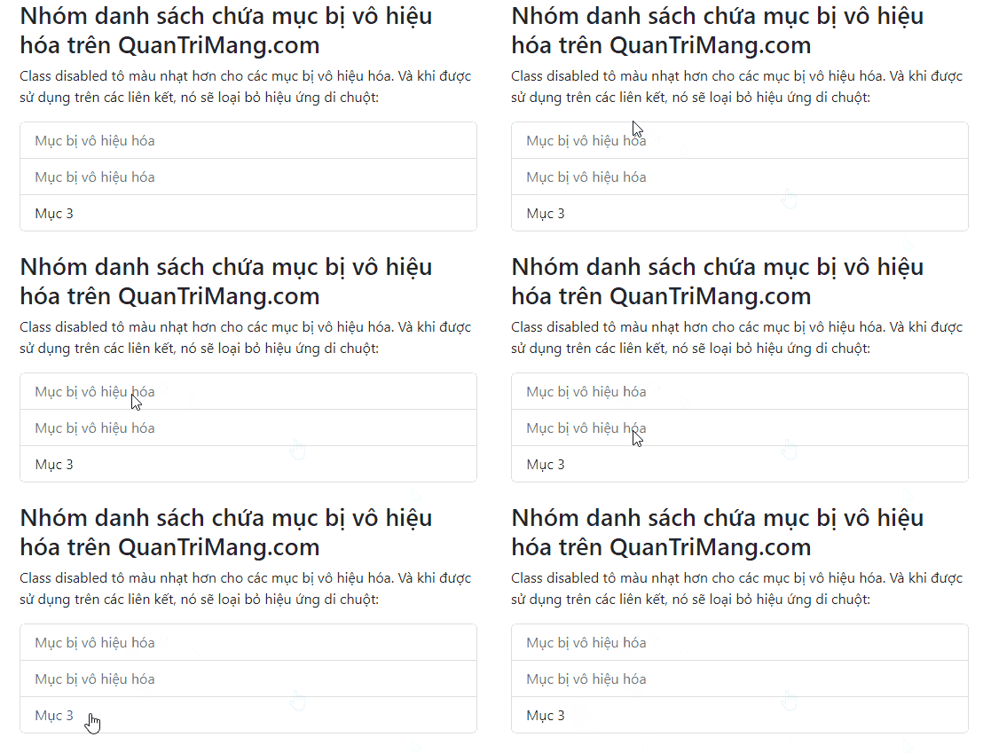
Use a flush list group
Add list-group-flush to remove the outer rounded corners and some borders. This style works well inside a card or another bordered container.
<ul class="list-group list-group-flush">
  <li class="list-group-item">First setting</li>
  <li class="list-group-item">Second setting</li>
  <li class="list-group-item">Third setting</li>
</ul>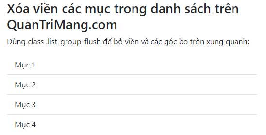
Create a numbered list group
Use an ordered list with list-group-numbered when sequence or priority matters:
<ol class="list-group list-group-numbered">
  <li class="list-group-item">Create an account</li>
  <li class="list-group-item">Verify your email</li>
  <li class="list-group-item">Complete your profile</li>
</ol>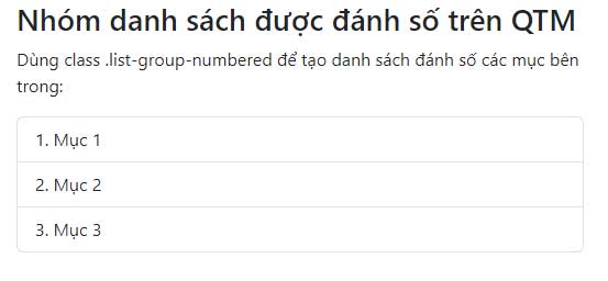
Bootstrap generates and aligns the visible numbers with CSS. Use this pattern only when order has meaning; otherwise an unordered list is more appropriate.
Display items horizontally
list-group-horizontal lays out items side by side at every breakpoint. A responsive class such as list-group-horizontal-md keeps the list vertical on small screens and switches to horizontal from the medium breakpoint.
<ul class="list-group list-group-horizontal-md">
  <li class="list-group-item flex-fill">Overview</li>
  <li class="list-group-item flex-fill">Activity</li>
  <li class="list-group-item flex-fill">Members</li>
</ul>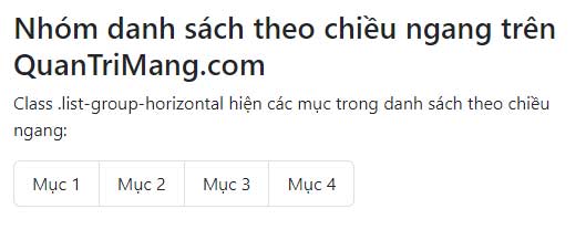
flex-fill gives the items equal access to the available width. Horizontal and flush list groups should not be combined.
Use contextual color variants
Contextual classes apply coordinated text and background colors:
<ul class="list-group">
  <li class="list-group-item list-group-item-primary">Primary</li>
  <li class="list-group-item list-group-item-success">Completed</li>
  <li class="list-group-item list-group-item-warning">Needs attention</li>
  <li class="list-group-item list-group-item-danger">Failed</li>
  <li class="list-group-item list-group-item-info">Information</li>
  <li class="list-group-item list-group-item-light">Light</li>
  <li class="list-group-item list-group-item-dark">Dark</li>
</ul>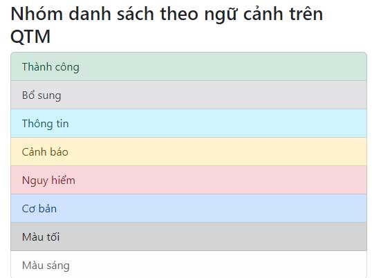
Use color to reinforce a state, not to replace a text label or icon. Readers should still understand the meaning when color is unavailable.
Use variants on links and buttons
Contextual variants also work with actionable items. Keep list-group-item-action so focus, hover, and active states remain clear.
<div class="list-group">
  <a class="list-group-item list-group-item-action list-group-item-info"
     href="/updates/">
    View updates
  </a>
  <button class="list-group-item list-group-item-action list-group-item-warning"
          type="button">
    Review pending changes
  </button>
</div>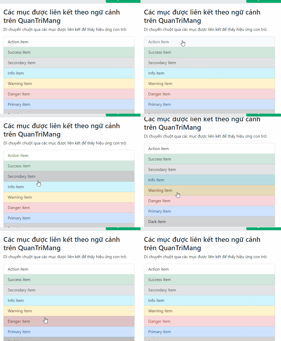
Add badges to list-group items
Flex utilities place a badge at the opposite edge of a row:
<ul class="list-group">
  <li class="list-group-item d-flex justify-content-between align-items-center">
    Inbox
    <span class="badge text-bg-primary rounded-pill">12</span>
  </li>
  <li class="list-group-item d-flex justify-content-between align-items-center">
    Drafts
    <span class="badge text-bg-secondary rounded-pill">4</span>
  </li>
  <li class="list-group-item d-flex justify-content-between align-items-center">
    Spam
    <span class="badge text-bg-danger rounded-pill">2</span>
  </li>
</ul>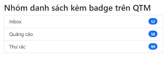
If the number needs more context for screen readers, include visually hidden text such as <span class="visually-hidden">unread messages</span> inside the badge.
Add custom content
A list-group item can contain headings, descriptions, metadata, badges, checkboxes, or radio controls. Keep the structure concise and ensure a stretched link does not cover other interactive controls.
<a href="/updates/release-notes"
   class="list-group-item list-group-item-action">
  <div class="d-flex w-100 justify-content-between gap-3">
    <h2 class="h5 mb-1">Release notes</h2>
    <small class="text-body-secondary">3 days ago</small>
  </div>
  <p class="mb-1">Review the latest fixes and improvements.</p>
  <small class="text-body-secondary">5 minute read</small>
</a>
Implementation checklist
- Choose list items, anchors, or buttons according to the content's behavior.
- Use
aria-currentfor a current item and nativedisabledfor unavailable buttons. - Keep contextual colors meaningful and add a text cue.
- Test long labels and horizontal groups at narrow viewport widths.
- Give badges enough context and avoid overcrowding each row.
- Keep focus styles visible on every actionable item.
You can test these examples in one of these free HTML editors or compare Bootstrap with other popular CSS frameworks. The full component reference is in the official Bootstrap list group documentation.
Related Articles
 Lesson 35: Input Groups in Bootstrap 54 minutes read
 Lesson 42: Large Grid in Bootstrap 54 minutes read
 Lesson 38: Grid Systems from Stacked to Horizontal in Bootstrap 54 minutes read
 Lesson 30: Flexing in Bootstrap 59 minutes read
 Lesson 15: Pagination in Bootstrap 54 minutes read
 Lesson 4: Typography in Bootstrap 512 minutes read
Reader Comments 0
Sign in with email or Google to join the discussion.