Table of Contents
Bootstrap 5 badges are compact labels and counters for short supporting information such as “New,” a status, or the number of unread messages. They scale with their parent because their font size and spacing use relative units.
Use a badge to supplement a clear label, not as the only way to communicate a critical state or action.
Create a basic badge
Combine badge with a Bootstrap 5 color helper such as text-bg-secondary:
<span class="badge text-bg-secondary">New</span>Badges inherit their scale from the immediate parent, so the same markup adapts to headings:
<h2>
  Product updates
  <span class="badge text-bg-secondary">New</span>
</h2>

<p>
  Release notes
  <span class="badge text-bg-info">Updated</span>
</p>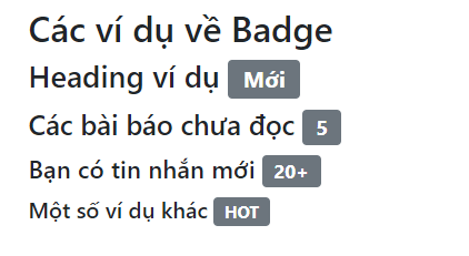
Bootstrap 5 does not use the older badge-primary or badge-danger naming from previous versions. Use text-bg-primary, text-bg-danger, and the other current text-background helpers.
Use contextual badge colors
<span class="badge text-bg-primary">Primary</span>
<span class="badge text-bg-secondary">Secondary</span>
<span class="badge text-bg-success">Complete</span>
<span class="badge text-bg-danger">Failed</span>
<span class="badge text-bg-warning">Pending</span>
<span class="badge text-bg-info">Information</span>
<span class="badge text-bg-light">Light</span>
<span class="badge text-bg-dark">Dark</span>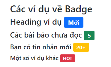
Choose a label that explains the state without color. “Complete” communicates more than a green badge that only says “Status.” The text-bg-* helpers pair foreground and background colors, but custom colors still need a contrast check.
Create a pill badge
Add rounded-pill for fully rounded ends:
<span class="badge rounded-pill text-bg-primary">New</span>
<span class="badge rounded-pill text-bg-success">Approved</span>
<span class="badge rounded-pill text-bg-warning">3 pending</span>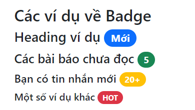
The old badge-pill class is not the Bootstrap 5 pattern. Use the general rounded-pill utility instead. Bootstrap does not provide a standard badge-lg class; a badge already scales with its parent, and custom sizing can use font-size or spacing utilities when necessary.
Add a count badge to a button
Place a badge after the button label when the number has an obvious relationship to it:
<button type="button" class="btn btn-primary">
  Notifications
  <span class="badge text-bg-light">4</span>
</button>

<button type="button" class="btn btn-danger">
  Errors
  <span class="badge text-bg-light">2</span>
</button>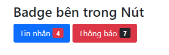
If the meaning is not clear from the visible button text, add screen-reader context:
<button type="button" class="btn btn-primary">
  Inbox
  <span class="badge text-bg-light">
    12
    <span class="visually-hidden">unread messages</span>
  </span>
</button>
Position a badge on a button corner
Bootstrap positioning utilities can create a notification bubble. Make the button position-relative, then position the badge absolutely.
<button type="button"
        class="btn btn-primary position-relative">
  Inbox
  <span class="position-absolute top-0 start-100 translate-middle
               badge rounded-pill text-bg-danger">
    99+
    <span class="visually-hidden">unread messages</span>
  </span>
</button>
Test positioned badges at narrow widths and large text sizes. The badge should not cover the button label or become clipped by an ancestor with hidden overflow.
Create a status dot
A small dot can indicate that a new alert exists, but it still needs hidden text because color and shape alone do not explain the meaning.
<button type="button"
        class="btn btn-primary position-relative">
  Profile
  <span class="position-absolute top-0 start-100 translate-middle
               p-2 bg-danger border border-light rounded-circle">
    <span class="visually-hidden">New account alerts</span>
  </span>
</button>
When a badge should not be interactive
In Bootstrap 5, badges do not automatically receive link hover or focus styles. If a label needs to navigate or perform an action, make the surrounding control explicit rather than relying on the badge appearance to imply interactivity.
<a class="btn btn-outline-primary" href="/updates/">
  View updates
  <span class="badge text-bg-primary">6</span>
</a>
For a removable tag or filter, use a real button with a clear accessible name and appropriate focus styling instead of a plain badge.
Badge accessibility checklist
- Use short text that explains the state without relying on color.
- Add visually hidden context when a standalone number could be ambiguous.
- Check color contrast, especially for warning, info, and custom backgrounds.
- Keep positioned badges from covering labels or being clipped.
- Use a real link or button when the element is interactive.
- Do not announce the same count twice through visible and hidden text.
- Use current Bootstrap 5 classes:
text-bg-*androunded-pill.
You can test these examples in one of these free HTML editors or compare Bootstrap with other popular CSS frameworks. For all supported styles and positioning examples, see the official Bootstrap badge documentation.
Related Articles
 Lesson 42: Large Grid in Bootstrap 54 minutes read
 Lesson 38: Grid Systems from Stacked to Horizontal in Bootstrap 54 minutes read
 Lesson 30: Flexing in Bootstrap 59 minutes read
 Lesson 15: Pagination in Bootstrap 54 minutes read
 Lesson 4: Typography in Bootstrap 512 minutes read
 Lesson 29: Utilities in Bootstrap 59 minutes read
Reader Comments 0
Sign in with email or Google to join the discussion.