Lesson 13: Progress Bars in Bootstrap 5
In this article, QuanTriMang will continue to guide you on using Bootstrap to create progress bars..
In this article, QuanTriMang will continue to guide you on using Bootstrap to create progress bars. The purpose of a progress bar is to show the upload process or workflow progress.
Progress bars use CSS3 transition effects and animations to create various visual effects. However, these features are not supported in IE 9 and earlier versions of Firefox , and Opera 12 also does not support animations.
Default progress bar
To create a basic process by default, follow these steps:
- Add one tag along with the class.
.progress - Next, in the tag above, add a blank space with the
.progress-baraccompanying class. - Add a style attribute with the width expressed as a percentage, for example,
mstyle="50%"to show a progress bar at 50%.
It would be something like this:
The complete HTML code for a progress bar would look like this:
Ví dụ Bootstrap - QuanTriMang Basic progress bar
To create a default progress bar, add the `.progress` class to the container element and add the `.progress-bar` class to its child element. Use the CSS `width` property to set the width of the progress bar.
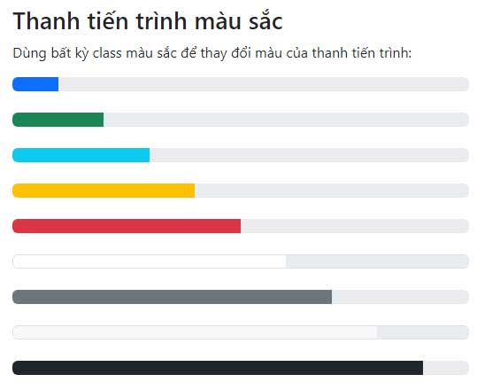
Color progress bar
By default, the progress bar is blue. Use any background classes in the context to change its color:
The example below will help you visualize it better:
TipsMake.com - Boostrap Color progress bar
Use any color class to change the color of the progress bar:
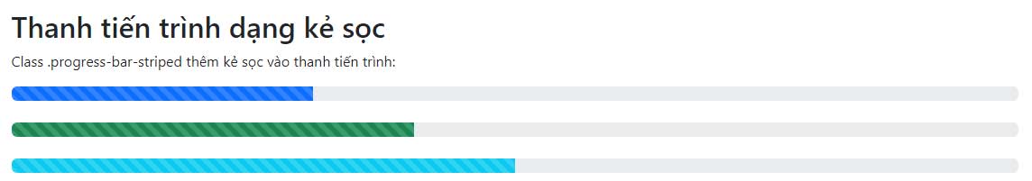
Striped progress bar
To create a striped progress bar:
- Add with class
.progressand.progress-striped. - Next, inside above, add an empty box with the class .
progress-barand classprogress-bar-*, where * can be success, info, warning, or danger. - Add a style attribute with the width expressed as a percentage, for example
style = '60%', , indicating that the progress bar is at 60%.
For example:
Ví dụ Boostrap Striped progress bar
The `.progress-bar-striped` class adds stripes to the progress bar:
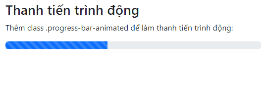
The progress bar has animations.
To create an animated progress bar:
- Add with class
.progressand.progress-striped. Also, add class.activeto.progress-striped. - Next, in the above section, add an empty field with the class
.progress-bar. - Add a style attribute with the width expressed as a percentage. For example, `style = "60%"` - the progress bar is at 60%.
For example, the following would create a gradient effect from right to left:
Ví dụ Boostrap Dynamic progress bar
Add the class .progress-bar-animated to make the progress bar dynamic:
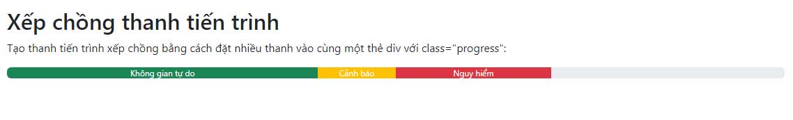
Stacked progress bars
You can even stack multiple progress bars. Place multiple progress bars in the same .progress file to stack them, as shown in the example below:
Bootstrap TipsMake.com Stack progress bars
Create a stacked progress bar by placing multiple bars within the same div tag with the class="progress":
Không gian miễn phí Cảnh báo Nguy hiểm
Above are the basics you need to know about creating a progress bar in Bootstrap 5. As you can see, just understanding the basic tabs is enough to create a beautiful progress bar using Bootstrap 5.
 Marvin Fry