Table of Contents
Bootstrap 5 no longer includes the jumbotron component. The same large hero or callout layout can be built with spacing, color, typography, border-radius, and container utilities. This approach is more flexible because the design is assembled from standard Bootstrap classes rather than a dedicated component.
What a Bootstrap jumbotron is
In older Bootstrap releases, a jumbotron was a prominent content box with generous spacing, a large heading, and optional call-to-action buttons. It was commonly used at the top of a landing page or to highlight one important message.
The Bootstrap term refers to this web layout, not the large video screens sometimes called jumbotrons in stadiums. For interface design, “hero section” or “callout” is often the clearer description.
Create a basic Bootstrap 5 jumbotron replacement
This example uses a neutral background, responsive padding, a rounded border, and a constrained text width:
<section class="p-4 p-md-5 mb-4 rounded-3 bg-body-tertiary"
         aria-labelledby="heroTitle">
  <div class="container-fluid py-3 py-md-5">
    <h1 class="display-5 fw-bold" id="heroTitle">
      Build faster with Bootstrap
    </h1>
    <p class="col-md-8 fs-4">
      Use responsive utilities and reusable components to create a clear,
      adaptable interface.
    </p>
    <a class="btn btn-primary btn-lg" href="/learn/">
      Start learning
    </a>
  </div>
</section>
The main classes provide specific behavior:
| Class | Purpose |
|---|---|
p-4 p-md-5 | Uses moderate padding on small screens and more space from the medium breakpoint |
mb-4 | Adds space after the section |
rounded-3 | Adds rounded corners |
bg-body-tertiary | Uses a subtle background that adapts to Bootstrap color modes |
display-5 fw-bold | Creates a large, bold heading |
col-md-8 | Limits the paragraph width on larger screens |
Create a dark hero section
Use Bootstrap color-mode helpers and contextual utilities for a dark callout. Keep text contrast and button states readable.
<section class="p-4 p-md-5 rounded-3 text-bg-dark"
         aria-labelledby="releaseTitle">
  <div class="py-3 py-md-5">
    <h1 class="display-5 fw-bold" id="releaseTitle">
      Version 5 is available
    </h1>
    <p class="col-lg-8 fs-5">
      Review the migration notes before upgrading an existing project.
    </p>
    <a class="btn btn-outline-light btn-lg" href="/updates/">
      View release details
    </a>
  </div>
</section>
Choose a real anchor for navigation and a button only for an in-page action. The visual style does not change the element's semantic purpose.
Create a full-width jumbotron
For an edge-to-edge background, put the section outside the page container and place a container inside it to align the content with the rest of the layout.
<section class="bg-primary-subtle py-5"
         aria-labelledby="fullHeroTitle">
  <div class="container">
    <h1 class="display-4 fw-bold" id="fullHeroTitle">
      Full-width background
    </h1>
    <p class="lead col-lg-8">
      The background reaches both viewport edges while the text stays aligned
      with the site's content grid.
    </p>
  </div>
</section>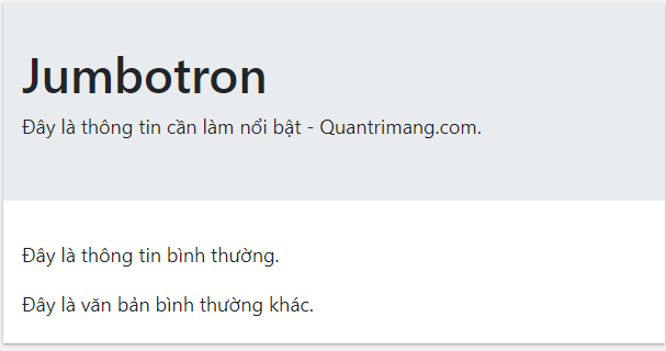
This replaces the older jumbotron-fluid pattern. Bootstrap 5 does not need that component class; normal layout and spacing utilities create the same structure.
Add a responsive two-column layout
A hero can pair text with supporting content by using the grid. This example avoids a fabricated image URL and leaves a clear place for your own image or illustration.
<section class="container py-5" aria-labelledby="productTitle">
  <div class="row align-items-center g-5">
    <div class="col-lg-6">
      <h1 class="display-5 fw-bold" id="productTitle">
        A clear product message
      </h1>
      <p class="lead">
        Explain the main benefit in one concise paragraph, then offer a
        specific next step.
      </p>
      <div class="d-grid gap-2 d-sm-flex">
        <a class="btn btn-primary btn-lg" href="/get-started/">
          Get started
        </a>
        <a class="btn btn-outline-secondary btn-lg" href="/features/">
          View features
        </a>
      </div>
    </div>

    <div class="col-lg-6">
      <div class="ratio ratio-16x9 rounded-3 bg-body-secondary"
           role="img"
           aria-label="Add a relevant product image or illustration here">
      </div>
    </div>
  </div>
</section>
Replace the placeholder with a real relevant asset and meaningful alternative text. Do not use a decorative stock image that competes with the page's main message.
Bootstrap 4 jumbotron markup
Bootstrap 4 used the dedicated jumbotron class:
<div class="jumbotron">
  <h1>Jumbotron heading</h1>
  <p>Highlighted introductory content.</p>
</div>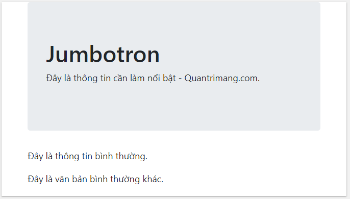
That markup is useful only when maintaining a Bootstrap 4 site. In a Bootstrap 5 project, jumbotron and jumbotron-fluid have no built-in component styles.
Design guidance for hero sections
- Use one clear heading that matches the page's purpose.
- Keep the supporting paragraph concise and specific.
- Limit the section to one primary action and, when needed, one secondary action.
- Use responsive padding so the layout is not oversized on small screens.
- Maintain readable line lengths instead of stretching text across the viewport.
- Check text and button contrast in every color mode.
- Use the correct heading level and do not skip the document hierarchy for visual size.
When not to use a jumbotron-style layout
A large hero consumes valuable space. Skip it when users need to reach a form, table, or task immediately, or when the page has no single message important enough to justify the visual emphasis. A normal heading and short introduction may serve readers better.
You can test these layouts in one of these free HTML editors or compare Bootstrap with other popular CSS frameworks. Bootstrap confirms the component's removal in the official migration guide and provides a current Bootstrap 5 jumbotron example.
Related Articles
 Lesson 42: Large Grid in Bootstrap 54 minutes read
 Lesson 38: Grid Systems from Stacked to Horizontal in Bootstrap 54 minutes read
 Lesson 30: Flexing in Bootstrap 59 minutes read
 Lesson 15: Pagination in Bootstrap 54 minutes read
 Lesson 4: Typography in Bootstrap 512 minutes read
 Lesson 29: Utilities in Bootstrap 59 minutes read
Reader Comments 0
Sign in with email or Google to join the discussion.