Table of Contents
A Bootstrap 5 popover is a small overlay that displays a title and short supporting content next to a trigger. It is useful for optional explanations that are too detailed for a tooltip but do not require a full dialog.
Popovers are opt-in. Adding data-bs-toggle="popover" is not enough; you must also initialize the component with JavaScript. Use bootstrap.bundle.min.js, which includes the Popper positioning library required by popovers.
Create and initialize a basic popover
Set the heading with data-bs-title and the body text with data-bs-content. Use a real interactive element, such as a button, as the trigger.
<button type="button"
        class="btn btn-primary"
        id="accountHelp"
        data-bs-toggle="popover"
        data-bs-title="Account settings"
        data-bs-content="You can change your display name from the Profile page.">
  Show help
</button>

<script>
  const trigger = document.getElementById('accountHelp');

  if (trigger) {
    bootstrap.Popover.getOrCreateInstance(trigger);
  }
</script>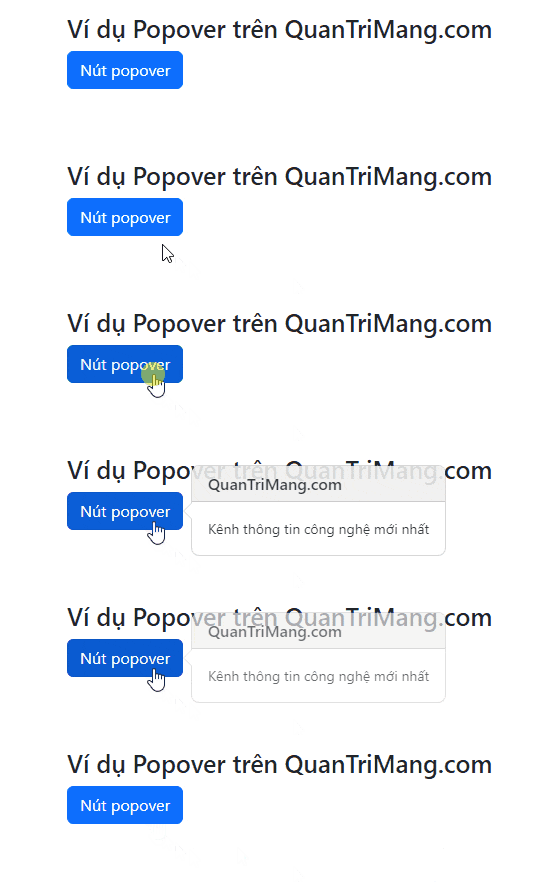
To initialize every popover on a page, select the matching triggers and create an instance for each one:
const popoverTriggers =
  document.querySelectorAll('[data-bs-toggle="popover"]');

popoverTriggers.forEach((element) => {
  bootstrap.Popover.getOrCreateInstance(element);
});
A popover with an empty title and empty content will not appear. Keep the content concise; large blocks of text or interactive forms are better placed in a modal.
Choose a popover placement
Add data-bs-placement with a value of top, right, bottom, or left.
<button type="button"
        class="btn btn-secondary"
        data-bs-toggle="popover"
        data-bs-placement="top"
        data-bs-content="This popover prefers the top position.">
  Popover on top
</button>

<button type="button"
        class="btn btn-secondary"
        data-bs-toggle="popover"
        data-bs-placement="right"
        data-bs-content="This popover prefers the right position.">
  Popover on right
</button>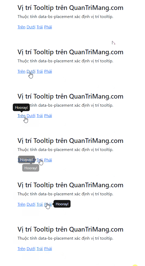
Placement is a preference, not a guarantee. Popper may choose another side when the requested position does not have enough room. This prevents the overlay from being cut off at the viewport edge.
Dismiss a popover on the next click
The default click trigger toggles a popover when the user activates the same button again. To close it when focus moves elsewhere, use the focus trigger. Bootstrap recommends an anchor with tabindex="0" for consistent dismiss-on-next-click behavior.
<a href="#"
   class="btn btn-danger"
   role="button"
   tabindex="0"
   data-bs-toggle="popover"
   data-bs-trigger="focus"
   data-bs-title="Dismissible popover"
   data-bs-content="Click or focus elsewhere to close this message.">
  Show dismissible popover
</a>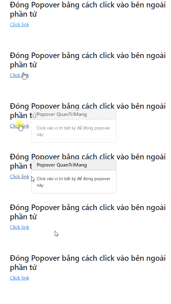
If the link is only acting as a control, prevent its default navigation in your event handler or use a valid destination appropriate to the page.
Support both hover and keyboard focus
A hover-only popover cannot be opened by keyboard users or touch-only devices. If hover feedback is useful, combine it with focus:
<button type="button"
        class="btn btn-info"
        data-bs-toggle="popover"
        data-bs-trigger="hover focus"
        data-bs-content="Available to pointer and keyboard users.">
  More information
</button>
Add a popover to a disabled control
A disabled button does not receive pointer or keyboard events, so it cannot trigger a popover directly. Put the popover on a focusable wrapper instead:
<span class="d-inline-block"
      tabindex="0"
      data-bs-toggle="popover"
      data-bs-trigger="hover focus"
      data-bs-content="Choose a file before continuing.">
  <button type="button"
          class="btn btn-primary"
          disabled>
    Upload
  </button>
</span>
Use this pattern only when the extra explanation is helpful. An inline message near a disabled control is often easier to discover and understand.
Avoid clipping in complex layouts
Responsive tables, input groups, and containers with overflow: hidden can clip a popover. Set its container to the document body:
const popover = new bootstrap.Popover('#accountHelp', {
  container: 'body'
});
Inside a modal, use an element within the modal as the container. This keeps the popover inside the modal's focus boundary.
Customize a popover with CSS variables
Bootstrap 5.2 and later supports a scoped custom class. Assign the class with data-bs-custom-class, then override only the variables you need.
<button type="button"
        class="btn btn-secondary"
        data-bs-toggle="popover"
        data-bs-custom-class="help-popover"
        data-bs-title="Keyboard shortcut"
        data-bs-content="Press Ctrl+S to save.">
  Show shortcut
</button>
.help-popover {
--bs-popover-max-width: 240px;
--bs-popover-border-color: #0d6efd;
--bs-popover-header-bg: #0d6efd;
--bs-popover-header-color: #fff;
}Accessibility and security checks
- Use a button, link, or form control that can receive keyboard focus.
- Do not rely on hover as the only trigger.
- Keep content short because assistive technology announces it as one description.
- Avoid interactive forms and multi-step controls inside a popover because focus order is not managed like a dialog.
- Prefer plain text for user-controlled content. Bootstrap sanitizes allowed HTML, but untrusted markup should not be inserted casually.
- Hide a popover before removing its trigger from the DOM.
For content that needs focus management or a user decision, use a Bootstrap modal instead. You can test the examples in one of these free HTML editors and review the complete API in the official Bootstrap popover documentation.
Related Articles
 Lesson 42: Large Grid in Bootstrap 54 minutes read
 Lesson 38: Grid Systems from Stacked to Horizontal in Bootstrap 54 minutes read
 Lesson 30: Flexing in Bootstrap 59 minutes read
 Lesson 15: Pagination in Bootstrap 54 minutes read
 Lesson 4: Typography in Bootstrap 512 minutes read
 Lesson 29: Utilities in Bootstrap 59 minutes read
Reader Comments 0
Sign in with email or Google to join the discussion.