Table of Contents
Bootstrap 5's offcanvas component creates a navigation panel, filter drawer, shopping cart, or other sidebar that slides into view without leaving the current page. The JavaScript required by the component is included in bootstrap.bundle.min.js, so make sure the Bootstrap bundle is loaded before testing the examples below.
If you are choosing a front-end toolkit, see this comparison of popular CSS frameworks. You can also build and test these examples in one of these free HTML editors.
Create a basic offcanvas sidebar
The trigger needs data-bs-toggle="offcanvas" and a target that matches the panel's id. The panel contains an optional header and a body. Add tabindex="-1" and connect the heading with aria-labelledby so assistive technology can identify the drawer.
<button class="btn btn-primary"
        type="button"
        data-bs-toggle="offcanvas"
        data-bs-target="#mainSidebar"
        aria-controls="mainSidebar">
  Open menu
</button>

<div class="offcanvas offcanvas-start"
     tabindex="-1"
     id="mainSidebar"
     aria-labelledby="mainSidebarLabel">
  <div class="offcanvas-header">
    <h2 class="offcanvas-title fs-5" id="mainSidebarLabel">Site menu</h2>
    <button type="button"
            class="btn-close"
            data-bs-dismiss="offcanvas"
            aria-label="Close"></button>
  </div>
  <div class="offcanvas-body">
    <nav aria-label="Sidebar navigation">
      <a class="d-block mb-2" href="/">Home</a>
      <a class="d-block" href="/learn/">Tutorials</a>
    </nav>
  </div>
</div>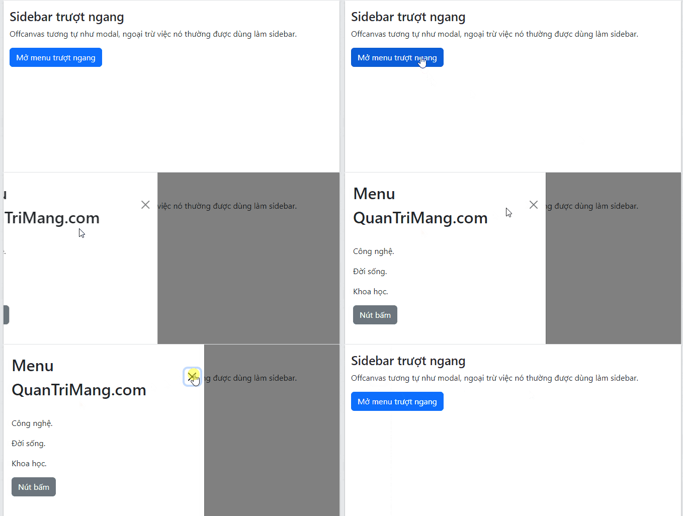
Bootstrap disables page scrolling and displays a backdrop while an offcanvas panel is open by default. It also manages focus and adds the dialog role when the component opens. Keep the close button available and use a clear accessible label for every trigger.
Choose where the panel opens
Use one placement class on the offcanvas element:
| Class | Position |
|---|---|
offcanvas-start | Left in left-to-right layouts |
offcanvas-end | Right in left-to-right layouts |
offcanvas-top | Top edge |
offcanvas-bottom | Bottom edge |
Right-side offcanvas
<div class="offcanvas offcanvas-end" tabindex="-1" id="rightPanel">
  ...
</div>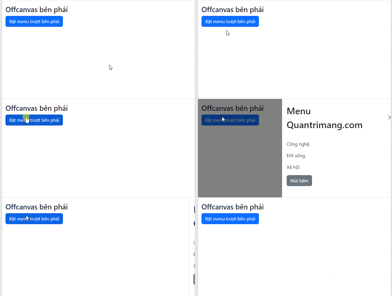
Top offcanvas
<div class="offcanvas offcanvas-top" tabindex="-1" id="topPanel">
  ...
</div>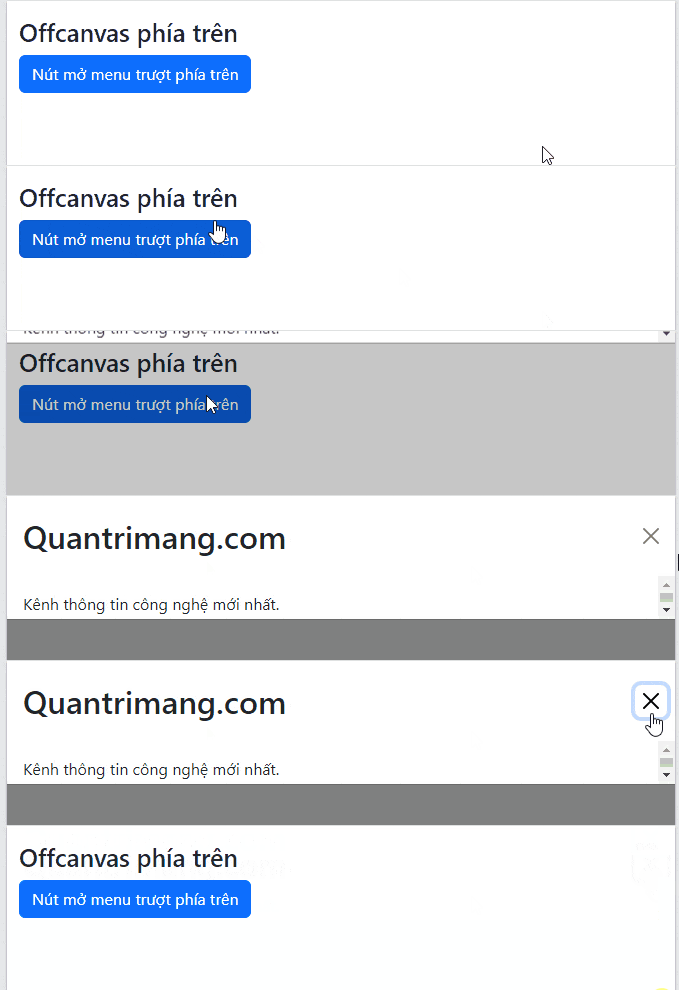
Bottom offcanvas
<div class="offcanvas offcanvas-bottom" tabindex="-1" id="bottomPanel">
  ...
</div>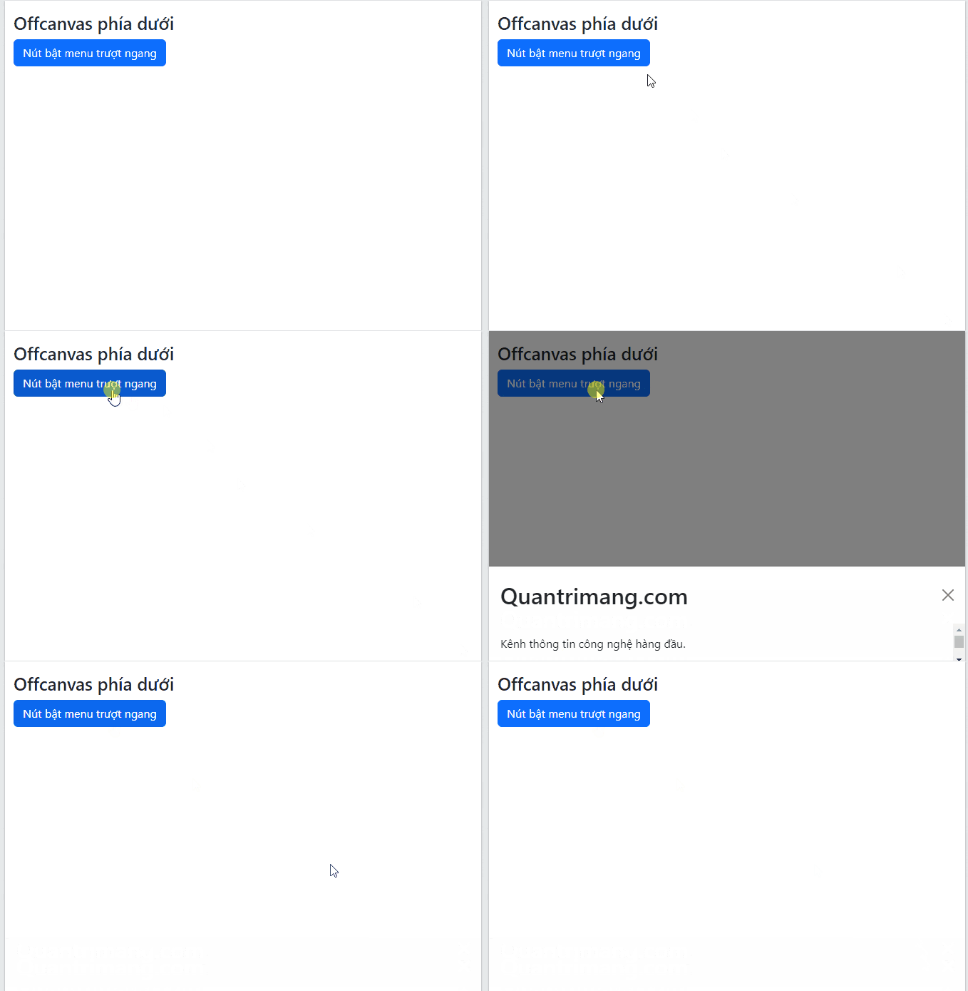
The same trigger and header structure used in the first example applies to every placement. Each trigger must point to the correct unique id.
Build a responsive sidebar
A responsive offcanvas behaves as a drawer below a selected breakpoint and remains visible as regular page content at that breakpoint and above. Replace the base offcanvas class with offcanvas-sm, offcanvas-md, offcanvas-lg, offcanvas-xl, or offcanvas-xxl.
This example uses a drawer below the large breakpoint and a permanently visible sidebar on large screens:
<button class="btn btn-primary d-lg-none"
        type="button"
        data-bs-toggle="offcanvas"
        data-bs-target="#responsiveSidebar"
        aria-controls="responsiveSidebar">
  Open filters
</button>

<aside class="offcanvas-lg offcanvas-start"
       tabindex="-1"
       id="responsiveSidebar"
       aria-labelledby="responsiveSidebarLabel">
  <div class="offcanvas-header">
    <h2 class="offcanvas-title fs-5" id="responsiveSidebarLabel">Filters</h2>
    <button type="button"
            class="btn-close"
            data-bs-dismiss="offcanvas"
            data-bs-target="#responsiveSidebar"
            aria-label="Close"></button>
  </div>
  <div class="offcanvas-body">
    Add filter controls here.
  </div>
</aside>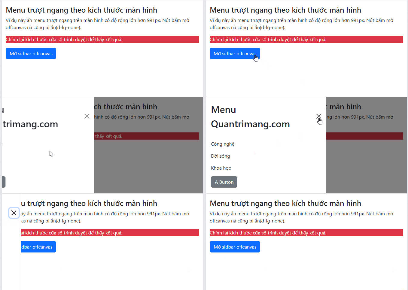
Control scrolling and the backdrop
Add these data attributes to the offcanvas element when the default behavior does not fit the interface:
| Attribute | Effect |
|---|---|
data-bs-scroll="true" | Allows the page behind the panel to scroll |
data-bs-backdrop="false" | Removes the backdrop |
data-bs-backdrop="static" | Keeps the panel open when the user clicks the backdrop |
Use these options deliberately. A backdrop helps separate a temporary drawer from the underlying page, while background scrolling can be useful for non-modal filters or navigation.
Use dark color mode
In Bootstrap 5.3 and later, apply data-bs-theme="dark" to the component instead of relying on the older dark-component utility classes.
<div class="offcanvas offcanvas-start text-bg-dark"
     data-bs-theme="dark"
     tabindex="-1"
     id="darkSidebar"
     aria-labelledby="darkSidebarLabel">
  <div class="offcanvas-header">
    <h2 class="offcanvas-title fs-5" id="darkSidebarLabel">Dark sidebar</h2>
    <button type="button"
            class="btn-close"
            data-bs-dismiss="offcanvas"
            aria-label="Close"></button>
  </div>
  <div class="offcanvas-body">Sidebar content</div>
</div>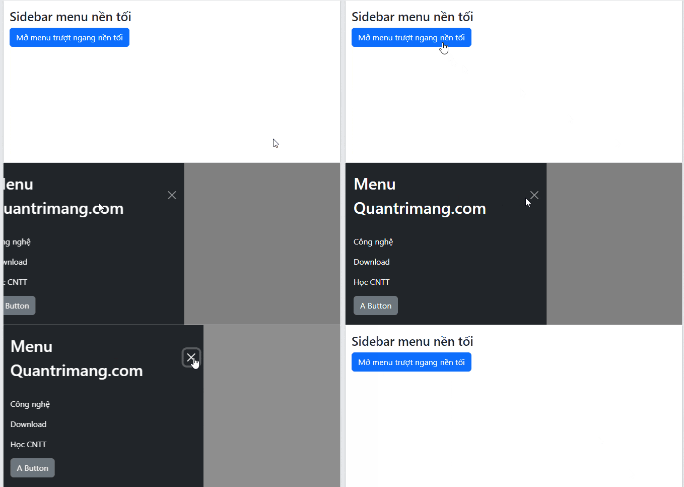
Adjust the width
Set Bootstrap's component variable on a custom class instead of overriding every offcanvas globally:
.offcanvas-narrow {
  --bs-offcanvas-width: 280px;
}
Then add offcanvas-narrow to the panel. Check the result at narrow viewport widths and avoid a fixed width that is wider than the available screen.
Implementation checklist
- Give every panel a unique
idand match it in the trigger's target. - Connect the visible title with
aria-labelledby. - Keep an accessible close control inside temporary drawers.
- Load the Bootstrap JavaScript bundle as well as the stylesheet.
- Test keyboard focus, backdrop behavior, page scrolling, and each responsive breakpoint.
Offcanvas is useful for temporary navigation and controls. For content that needs a stronger modal interaction, compare it with Bootstrap modals. The complete component API and current version notes are available in the official Bootstrap offcanvas documentation.
Related Articles
 Lesson 42: Large Grid in Bootstrap 54 minutes read
 Lesson 38: Grid Systems from Stacked to Horizontal in Bootstrap 54 minutes read
 Lesson 30: Flexing in Bootstrap 59 minutes read
 Lesson 15: Pagination in Bootstrap 54 minutes read
 Lesson 4: Typography in Bootstrap 512 minutes read
 Lesson 29: Utilities in Bootstrap 59 minutes read
Reader Comments 0
Sign in with email or Google to join the discussion.