Table of Contents
Bootstrap 5 button groups combine related controls into a single horizontal row or vertical stack. Use them for compact action sets, view selectors, formatting controls, and mutually exclusive choices.
Group only actions that belong together. If buttons have unrelated purposes, spacing them separately is easier to understand and reduces accidental clicks.
Create a horizontal button group
Wrap buttons in btn-group, add role="group", and provide a label that describes the group.
<div class="btn-group"
     role="group"
     aria-label="Text alignment">
  <button type="button" class="btn btn-outline-primary">Left</button>
  <button type="button" class="btn btn-outline-primary">Center</button>
  <button type="button" class="btn btn-outline-primary">Right</button>
</div>
The group label is important because assistive technology otherwise announces separate buttons without explaining why they are connected.
Change the group size
Add btn-group-lg or btn-group-sm to the wrapper. You do not need a sizing class on every button.
<div class="btn-group btn-group-lg"
     role="group"
     aria-label="Large view controls">
  <button type="button" class="btn btn-primary">Grid</button>
  <button type="button" class="btn btn-primary">List</button>
</div>

<div class="btn-group"
     role="group"
     aria-label="Default view controls">
  <button type="button" class="btn btn-primary">Grid</button>
  <button type="button" class="btn btn-primary">List</button>
</div>

<div class="btn-group btn-group-sm"
     role="group"
     aria-label="Small view controls">
  <button type="button" class="btn btn-primary">Grid</button>
  <button type="button" class="btn btn-primary">List</button>
</div>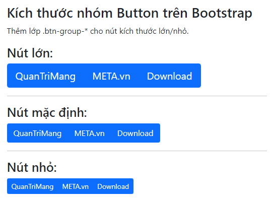
Prefer the default or large size for touch interfaces. A compact group should still provide comfortable targets and readable labels.
Create a vertical button group
Replace btn-group with btn-group-vertical:
<div class="btn-group-vertical"
     role="group"
     aria-label="Export format">
  <button type="button" class="btn btn-primary">PDF</button>
  <button type="button" class="btn btn-primary">CSV</button>
  <button type="button" class="btn btn-primary">JSON</button>
</div>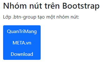
A vertical group is useful when labels are too long for a compact row. Split-button dropdowns are not supported in vertical groups.
Combine groups in a toolbar
Use btn-toolbar when several related groups need to appear together. Label the toolbar and every group inside it.
<div class="btn-toolbar gap-2"
     role="toolbar"
     aria-label="Document formatting">
  <div class="btn-group"
       role="group"
       aria-label="Text style">
    <button type="button" class="btn btn-outline-secondary">Bold</button>
    <button type="button" class="btn btn-outline-secondary">Italic</button>
  </div>

  <div class="btn-group"
       role="group"
       aria-label="Text alignment">
    <button type="button" class="btn btn-outline-secondary">Left</button>
    <button type="button" class="btn btn-outline-secondary">Center</button>
    <button type="button" class="btn btn-outline-secondary">Right</button>
  </div>
</div>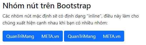
Use gap or margin utilities to separate groups. Do not rely on button color alone to explain which actions belong together.
Create checkbox toggle buttons
Use native checkbox inputs when users may choose several options. The btn-check input remains the form control, and each label provides the visual button.
<div class="btn-group"
     role="group"
     aria-label="Visible dashboard panels">
  <input type="checkbox"
         class="btn-check"
         id="showSales"
         autocomplete="off"
         checked>
  <label class="btn btn-outline-primary" for="showSales">Sales</label>

  <input type="checkbox"
         class="btn-check"
         id="showTraffic"
         autocomplete="off">
  <label class="btn btn-outline-primary" for="showTraffic">Traffic</label>

  <input type="checkbox"
         class="btn-check"
         id="showCosts"
         autocomplete="off">
  <label class="btn btn-outline-primary" for="showCosts">Costs</label>
</div>
Every input needs a unique ID and a matching for value on its label.
Create a radio button group
Radio inputs are appropriate when only one option may be selected. Give the inputs the same name.
<div class="btn-group"
     role="group"
     aria-label="Report range">
  <input type="radio"
         class="btn-check"
         name="reportRange"
         id="rangeWeek"
         autocomplete="off"
         checked>
  <label class="btn btn-outline-primary" for="rangeWeek">Week</label>

  <input type="radio"
         class="btn-check"
         name="reportRange"
         id="rangeMonth"
         autocomplete="off">
  <label class="btn btn-outline-primary" for="rangeMonth">Month</label>

  <input type="radio"
         class="btn-check"
         name="reportRange"
         id="rangeYear"
         autocomplete="off">
  <label class="btn btn-outline-primary" for="rangeYear">Year</label>
</div>
Because the controls are real radio inputs, keyboard and form behavior remain predictable.
Nest a dropdown in a button group
Place a nested btn-group inside the main group. Dropdowns need the Bootstrap JavaScript bundle.
<div class="btn-group"
     role="group"
     aria-label="File actions">
  <button type="button" class="btn btn-primary">Save</button>
  <button type="button" class="btn btn-primary">Download</button>

  <div class="btn-group" role="group">
    <button type="button"
            class="btn btn-primary dropdown-toggle"
            data-bs-toggle="dropdown"
            aria-expanded="false">
      More
    </button>
    <ul class="dropdown-menu">
      <li><button type="button" class="dropdown-item">Duplicate</button></li>
      <li><button type="button" class="dropdown-item">Archive</button></li>
    </ul>
  </div>
</div>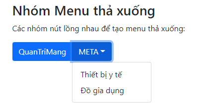
Keep the primary actions visible and put lower-priority actions in the dropdown. If the menu contains navigation links, use anchors with real destinations instead of buttons.
Use links in a button group
A group may contain styled links for navigation. Mark the current destination with active and aria-current="page".
<div class="btn-group" aria-label="Account pages">
  <a class="btn btn-primary active"
     aria-current="page"
     href="/account/">Profile</a>
  <a class="btn btn-primary"
     href="/account/security/">Security</a>
  <a class="btn btn-primary"
     href="/account/billing/">Billing</a>
</div>
For full site navigation, a Bootstrap nav or navbar may communicate the structure more clearly than a row of button-styled links.
Button-group accessibility checklist
- Use
role="group"orrole="toolbar"and provide an explicit label. - Use buttons for actions and anchors for destinations.
- Keep visible focus styles on every control.
- Use native checkbox or radio inputs for selectable states.
- Make each input ID unique and match it to its label.
- Test wrapping and touch targets at narrow viewport widths.
- Group only controls that have a clear relationship.
You can test these examples in one of these free HTML editors or compare Bootstrap with other popular CSS frameworks. The full reference is in the official Bootstrap button group documentation.
Related Articles
 Lesson 16: List Groups in Bootstrap 56 minutes read
 Lesson 35: Input Groups in Bootstrap 54 minutes read
 How to Create a Bootstrap Button7 minutes read
 Lesson 42: Large Grid in Bootstrap 54 minutes read
 Lesson 38: Grid Systems from Stacked to Horizontal in Bootstrap 54 minutes read
 Lesson 30: Flexing in Bootstrap 59 minutes read
Reader Comments 0
Sign in with email or Google to join the discussion.