Table of Contents
Bootstrap 5 nav classes create flexible groups of navigation links, while the Tab JavaScript plugin turns tabs or pills into controls for switching local content panels. The two patterns look similar but serve different purposes: site navigation takes users to another location; dynamic tabs change content in the current page.
Create a basic horizontal nav
Add nav to the list, nav-item to each item, and nav-link to each link. Use aria-current="page" on the link for the current destination.
<ul class="nav">
  <li class="nav-item">
    <a class="nav-link active"
       aria-current="page"
       href="/">Home</a>
  </li>
  <li class="nav-item">
    <a class="nav-link" href="/learn/">Tutorials</a>
  </li>
  <li class="nav-item">
    <a class="nav-link" href="/contact/">Contact</a>
  </li>
  <li class="nav-item">
    <a class="nav-link disabled" aria-disabled="true">Members</a>
  </li>
</ul>
You can also use a nav element and place nav-link anchors directly inside it. When links perform real navigation, give each one a valid destination rather than using an empty fragment.
Align a horizontal nav
Because the nav component uses flexbox, standard Bootstrap flex utilities control its alignment:
<ul class="nav justify-content-start">...</ul>
<ul class="nav justify-content-center">...</ul>
<ul class="nav justify-content-end">...</ul>
Use responsive variants such as justify-content-md-center when the alignment should change at a breakpoint.
Create a vertical nav
Add flex-column to stack links. A responsive utility such as flex-sm-row can change the layout to horizontal on wider screens.
<nav class="nav flex-column flex-sm-row">
  <a class="nav-link active"
     aria-current="page"
     href="/">Home</a>
  <a class="nav-link" href="/learn/">Tutorials</a>
  <a class="nav-link" href="/contact/">Contact</a>
</nav>
Style navigation as tabs
Add nav-tabs for a tab-shaped navigation style. This example still uses ordinary links, so it navigates between pages rather than switching panels in place.
<ul class="nav nav-tabs">
  <li class="nav-item">
    <a class="nav-link active"
       aria-current="page"
       href="/account/">Overview</a>
  </li>
  <li class="nav-item">
    <a class="nav-link" href="/account/security/">Security</a>
  </li>
  <li class="nav-item">
    <a class="nav-link" href="/account/billing/">Billing</a>
  </li>
</ul>
Do not add tab ARIA roles to page navigation simply because it looks like tabs. Those roles are only for an interactive tab interface that switches local panels.
Style navigation as pills
Replace nav-tabs with nav-pills for filled active states:
<ul class="nav nav-pills">
  <li class="nav-item">
    <a class="nav-link active"
       aria-current="page"
       href="/account/">Overview</a>
  </li>
  <li class="nav-item">
    <a class="nav-link" href="/account/security/">Security</a>
  </li>
</ul>
Bootstrap 5.3 also provides nav-underline when an underline is a better fit for the design.
Fill the available width
nav-fill distributes available space proportionally. nav-justified gives every item the same width.
<ul class="nav nav-pills nav-fill">...</ul>
<ul class="nav nav-tabs nav-justified">...</ul>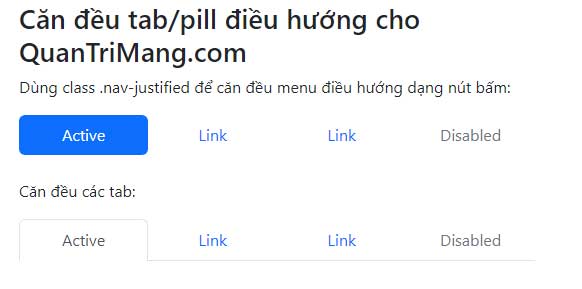
Check long labels at narrow widths. Equal-width tabs can become difficult to read when the text wraps into several lines.
Add a dropdown to pills or tabs
A dropdown uses the same Bootstrap dropdown markup inside a nav-item. Load bootstrap.bundle.min.js so the menu can open.
<ul class="nav nav-pills">
  <li class="nav-item">
    <a class="nav-link active"
       aria-current="page"
       href="/">Home</a>
  </li>

  <li class="nav-item dropdown">
    <button class="nav-link dropdown-toggle"
            type="button"
            data-bs-toggle="dropdown"
            aria-expanded="false">
      Categories
    </button>
    <ul class="dropdown-menu">
      <li><a class="dropdown-item" href="/learn/">Tutorials</a></li>
      <li><a class="dropdown-item" href="/technology/">Technology</a></li>
      <li><a class="dropdown-item" href="/application/">Applications</a></li>
    </ul>
  </li>
</ul>
The same structure works with nav-tabs:

Keep dropdown labels descriptive. If a small number of top-level links can fit without a submenu, a flat navigation structure is usually easier to scan.
Create switchable content tabs
For local panels, use buttons with data-bs-toggle="tab". Each button's data-bs-target must match one tab-pane ID. The active trigger and pane both need active; the initial pane also needs show when a fade is used.
<ul class="nav nav-tabs" id="settingsTabs" role="tablist">
  <li class="nav-item" role="presentation">
    <button class="nav-link active"
            id="profile-tab"
            data-bs-toggle="tab"
            data-bs-target="#profile-pane"
            type="button"
            role="tab"
            aria-controls="profile-pane"
            aria-selected="true">
      Profile
    </button>
  </li>

  <li class="nav-item" role="presentation">
    <button class="nav-link"
            id="security-tab"
            data-bs-toggle="tab"
            data-bs-target="#security-pane"
            type="button"
            role="tab"
            aria-controls="security-pane"
            aria-selected="false">
      Security
    </button>
  </li>
</ul>

<div class="tab-content" id="settingsTabContent">
  <div class="tab-pane fade show active"
       id="profile-pane"
       role="tabpanel"
       aria-labelledby="profile-tab"
       tabindex="0">
    Profile settings appear here.
  </div>

  <div class="tab-pane fade"
       id="security-pane"
       role="tabpanel"
       aria-labelledby="security-tab"
       tabindex="0">
    Security settings appear here.
  </div>
</div>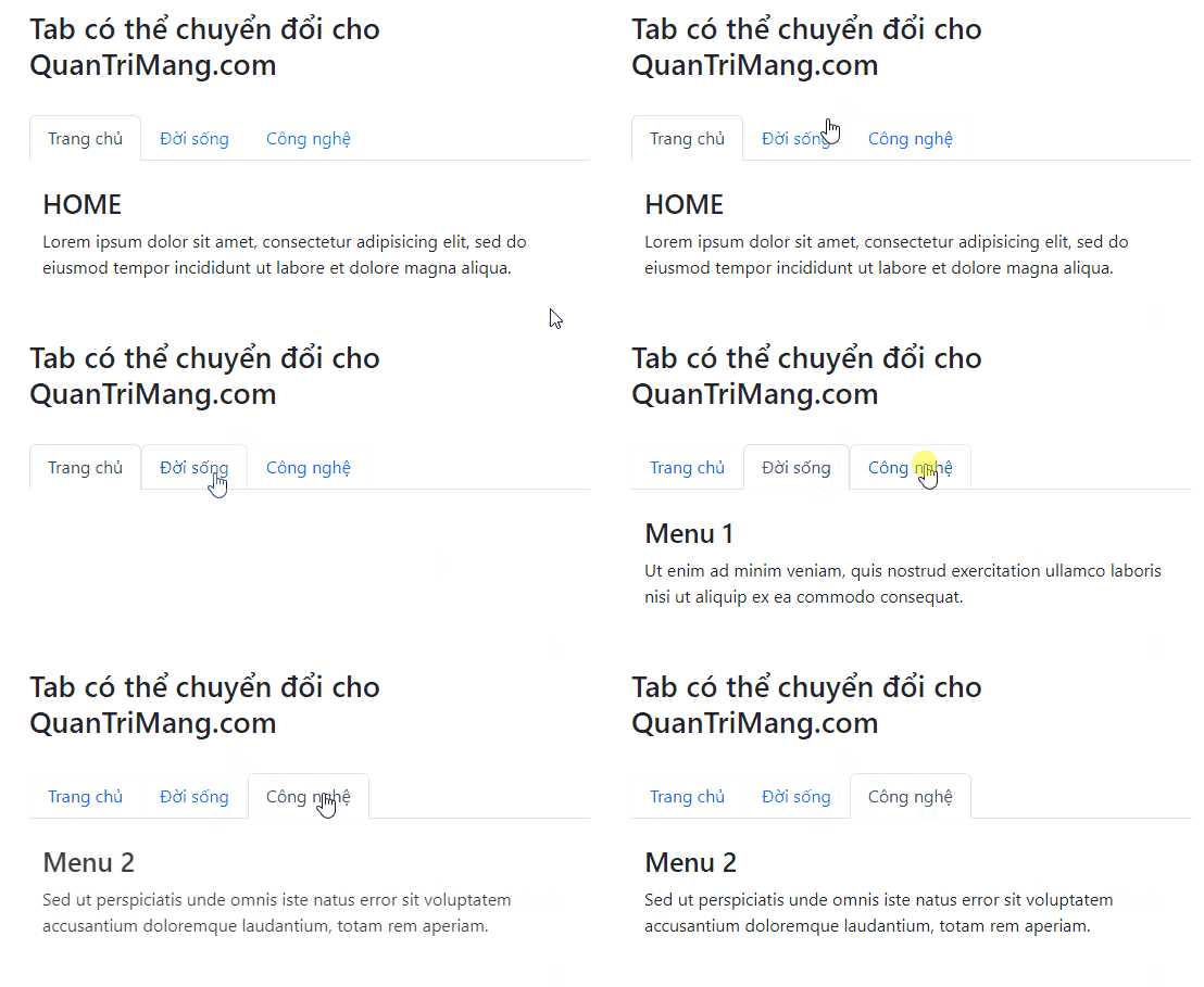
The Bootstrap 5 attribute is data-bs-toggle, not the older data-toggle syntax from Bootstrap 4.
Create switchable pill panels
The Tab JavaScript plugin also works with pills. Keep data-bs-toggle="pill" on each trigger and use the same panel relationship attributes.
<div class="nav nav-pills" role="tablist">
  <button class="nav-link active"
          data-bs-toggle="pill"
          data-bs-target="#summary-pane"
          type="button"
          role="tab"
          aria-controls="summary-pane"
          aria-selected="true">
    Summary
  </button>
  <button class="nav-link"
          data-bs-toggle="pill"
          data-bs-target="#details-pane"
          type="button"
          role="tab"
          aria-controls="details-pane"
          aria-selected="false">
    Details
  </button>
</div>
Show a tab with JavaScript
Data attributes handle most interfaces. JavaScript is useful when another action needs to select a tab:
const securityTrigger =
  document.getElementById('security-tab');

bootstrap.Tab.getOrCreateInstance(securityTrigger).show();
You can listen for shown.bs.tab when content needs to update after the new panel becomes active.
Navigation and tab accessibility checklist
- Use valid destinations and
aria-currentfor page navigation. - Use buttons, tab roles,
aria-controls, andaria-selectedfor switchable local panels. - Do not put
role="tablist"directly on anavlandmark; wrap a separate tab list inside it if necessary. - Give every trigger and panel a unique, matching ID relationship.
- Keep labels short and test keyboard behavior in both horizontal and vertical layouts.
- Do not hide critical information in an inactive panel without another way to find it.
For broader project choices, compare popular CSS frameworks. You can test the examples in one of these free HTML editors. The complete component API is in the official Bootstrap navs and tabs documentation.
Related Articles
 Lesson 42: Large Grid in Bootstrap 54 minutes read
 Lesson 38: Grid Systems from Stacked to Horizontal in Bootstrap 54 minutes read
 Lesson 30: Flexing in Bootstrap 59 minutes read
 Lesson 15: Pagination in Bootstrap 54 minutes read
 Lesson 4: Typography in Bootstrap 512 minutes read
 Lesson 29: Utilities in Bootstrap 59 minutes read
Reader Comments 0
Sign in with email or Google to join the discussion.