Table of Contents
Bootstrap 5 toasts are compact, temporary notifications for events such as a saved setting, completed upload, or added cart item. They do not initialize automatically: you must create the markup, load the Bootstrap JavaScript bundle, and call the Toast API to display them.
Use a toast for brief, non-blocking feedback. Important errors or information required to complete a task should remain visible in an alert or inline validation message instead.
Create the toast markup
A standard toast has a wrapper, an optional header, and a body. Include a dismiss button and accessibility attributes so the notification can be announced and closed.
<div class="toast"
     id="saveToast"
     role="status"
     aria-live="polite"
     aria-atomic="true">
  <div class="toast-header">
    <strong class="me-auto">Settings</strong>
    <small class="text-body-secondary">Just now</small>
    <button type="button"
            class="btn-close"
            data-bs-dismiss="toast"
            aria-label="Close"></button>
  </div>
  <div class="toast-body">
    Your settings were saved.
  </div>
</div>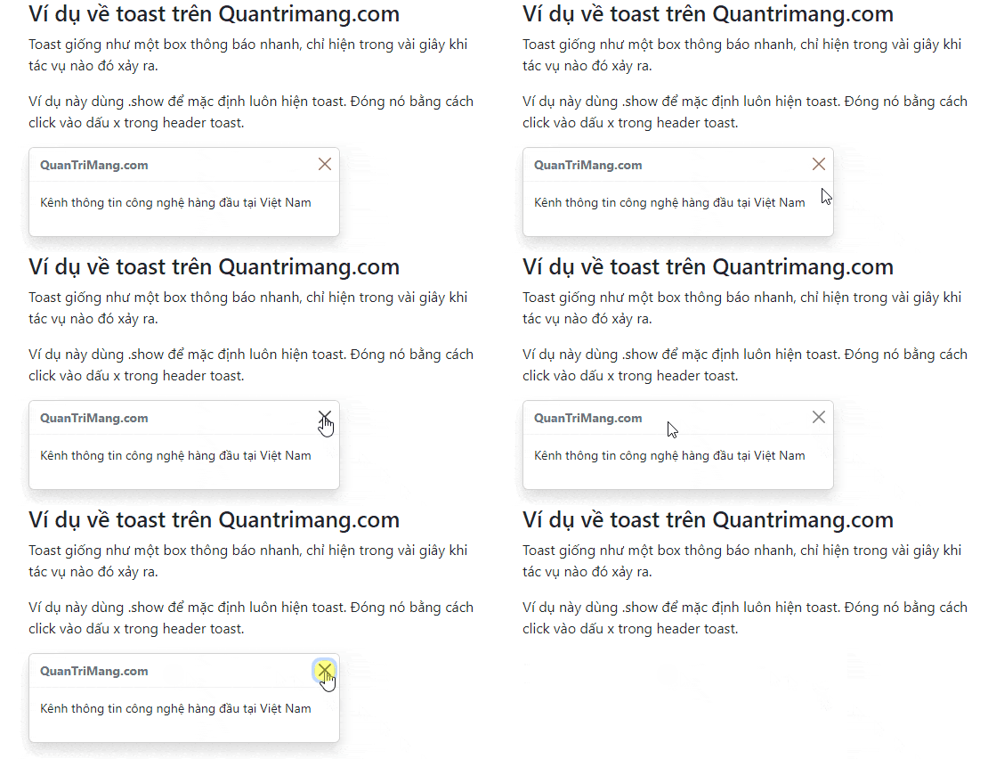
Use role="status" aria-live="polite" for routine feedback. Reserve role="alert" aria-live="assertive" for genuinely urgent messages because assertive announcements interrupt other screen-reader output.
Show a toast when a button is clicked
This complete example places the notification in the lower-right corner and opens it from a button. The live region exists in the document before the toast is shown, which allows assistive technology to detect the update reliably.
<button type="button" class="btn btn-primary" id="showToastButton">
  Save settings
</button>

<div class="toast-container position-fixed bottom-0 end-0 p-3"
     aria-live="polite"
     aria-atomic="true">
  <div class="toast" id="liveToast" role="status">
    <div class="toast-header">
      <strong class="me-auto">Settings</strong>
      <small class="text-body-secondary">Just now</small>
      <button type="button"
              class="btn-close"
              data-bs-dismiss="toast"
              aria-label="Close"></button>
    </div>
    <div class="toast-body">
      Your changes have been saved.
    </div>
  </div>
</div>

<script>
  const toastButton = document.getElementById('showToastButton');
  const toastElement = document.getElementById('liveToast');

  if (toastButton && toastElement) {
    const toast = bootstrap.Toast.getOrCreateInstance(toastElement);

    toastButton.addEventListener('click', () => {
      toast.show();
    });
  }
</script>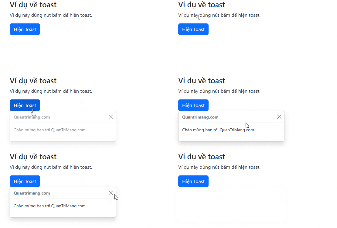
getOrCreateInstance() returns the existing Toast instance or creates one if needed. This avoids attaching multiple Bootstrap instances to the same element.
Control how long the toast stays visible
Toasts hide automatically unless autohide is disabled. Set options in data attributes or JavaScript:
| Option | Example | Purpose |
|---|---|---|
delay | data-bs-delay="8000" | Sets the time in milliseconds before automatic dismissal |
autohide | data-bs-autohide="false" | Keeps the toast visible until it is dismissed |
animation | data-bs-animation="false" | Disables the fade transition |
The equivalent JavaScript initialization is:
const toast = new bootstrap.Toast(toastElement, {
  delay: 8000,
  autohide: true,
  animation: true
});
Choose a delay that gives readers enough time to understand the message. When autohide is false, always provide a clearly labeled close button.
Position and stack multiple toasts
Bootstrap positioning utilities can place a toast-container at any viewport corner. Common combinations include:
top-0 end-0for the upper-right corner.bottom-0 end-0for the lower-right corner.top-0 start-50 translate-middle-xfor the top center.
Add position-fixed when the container should remain attached to the viewport and p-3 to keep it away from the edge. Multiple toast elements inside one container stack vertically with suitable spacing.
<div class="toast-container position-fixed top-0 end-0 p-3">
  <div class="toast" id="firstToast">...</div>
  <div class="toast" id="secondToast">...</div>
</div>
Use a simpler toast
The header is optional. For short messages, combine the body and dismiss button in a flex row:
<div class="toast align-items-center text-bg-success border-0"
     role="status"
     aria-live="polite"
     aria-atomic="true">
  <div class="d-flex">
    <div class="toast-body">File uploaded successfully.</div>
    <button type="button"
            class="btn-close btn-close-white me-2 m-auto"
            data-bs-dismiss="toast"
            aria-label="Close"></button>
  </div>
</div>
Common problems
The toast never appears
Confirm that bootstrap.bundle.min.js is loaded, the element ID is correct, and toast.show() runs after the element exists. Adding only the HTML does not initialize the component.
The toast disappears too quickly
Increase delay to match the amount of text. Do not put long instructions or critical decisions in a temporary toast.
The notification is not announced
Place the live region in the page before changing or displaying the message. Choose a role and live setting appropriate to the urgency, and keep aria-atomic="true" so the full message is announced as one unit.
Toasts are best for short status updates. For messages that must remain visible, consider a Bootstrap alert; for an interaction that requires the user's attention, see how Bootstrap modals work. You can test these examples in one of these free HTML editors. For all options, methods, and events, consult the official Bootstrap toast documentation.
Related Articles
 Lesson 42: Large Grid in Bootstrap 54 minutes read
 Lesson 38: Grid Systems from Stacked to Horizontal in Bootstrap 54 minutes read
 Lesson 30: Flexing in Bootstrap 59 minutes read
 Lesson 15: Pagination in Bootstrap 54 minutes read
 Lesson 4: Typography in Bootstrap 512 minutes read
 Lesson 29: Utilities in Bootstrap 59 minutes read
Reader Comments 0
Sign in with email or Google to join the discussion.