Table of Contents
Bootstrap 5 dropdowns are click-activated overlays for lists of links, actions, filters, or compact forms. The component uses Popper for positioning, so load bootstrap.bundle.min.js or load Popper before Bootstrap's separate JavaScript file.
A dropdown is not the same as a native select field. Use a select when a form needs one value from a defined list; use a dropdown for navigation or a group of commands.
Create a basic dropdown
Wrap the toggle and menu in dropdown. The toggle needs data-bs-toggle="dropdown", and each menu link uses dropdown-item.
<div class="dropdown">
  <button class="btn btn-primary dropdown-toggle"
          type="button"
          id="resourcesMenu"
          data-bs-toggle="dropdown"
          aria-expanded="false">
    Resources
  </button>

  <ul class="dropdown-menu" aria-labelledby="resourcesMenu">
    <li><a class="dropdown-item" href="/learn/">Tutorials</a></li>
    <li><a class="dropdown-item" href="/technology/">Technology</a></li>
    <li><a class="dropdown-item" href="/application/">Applications</a></li>
  </ul>
</div>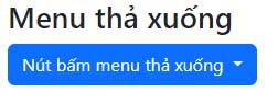
Bootstrap opens dropdowns on click rather than hover. This works for keyboard and touch users and avoids menus appearing unexpectedly as the pointer crosses the page.
Add a divider
Use a divider to separate a distinct group of actions. Put dropdown-divider on an hr inside its own list item.
<ul class="dropdown-menu">
  <li><a class="dropdown-item" href="/account/">Account</a></li>
  <li><a class="dropdown-item" href="/settings/">Settings</a></li>
  <li><hr class="dropdown-divider"></li>
  <li><button class="dropdown-item" type="button">Sign out</button></li>
</ul>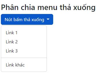
Use anchors for navigation and buttons for actions. This preserves the expected behavior for keyboard users and browser commands such as opening links in a new tab.
Group items with headers
dropdown-header adds a non-interactive label for a group of related items.
<ul class="dropdown-menu">
  <li><h2 class="dropdown-header">Documentation</h2></li>
  <li><a class="dropdown-item" href="/learn/html/">HTML</a></li>
  <li><a class="dropdown-item" href="/learn/css/">CSS</a></li>
  <li><h2 class="dropdown-header">Community</h2></li>
  <li><a class="dropdown-item" href="/contact/">Contact</a></li>
</ul>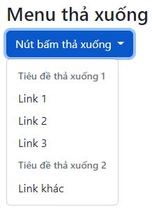
Keep headers short and do not make them look like clickable options.
Mark active and disabled items
Add active and aria-current="true" to the current destination. For an unavailable item, use disabled, set aria-disabled="true", and omit the destination when possible.
<ul class="dropdown-menu">
  <li>
    <a class="dropdown-item active"
       aria-current="true"
       href="/overview/">Overview</a>
  </li>
  <li><a class="dropdown-item" href="/reports/">Reports</a></li>
  <li>
    <a class="dropdown-item disabled"
       aria-disabled="true">Admin tools</a>
  </li>
</ul>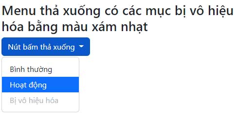
A disabled style alone does not always prevent custom event handlers from running. Ensure application logic also blocks an unavailable action.
Open the menu in another direction
Apply a direction class to the outer wrapper. Popper can adjust the final position if the preferred direction does not fit.
| Wrapper class | Preferred direction |
|---|---|
dropdown | Down |
dropup | Up |
dropend | Toward the inline end |
dropstart | Toward the inline start |
Dropend
<div class="btn-group dropend">
  <button class="btn btn-primary dropdown-toggle"
          type="button"
          data-bs-toggle="dropdown"
          aria-expanded="false">
    Open toward the end
  </button>
  <ul class="dropdown-menu">...</ul>
</div>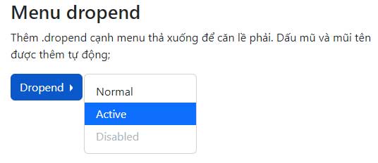
Dropstart
<div class="btn-group dropstart">
  <button class="btn btn-primary dropdown-toggle"
          type="button"
          data-bs-toggle="dropdown"
          aria-expanded="false">
    Open toward the start
  </button>
  <ul class="dropdown-menu">...</ul>
</div>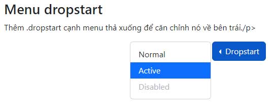
In right-to-left layouts, start and end directions are mirrored automatically.
Align the menu edge
Add dropdown-menu-end to align the menu with the toggle's inline end:
<div class="dropdown">
  <button class="btn btn-primary dropdown-toggle"
          type="button"
          data-bs-toggle="dropdown"
          aria-expanded="false">
    Account
  </button>
  <ul class="dropdown-menu dropdown-menu-end">
    ...
  </ul>
</div>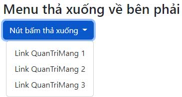
For responsive alignment, add data-bs-display="static" to the trigger and use a class such as dropdown-menu-lg-end. This keeps the default alignment on small screens and uses end alignment from the large breakpoint upward.
Create a dropup
Use dropup when a control sits close to the bottom of a panel or viewport:
<div class="btn-group dropup">
  <button class="btn btn-primary dropdown-toggle"
          type="button"
          data-bs-toggle="dropdown"
          aria-expanded="false">
    More actions
  </button>
  <ul class="dropdown-menu">
    <li><button class="dropdown-item" type="button">Duplicate</button></li>
    <li><button class="dropdown-item" type="button">Archive</button></li>
  </ul>
</div>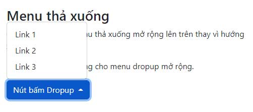
Add plain text to a menu
Use dropdown-item-text for non-interactive supporting text. Do not use it for an item that should behave like a link or button.
<ul class="dropdown-menu">
  <li><span class="dropdown-item-text">Signed in as Alex</span></li>
  <li><a class="dropdown-item" href="/account/">View account</a></li>
  <li><button class="dropdown-item" type="button">Sign out</button></li>
</ul>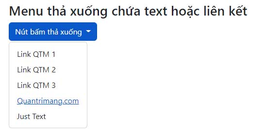
Combine a dropdown with a button group
Place a dropdown wrapper inside btn-group when several actions should appear as one horizontal control group.
<div class="btn-group" role="group" aria-label="Export options">
  <button class="btn btn-primary" type="button">Export PDF</button>
  <button class="btn btn-primary" type="button">Export CSV</button>

  <div class="btn-group" role="group">
    <button class="btn btn-primary dropdown-toggle"
            type="button"
            data-bs-toggle="dropdown"
            aria-expanded="false">
      More
    </button>
    <ul class="dropdown-menu">
      <li><button class="dropdown-item" type="button">Export JSON</button></li>
      <li><button class="dropdown-item" type="button">Print</button></li>
    </ul>
  </div>
</div>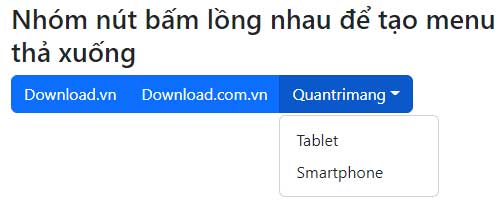
Use a dropdown in a vertical button group
<div class="btn-group-vertical" role="group" aria-label="File actions">
  <button class="btn btn-primary" type="button">New file</button>
  <button class="btn btn-primary" type="button">Upload</button>

  <div class="btn-group dropend" role="group">
    <button class="btn btn-primary dropdown-toggle"
            type="button"
            data-bs-toggle="dropdown"
            aria-expanded="false">
      More
    </button>
    <ul class="dropdown-menu">
      <li><button class="dropdown-item" type="button">Import</button></li>
      <li><button class="dropdown-item" type="button">Archive</button></li>
    </ul>
  </div>
</div>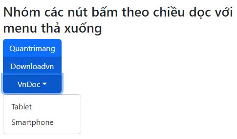
Control auto-close behavior
By default, the menu closes after a click inside or outside it. Set data-bs-auto-close on the toggle when a form or multi-step selection needs different behavior:
| Value | Behavior |
|---|---|
true | Closes after inside or outside clicks |
false | Closes only from the toggle or JavaScript |
inside | Closes only after a click inside |
outside | Closes only after a click outside |
<button class="btn btn-primary dropdown-toggle"
        type="button"
        data-bs-toggle="dropdown"
        data-bs-auto-close="outside"
        aria-expanded="false">
  Choose filters
</button>
Dropdown accessibility checklist
- Use a button for a toggle that only opens a menu.
- Keep
aria-expandedon the toggle; Bootstrap updates it automatically. - Use anchors for destinations and buttons for actions.
- Do not make hover the only way to open the menu.
- Keep focusable controls in a logical order and test arrow-key and Escape behavior.
- Add specialized ARIA menu roles only when implementing a true application menu pattern.
You can test the markup in one of these free HTML editors or compare Bootstrap with other popular CSS frameworks. For the full option and event reference, see the official Bootstrap dropdown documentation.
Related Articles
 Lesson 20: Navs in Bootstrap 56 minutes read
 Lesson 32: Selection Menus in Bootstrap 53 minutes read
 Answering Frequently Asked Questions About Bootstrap7 minutes read
 Lesson 15: Pagination in Bootstrap 54 minutes read
 Lesson 38: Grid Systems from Stacked to Horizontal in Bootstrap 54 minutes read
 Lesson 42: Large Grid in Bootstrap 54 minutes read
Reader Comments 0
Sign in with email or Google to join the discussion.