Lesson 9: Alerts in Bootstrap 5
What is Bootstrap 5 Alert? Bootstrap 5 alerts are a crucial component in web and application development. Here's everything you need to know about alerts in Bootstrap 5..
What is Bootstrap 5 Alert? Bootstrap 5 alert is a crucial component in web and application development. Here's everything you need to know about alerts in Bootstrap 5 .
Basic Alert
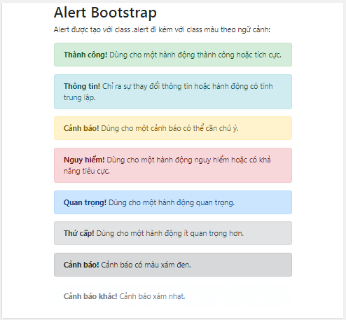
You can add a basic alert by creating a block with additional classes .alertcombined with the 6 context classes .alert-success, .alert-info, .alert-warning, .alert-danger, .alert-primary, .alert-secondary, .alert-lightor.alert-dark
Let's try the following example:
Ví dụ Bootstrap - TipsMake.com.com Alert Bootstrap
The alert is created with the .alert class, which includes a contextual color class:
Thành công! Dùng cho một hành động thành công hoặc tích cực. Thông tin! Chỉ ra sự thay đổi thông tin hoặc hành động có tính trung lập. Cảnh báo! Dùng cho một cảnh báo có thể cần chú ý. Nguy hiểm! Dùng cho một hành động nguy hiểm hoặc có khả năng tiêu cực. Quan trọng! Dùng cho một hành động quan trọng. Thứ cấp! Dùng cho một hành động ít quan trọng hơn. Cảnh báo! Cảnh báo có màu xám đen. Cảnh báo khác! Cảnh báo xám nhạt.
We will receive warnings like the following on the web:
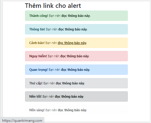
Insert a link in the alert.
When you need to add a link to the alert, you add a class .alert-linkto the link inside the alert box, then the link will have a color that matches the alert's color, as in this example:
Ví dụ Bootstrap - TipsMake.com.com Add a link to Alert
Thành công! Bạn nên đọc thông báo này. Thông tin! Bạn nên đọc thông báo này. Cảnh báo! Bạn nên đọc thông báo này. Nguy hiểm! Bạn nên đọc thông báo này. Quan trọng! Bạn nên đọc thông báo này. Thứ cấp! Bạn nên đọc thông báo này. Nền tối! Bạn nên đọc thông báo này. Nền sáng! Bạn nên đọc thông báo này.
When you hover your mouse over the warning link, you will see the link appear at the bottom of the browser window as shown in the image:
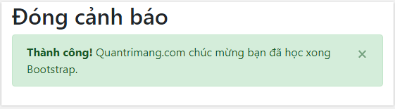
Close the alert.
To close the alert message, you add a class .alert-dismissibleto the alert container. Then add the class="close" and data-dismiss="alert" to the link or button element (the button that you click to close the alert). We will learn more about buttons in Bootstrap in the next lesson.
Here's an example of closing warnings in Bootstrap 5:
Ví dụ Bootstrap - TipsMake.com.com Close the alert.
Thành công! TipsMake.com.com chúc mừng bạn đã học xong Bootstrap. Thông tin! Bạn sẽ học được nhiều bài học hay về Bootstrap trên QuanTriMang.com. When you click the button xon the right, the alert will be closed:
Create dynamic alerts
If you add the class .fade, .showit will create a fade-out effect when the alert closes. The usage is the same as above; you add fade and show to the tag div. For example, if you need to close an alert notifying you that an action has been successfully completed, it would look like this:
Then we have this .html file:
Ví dụ Bootstrap - TipsMake.com.com Close the alert.
Thành công! Chúc mừng bạn đã học xong Bootstrap. This code produces the same result as above; the effect only appears when you click the close button, so I didn't take a screenshot.
Note : In Bootstrap 4, you will need to add an × character between the opening and closing Button tags. The closing button in Bootstrap 4 will then look like this:
× (×) is a very commonly used HTML entity for closing buttons instead of the letter x.
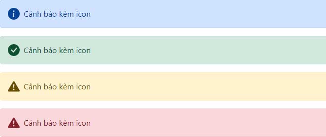
Icon
Similarly, you can use the flexbox and Icon widgets in Bootstrap to create alerts with icons. Depending on the icon and content, you may want to add more widgets or customization options.
For example:
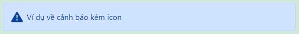
Bootstrap Example Ví dụ về cảnh báo kèm icon You need more than one icon for your alert. Consider using more Bootstrap icons and creating an internal SVG icon for easy referencing.
Bootstrap Example Cảnh báo kèm icon Cảnh báo kèm icon Cảnh báo kèm icon Cảnh báo kèm icon
By the end of this article, you should now be able to customize the format of a warning/notification on your website to alert users. Keep following our next series of articles!
 Marvin Fry