Table of Contents
Bootstrap 5 modals are dialogs displayed above the current page for confirmations, forms, detailed messages, and focused tasks. Bootstrap supplies the backdrop, focus handling, keyboard behavior, and show/hide API, but you still need clear content, a dismiss control, and accessible labels.
Load the Bootstrap stylesheet and bootstrap.bundle.min.js before testing the examples. Bootstrap supports one modal at a time, so avoid nested dialogs.
Create a basic Bootstrap modal
The trigger's data-bs-target must match the modal's unique id. Connect the dialog to its visible heading with aria-labelledby, add tabindex="-1", and provide at least one close control.
<button type="button"
        class="btn btn-primary"
        data-bs-toggle="modal"
        data-bs-target="#profileModal">
  Edit profile
</button>

<div class="modal fade"
     id="profileModal"
     tabindex="-1"
     aria-labelledby="profileModalLabel"
     aria-hidden="true">
  <div class="modal-dialog">
    <div class="modal-content">
      <div class="modal-header">
        <h1 class="modal-title fs-5" id="profileModalLabel">
          Edit profile
        </h1>
        <button type="button"
                class="btn-close"
                data-bs-dismiss="modal"
                aria-label="Close"></button>
      </div>

      <div class="modal-body">
        Add the form or message here.
      </div>

      <div class="modal-footer">
        <button type="button"
                class="btn btn-secondary"
                data-bs-dismiss="modal">
          Cancel
        </button>
        <button type="button" class="btn btn-primary">
          Save changes
        </button>
      </div>
    </div>
  </div>
</div>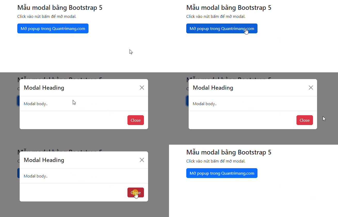
The header and footer are optional, but the modal-body supplies the component's standard body padding. A visible heading and obvious way to close the dialog make the interaction easier to understand.
Enable or remove the fade animation
Add fade to the outer modal element for Bootstrap's transition:
<div class="modal fade" id="animatedModal" tabindex="-1">
  ...
</div>
Remove fade if the dialog should appear immediately:
<div class="modal" id="instantModal" tabindex="-1">
  ...
</div>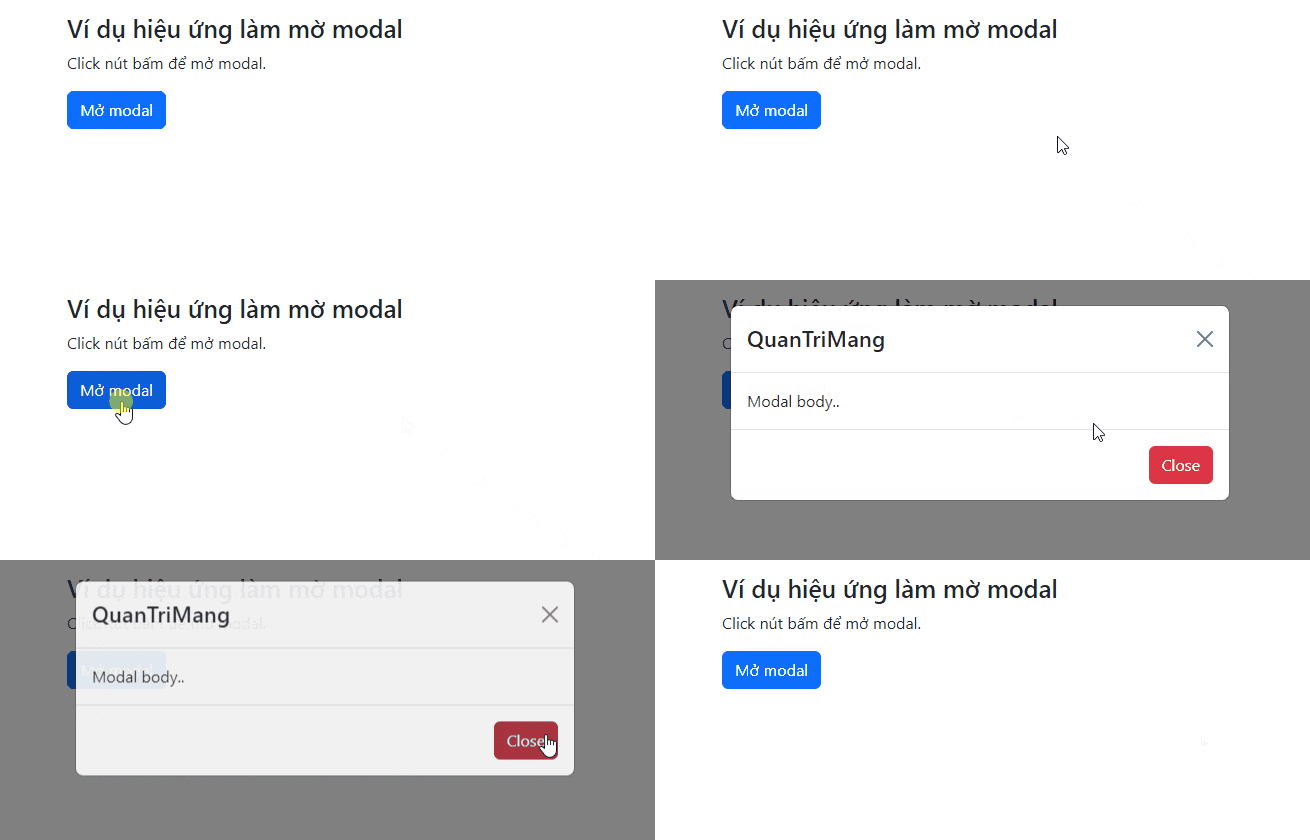
Bootstrap respects the user's reduced-motion preference, so do not add a separate animation that overrides that behavior.
Change the modal size
Place a size class on modal-dialog, not on the outer modal. The default size requires no modifier.
| Size | Class | Maximum width |
|---|---|---|
| Small | modal-sm | 300px |
| Default | None | 500px |
| Large | modal-lg | 800px |
| Extra large | modal-xl | 1140px |
<div class="modal-dialog modal-sm">...</div>
<div class="modal-dialog">...</div>
<div class="modal-dialog modal-lg">...</div>
<div class="modal-dialog modal-xl">...</div>
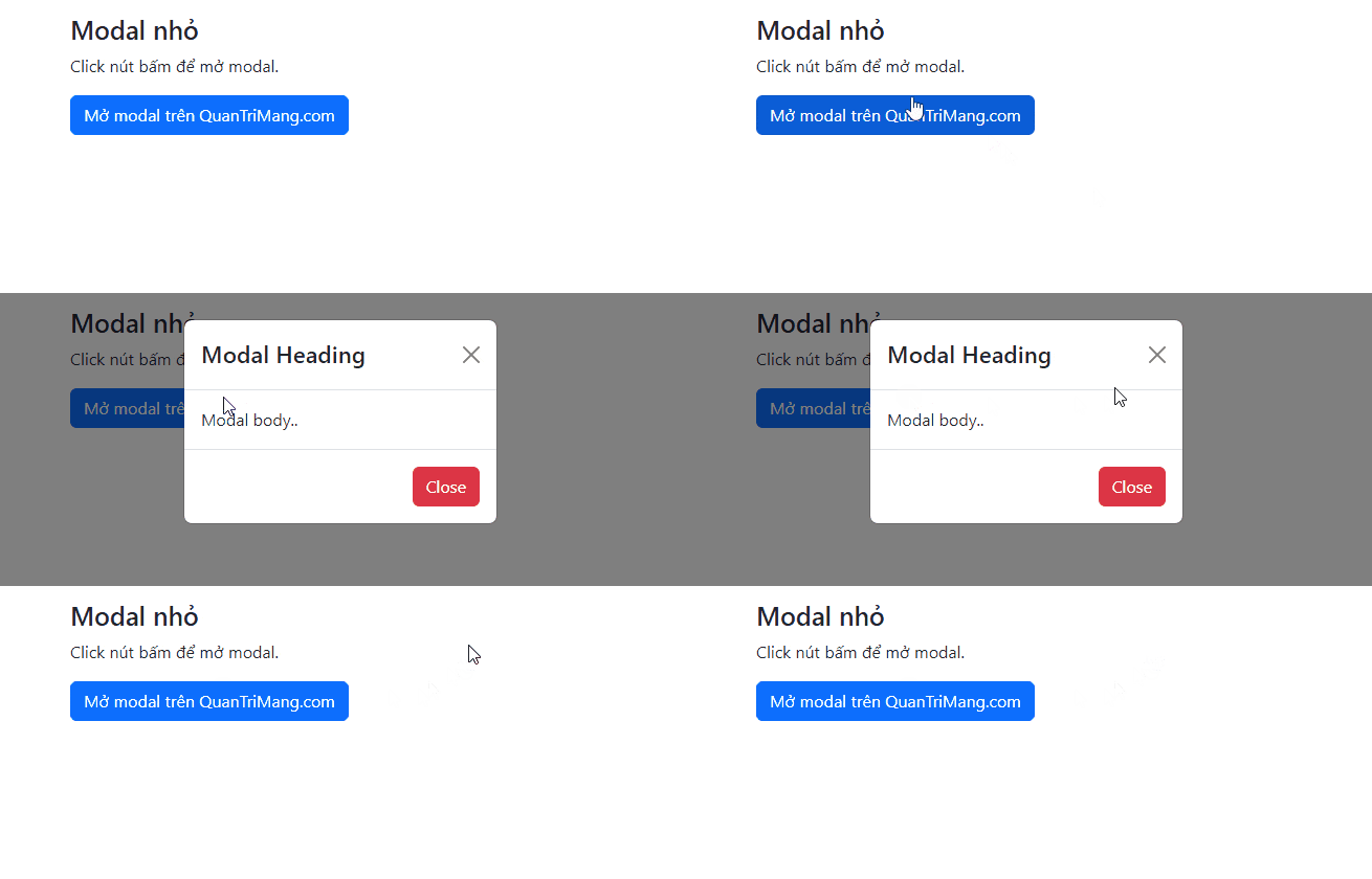
Small modal
Use a small dialog for a short confirmation or a compact message.
Large modal
A large dialog can accommodate a wider form, table, or preview without using the entire viewport.
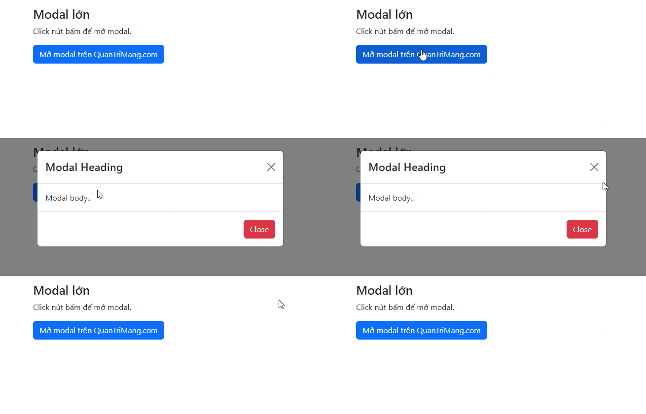
Size modifiers are maximum widths and respond to the viewport. The dialog still shrinks on narrow screens to avoid horizontal scrolling.
Create a fullscreen modal
Add modal-fullscreen to modal-dialog when the dialog should fill the viewport:
<div class="modal-dialog modal-fullscreen">
  <div class="modal-content">...</div>
</div>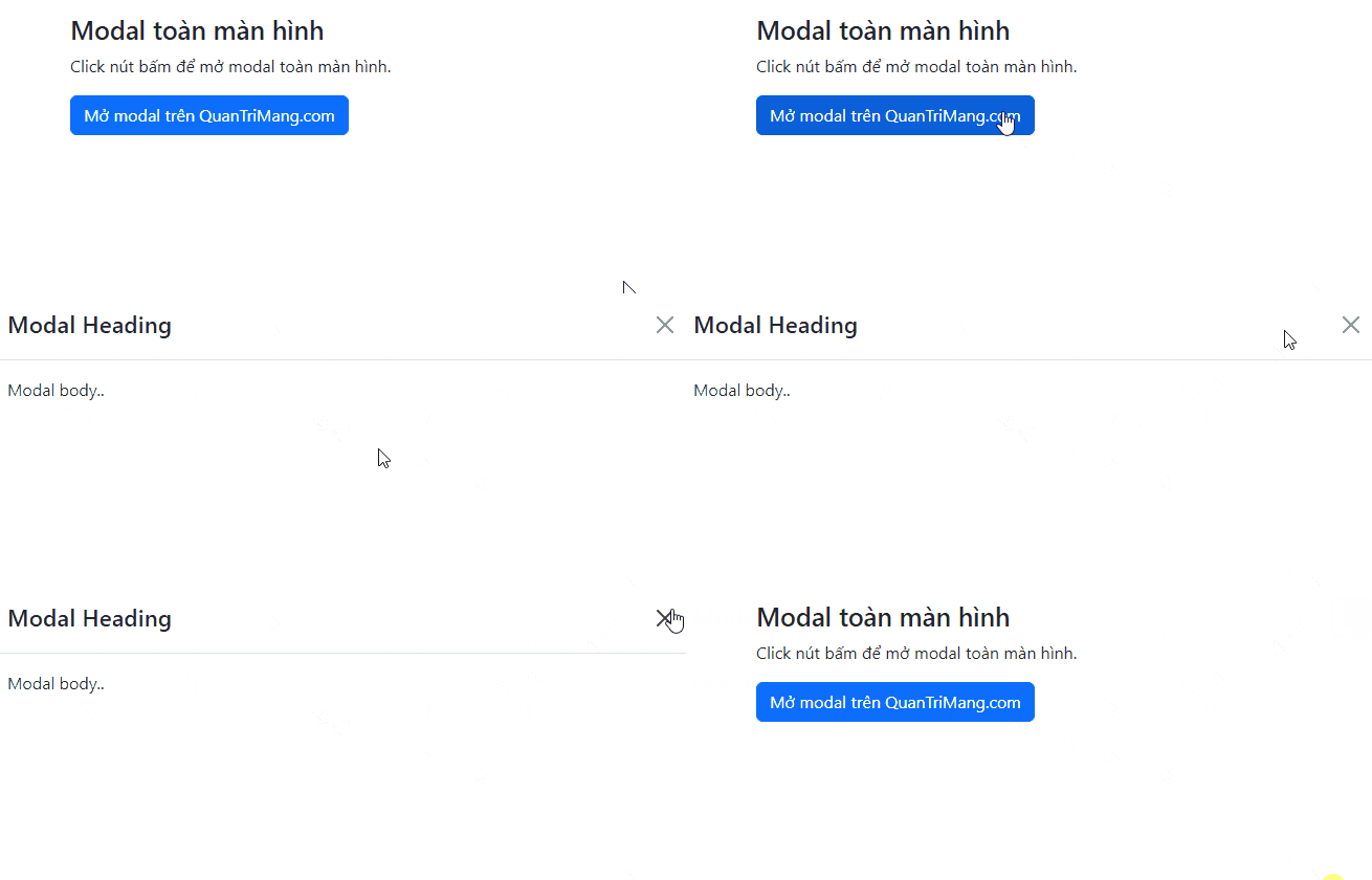
Bootstrap also provides responsive fullscreen classes. Each one is fullscreen below the named breakpoint and returns to a standard dialog above it.
| Class | Fullscreen below |
|---|---|
modal-fullscreen-sm-down | 576px |
modal-fullscreen-md-down | 768px |
modal-fullscreen-lg-down | 992px |
modal-fullscreen-xl-down | 1200px |
modal-fullscreen-xxl-down | 1400px |
<div class="modal-dialog modal-fullscreen-md-down">
  ...
</div>
This pattern is useful for forms that need maximum room on phones but should remain a conventional dialog on larger displays.
Center the dialog vertically
Add modal-dialog-centered to align a shorter modal near the vertical center of the viewport:
<div class="modal-dialog modal-dialog-centered">
  ...
</div>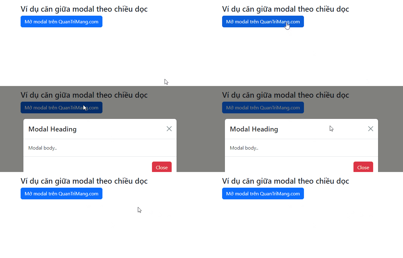
Centering works well for short confirmations. Long content should start near the top so readers can see the beginning immediately.
Handle long modal content
When a modal is taller than the viewport, the page-level dialog area scrolls automatically.
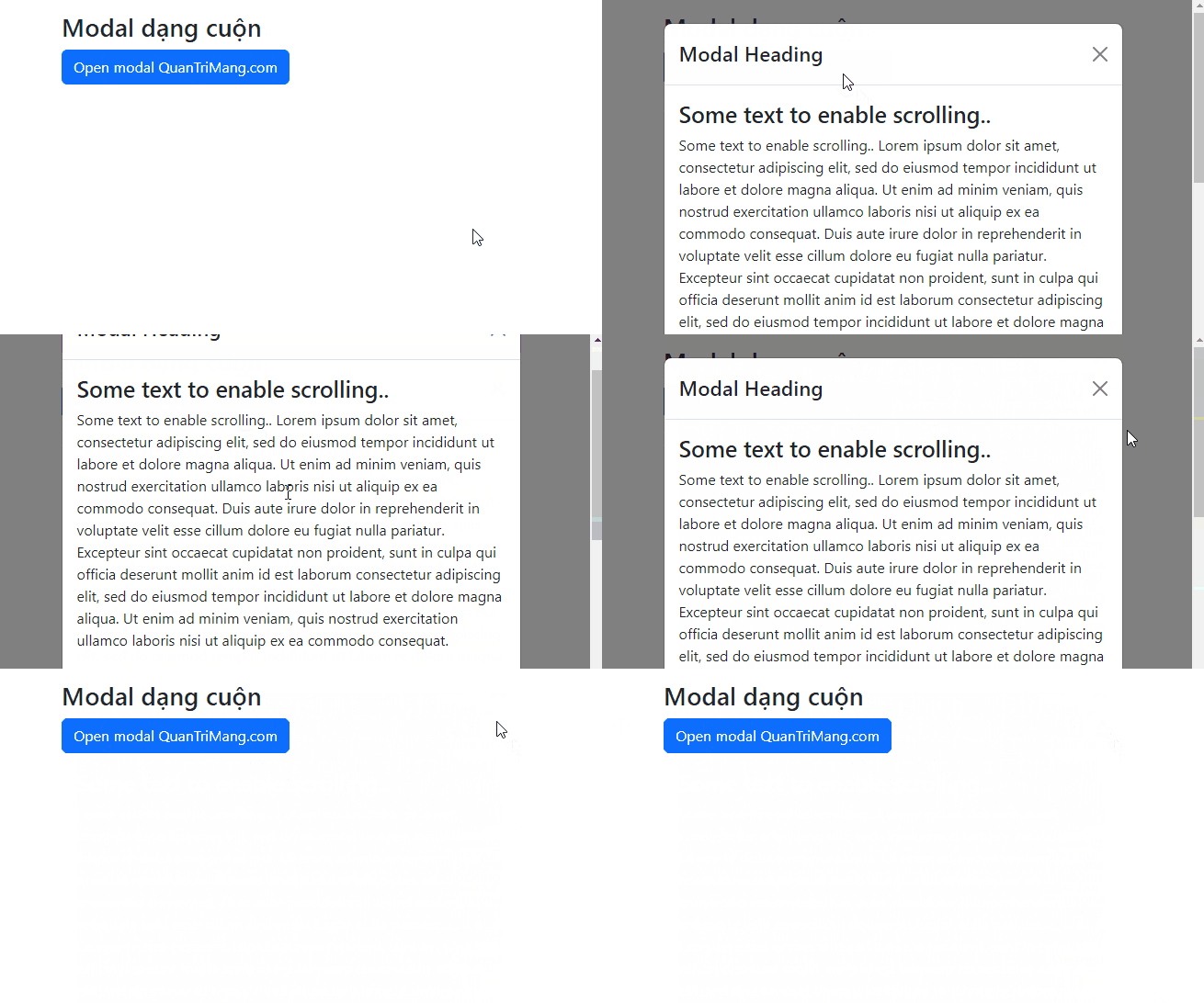
To keep the header and footer visible while only the body scrolls, add modal-dialog-scrollable:
<div class="modal-dialog modal-dialog-scrollable">
  <div class="modal-content">
    <div class="modal-header">...</div>
    <div class="modal-body">
      Long content goes here.
    </div>
    <div class="modal-footer">...</div>
  </div>
</div>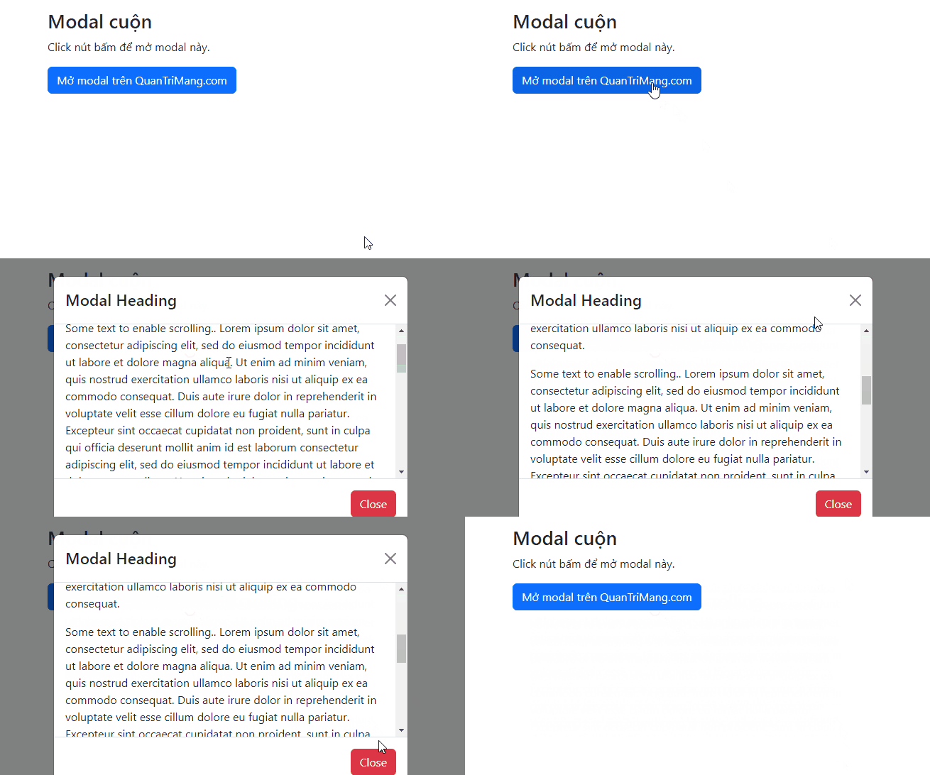
A scrollable dialog should still be concise. If users need to read a long article or perform a complex workflow, a dedicated page may be easier to navigate.
Control backdrop and keyboard dismissal
By default, clicking the backdrop or pressing Escape closes a modal. For an operation that must not be dismissed accidentally, use a static backdrop and disable keyboard dismissal:
<div class="modal fade"
     id="requiredActionModal"
     data-bs-backdrop="static"
     data-bs-keyboard="false"
     tabindex="-1"
     aria-labelledby="requiredActionLabel"
     aria-hidden="true">
  ...
</div>
Use this configuration sparingly and keep an explicit close or cancel action unless the user genuinely must complete the step.
Open and close a modal with JavaScript
const modalElement = document.getElementById('profileModal');
const modal = bootstrap.Modal.getOrCreateInstance(modalElement);

modal.show();
modal.hide();
Listen for lifecycle events when work must happen after the transition finishes:
modalElement.addEventListener('shown.bs.modal', () => {
  document.getElementById('profileName').focus();
});

modalElement.addEventListener('hidden.bs.modal', () => {
  // Reset temporary state if appropriate.
});
The HTML autofocus attribute does not automatically move focus inside a Bootstrap modal. Use the shown.bs.modal event when a specific field should receive initial focus.
Modal accessibility checklist
- Use
aria-labelledbyto reference a visible modal title. - Add
aria-describedbywhen a separate description is helpful. - Keep the modal near the top level of the document instead of nesting it inside another fixed element.
- Provide a keyboard-accessible dismiss control with a clear label.
- Use one modal at a time and avoid nested dialogs.
- Return users to a sensible place after the modal closes.
- Do not put essential information only behind a modal that opens automatically.
If you are deciding whether Bootstrap fits your project, compare popular CSS frameworks. You can also test the markup in one of these free HTML editors. See the official Bootstrap modal documentation for the complete API, options, and event reference.
Related Articles
 Answering Frequently Asked Questions About Bootstrap7 minutes read
 Lesson 42: Large Grid in Bootstrap 54 minutes read
 Lesson 38: Grid Systems from Stacked to Horizontal in Bootstrap 54 minutes read
 Lesson 30: Flexing in Bootstrap 59 minutes read
 Lesson 15: Pagination in Bootstrap 54 minutes read
 Lesson 4: Typography in Bootstrap 512 minutes read
Reader Comments 0
Sign in with email or Google to join the discussion.