Lesson 19: How to use Collapse in Bootstrap 5
Collapse in Bootstrap 5 allows you to hide or show content on a page using several JavaScript classes and plugins. Here's what you need to know about Collapse in Bootstrap 5..
Collapse in Bootstrap 5 allows you to hide or show content on a page using several JavaScript classes and plugins. Here's what you need to know about Collapse in Bootstrap 5 .
Basic usage of Collapse in Bootstrap 5
Collapse is useful when you want to hide and show a large amount of content on a page. Basically, the code would look like this:
Nội dung. For example:
Bootstrap Example Simple content hide/show button
Click the button to hide or show the content.
Kênh thông tin công nghệ nhanh nhất, các bài học lập trình online, tin tức game, cập nhật xu hướng giới trẻ.

Detailed explanation:
The class .collapse indicates the collapsible element () . This is the content that will be shown or hidden with a single click of a button.
To control collapsible (show/hide) content, add the attribute data-bs-toggle="collapse" to the element or bar.Then, add data-bs-target="#id" to connect that button to the collapsible content().
Note: For the `data-bs-target` factor, you can use the `href` attribute instead of `data-bs-target` .
Collapsible Lorem ipsum dolor text. By default, collapsible content is hidden. However, you can add a class .showto display it by default:
Lorem ipsum dolor text. For example:
Bootstrap Example By default, the content is displayed in a collapsible format.
Add the `.show` class next to the `collapse` class to default to displaying the content.
Click the button to toggle between showing and hiding the content.
QuanTriMang.com là kênh kiến thức công nghệ hàng đầu hiện nay. Cập nhật nhanh mọi bản tin game, đời sống, xã hội, xu hướng hót trên mạng và nhiều hơn thế nữa.

Accordion
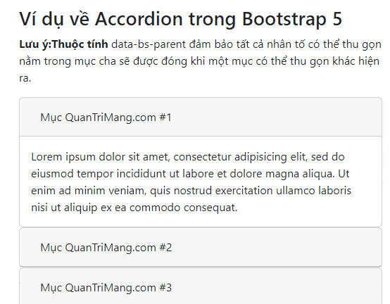
This is a collapsible menu design in a stacked format. Note that the `data-bs-parent` property is used to ensure that all collapsible elements within a specific parent element will close when one of the collapsible items is displayed.
Basic code:
Collapsible Group Item #1 Lorem ipsum. Collapsible Group Item #2 Lorem ipsum. Collapsible Group Item #3 Lorem ipsum. For example:
Bootstrap Example An example of an accordion in Bootstrap 5.
Note: The `data-bs-parent` property ensures that all collapsible elements within the parent item are closed when another collapsible item appears.
Mục QuanTriMang.com #1 Lorem ipsum dolor sit amet, consectetur adipisicing elit, sed do eiusmod tempor incididunt ut labore et dolore magna aliqua. Ut enim ad minim veniam, quis nostrud exercitation ullamco laboris nisi ut aliquip ex ea commodo consequat. Mục QuanTriMang.com #2 Lorem ipsum dolor sit amet, consectetur adipisicing elit, sed do eiusmod tempor incididunt ut labore et dolore magna aliqua. Ut enim ad minim veniam, quis nostrud exercitation ullamco laboris nisi ut aliquip ex ea commodo consequat. Mục QuanTriMang.com #3 Lorem ipsum dolor sit amet, consectetur adipisicing elit, sed do eiusmod tempor incididunt ut labore et dolore magna aliqua. Ut enim ad minim veniam, quis nostrud exercitation ullamco laboris nisi ut aliquip ex ea commodo consequat.
Above is how to collapse and expand menus on websites and applications using Bootstrap 5's Collapse feature . This component is quite easy to use with two basic styles. Remember it to diversify your project designs!
 Kareem Winters