Table of Contents
Bootstrap 5 pagination styles a sequence of links for moving between pages of results, articles, or records. Use a labeled nav landmark, a pagination list, page-item list items, and page-link links.
Create basic pagination
Give the navigation a descriptive label, especially when a page contains more than one pagination component.
<nav aria-label="Search results pages">
  <ul class="pagination">
    <li class="page-item">
      <a class="page-link" href="/search?page=1">Previous</a>
    </li>
    <li class="page-item">
      <a class="page-link" href="/search?page=1">1</a>
    </li>
    <li class="page-item">
      <a class="page-link" href="/search?page=2">2</a>
    </li>
    <li class="page-item">
      <a class="page-link" href="/search?page=3">3</a>
    </li>
    <li class="page-item">
      <a class="page-link" href="/search?page=3">Next</a>
    </li>
  </ul>
</nav>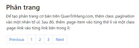
The example uses real URLs so pagination still works without JavaScript. Preserve filters, search terms, and sorting choices in each destination when those values are part of the current results.
Mark the current page
Add active to the current page-item. If the current page remains an anchor, add aria-current="page".
<li class="page-item">
  <a class="page-link" href="/search?page=1">1</a>
</li>
<li class="page-item active">
  <a class="page-link"
     href="/search?page=2"
     aria-current="page">2</a>
</li>
<li class="page-item">
  <a class="page-link" href="/search?page=3">3</a>
</li>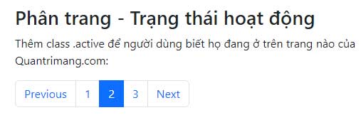
A non-interactive span can replace the current-page link when reloading the same page would provide no value:
<li class="page-item active">
  <span class="page-link">2</span>
</li>
Disable Previous or Next at an endpoint
On the first page, Previous has nowhere to go. Use a span rather than a fake link so it cannot receive keyboard focus or trigger navigation.
<li class="page-item disabled" aria-disabled="true">
  <span class="page-link">Previous</span>
</li>
If an anchor must be retained, remove its destination, add tabindex="-1", and prevent activation in your application logic. The visual disabled class alone is not a complete interaction guard.
Use icons for Previous and Next
When visible controls use symbols, provide a text label for assistive technology and hide the decorative symbol:
<li class="page-item">
<a class="page-link"
href="/search?page=1"
aria-label="Previous page">
<span aria-hidden="true">«</span>
</a>
</li>
<li class="page-item">
<a class="page-link"
href="/search?page=3"
aria-label="Next page">
<span aria-hidden="true">»</span>
</a>
</li>Text labels are usually clearer than icons alone, especially when the pagination sits far from the content it controls.
Change the pagination size
Add pagination-lg or pagination-sm to the pagination list. The default size needs no modifier.
<ul class="pagination pagination-lg">...</ul>
<ul class="pagination">...</ul>
<ul class="pagination pagination-sm">...</ul>
Choose a size that provides comfortable touch targets. Compact pagination can save space but should not become difficult to tap.
Align pagination
Pagination uses flexbox, so Bootstrap justification utilities control its horizontal position:
<ul class="pagination justify-content-start">...</ul>
<ul class="pagination justify-content-center">...</ul>
<ul class="pagination justify-content-end">...</ul>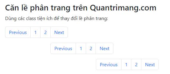
Use responsive variants such as justify-content-md-center if the alignment should change at a breakpoint.
Handle many pages
Do not render hundreds of numbered links. Show the current page, a small range around it, endpoints when helpful, and Previous and Next controls. An ellipsis is a visual separator, not a destination:
<nav aria-label="Article pages">
<ul class="pagination">
<li class="page-item">
<a class="page-link" href="/articles?page=4">Previous</a>
</li>
<li class="page-item">
<a class="page-link" href="/articles?page=1">1</a>
</li>
<li class="page-item disabled" aria-hidden="true">
<span class="page-link">…</span>
</li>
<li class="page-item active">
<span class="page-link">5</span>
</li>
<li class="page-item">
<a class="page-link" href="/articles?page=6">6</a>
</li>
<li class="page-item">
<a class="page-link" href="/articles?page=6">Next</a>
</li>
</ul>
</nav>On very small screens, Previous and Next plus a concise status such as “Page 5 of 24” may be easier to use than a long row of numbers.
Breadcrumbs are not pagination
Breadcrumbs show the current page's position in a site hierarchy. Pagination moves through a sequence of peer pages. Bootstrap styles them as separate components, so choose the pattern that matches the relationship.
<nav aria-label="Breadcrumb">
  <ol class="breadcrumb">
    <li class="breadcrumb-item">
      <a href="/">Home</a>
    </li>
    <li class="breadcrumb-item">
      <a href="/learn/">Tutorials</a>
    </li>
    <li class="breadcrumb-item active"
        aria-current="page">
      Bootstrap
    </li>
  </ol>
</nav>
The final breadcrumb item represents the current page, so it is typically plain text with aria-current="page". Bootstrap adds separators with CSS.
Pagination accessibility checklist
- Wrap the list in a
navwith a specific accessible label. - Use real URLs for page links whenever possible.
- Mark the current page with
activeandaria-current="page". - Use non-interactive spans for controls that have no valid destination.
- Give icon-only controls clear accessible names.
- Keep touch targets large enough and test wrapping at narrow widths.
- Preserve the current query, filters, and sort order in each page URL.
You can test the markup in one of these free HTML editors or compare Bootstrap with other popular CSS frameworks. See the official references for Bootstrap pagination and Bootstrap breadcrumbs.
Related Articles
 Lesson 42: Large Grid in Bootstrap 54 minutes read
 Lesson 38: Grid Systems from Stacked to Horizontal in Bootstrap 54 minutes read
 Lesson 30: Flexing in Bootstrap 59 minutes read
 Lesson 4: Typography in Bootstrap 512 minutes read
 Lesson 29: Utilities in Bootstrap 59 minutes read
 Lesson 39: Ultra-Small Grid Styles in Bootstrap 54 minutes read
Reader Comments 0
Sign in with email or Google to join the discussion.