Table of Contents
Bootstrap 5 spinners are CSS loading indicators for a page section, button action, or background request. The visual animation requires no JavaScript, but your application still needs JavaScript to show the spinner when work starts and hide it when the work finishes.
A spinner communicates that progress is indeterminate. If you know the completion percentage, use a progress bar instead.
Create a border spinner
Add spinner-border and provide a status message for assistive technology:
<div class="spinner-border" role="status">
  <span class="visually-hidden">Loading results...</span>
</div>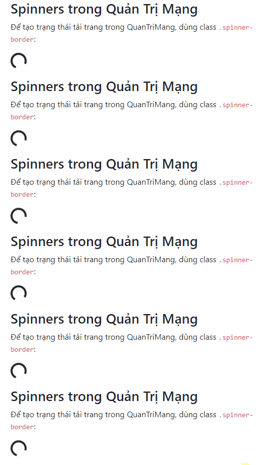
The hidden text should describe the actual operation, such as “Uploading file” or “Loading search results,” rather than relying on a generic message everywhere.
Change the spinner color
Bootstrap spinners use currentColor, so text color utilities change their color:
<div class="spinner-border text-primary" role="status">
  <span class="visually-hidden">Loading...</span>
</div>
<div class="spinner-border text-success" role="status">
  <span class="visually-hidden">Loading...</span>
</div>
<div class="spinner-border text-danger" role="status">
  <span class="visually-hidden">Loading...</span>
</div>
<div class="spinner-border text-dark" role="status">
  <span class="visually-hidden">Loading...</span>
</div>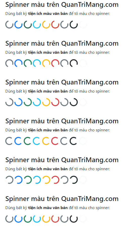
Choose a color with enough contrast against its background. Color can reinforce context, but a loading indicator should not depend on color alone to explain what is happening.
Use a growing spinner
spinner-grow repeatedly expands and fades instead of rotating:
<div class="spinner-grow text-primary" role="status">
  <span class="visually-hidden">Loading...</span>
</div>
<div class="spinner-grow text-secondary" role="status">
  <span class="visually-hidden">Loading...</span>
</div>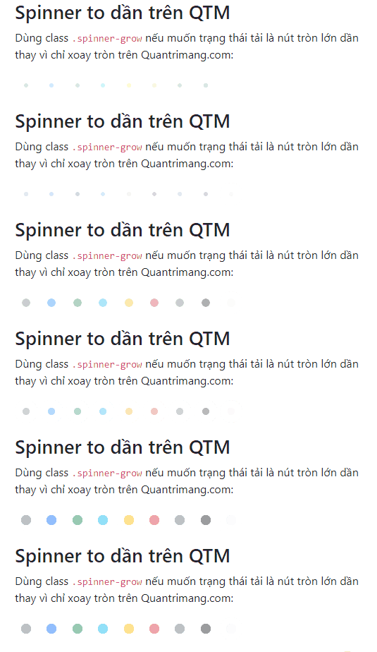
Both spinner types follow the user's reduced-motion preference. Avoid adding custom animations that override that behavior.
Make a spinner smaller or larger
Use spinner-border-sm or spinner-grow-sm for compact indicators inside buttons and other controls.
<div class="spinner-border spinner-border-sm" role="status">
  <span class="visually-hidden">Loading...</span>
</div>

<div class="spinner-grow spinner-grow-sm" role="status">
  <span class="visually-hidden">Loading...</span>
</div>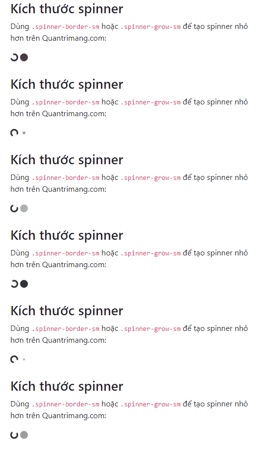
For a custom size, set both width and height so the spinner remains circular:
<div class="spinner-border"
     style="width: 3rem; height: 3rem;"
     role="status">
  <span class="visually-hidden">Loading...</span>
</div>
Align a spinner
Use standard Bootstrap utilities instead of positioning the spinner with one-off CSS:
<div class="d-flex justify-content-center">
  <div class="spinner-border" role="status">
    <span class="visually-hidden">Loading results...</span>
  </div>
</div>
To align visible text on one side and the spinner on the other:
<div class="d-flex align-items-center">
  <strong role="status">Loading results...</strong>
  <div class="spinner-border ms-auto" aria-hidden="true"></div>
</div>
In the second example, the visible text carries the status role and the decorative spinner is hidden from assistive technology, avoiding a duplicate announcement.
Add a spinner to a button
Disable a button while its action is processing so users cannot submit it repeatedly. Keep visible status text when space allows.
<button class="btn btn-primary"
        type="button"
        id="saveButton"
        disabled
        aria-disabled="true">
  <span class="spinner-border spinner-border-sm"
        aria-hidden="true"></span>
  <span role="status">Saving...</span>
</button>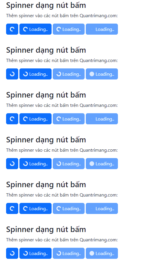
If the button contains only a spinner, add a visually hidden status label:
<button class="btn btn-primary" type="button" disabled>
  <span class="spinner-border spinner-border-sm"
        aria-hidden="true"></span>
  <span class="visually-hidden" role="status">Saving...</span>
</button>
Toggle a loading state with JavaScript
This example updates the button state around an asynchronous save operation. The finally block restores the button whether the operation succeeds or fails.
async function saveChanges() {
  const button = document.getElementById('saveButton');
  const originalHtml = button.innerHTML;

  button.disabled = true;
  button.innerHTML =
    '<span class="spinner-border spinner-border-sm" aria-hidden="true"></span> ' +
    '<span role="status">Saving...</span>';

  try {
    await submitChanges();
  } finally {
    button.disabled = false;
    button.innerHTML = originalHtml;
  }
}
For a page section, set a nearby container to aria-busy="true" while it is updating and return it to false when the new content is ready.
When not to use a spinner
- Do not show a spinner for an operation that has already failed; display an actionable error message.
- Do not leave an indefinite spinner running with no status or timeout handling.
- Do not use a spinner for known progress; show a progress bar with the current value.
- Do not replace all button text if the action would become ambiguous.
- Do not overlay a full page when only one small section is loading.
Implementation checklist
- Use a specific visible or visually hidden status message.
- Prevent duplicate submissions while a button action is pending.
- Keep the spinner close to the content or control it describes.
- Restore the interface when the request completes or fails.
- Check color contrast and reduced-motion behavior.
- Use
aria-busyon an updating region when appropriate.
You can test these examples in one of these free HTML editors or compare Bootstrap with other popular CSS frameworks. For all supported spinner utilities, see the official Bootstrap spinner documentation.
Related Articles
 Lesson 42: Large Grid in Bootstrap 54 minutes read
 Lesson 38: Grid Systems from Stacked to Horizontal in Bootstrap 54 minutes read
 Lesson 30: Flexing in Bootstrap 59 minutes read
 Lesson 15: Pagination in Bootstrap 54 minutes read
 Lesson 4: Typography in Bootstrap 512 minutes read
 Lesson 29: Utilities in Bootstrap 59 minutes read
Reader Comments 0
Sign in with email or Google to join the discussion.