Table of Contents
To style an HTML table with Bootstrap 5, add the table class to the <table> element. You can then combine it with modifier classes such as table-striped, table-hover, table-bordered, table-sm, or table-dark. For a wide table, place it inside a table-responsive wrapper so it can scroll horizontally on a small screen.
Bootstrap improves the presentation of a table, but the underlying HTML still matters. Use tables for rows and columns of related data, not for page layout. If you need a refresher on markup, see the guide to modern HTML5 structure. You can also compare Bootstrap with other options in this overview of popular CSS frameworks.
Create a basic Bootstrap 5 table
A useful table normally has a <caption>, a header group in <thead>, and data rows in <tbody>. Column headers use <th scope="col">, while a header that identifies a row uses <th scope="row">. These elements give the data a meaningful structure for assistive technology as well as visual users.
<table class="table">
  <caption>Team members</caption>
  <thead>
    <tr>
      <th scope="col">#</th>
      <th scope="col">First name</th>
      <th scope="col">Last name</th>
      <th scope="col">Role</th>
    </tr>
  </thead>
  <tbody>
    <tr>
      <th scope="row">1</th>
      <td>Ava</td>
      <td>Nguyen</td>
      <td>Designer</td>
    </tr>
    <tr>
      <th scope="row">2</th>
      <td>Noah</td>
      <td>Tran</td>
      <td>Developer</td>
    </tr>
  </tbody>
</table>| # | First name | Last name | Role |
|---|---|---|---|
| 1 | Ava | Nguyen | Designer |
| 2 | Noah | Tran | Developer |
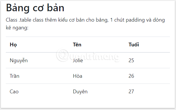
Bootstrap's table styling is opt-in. A plain <table> does not receive these styles until you add class="table". This also prevents the styles from automatically cascading into a nested table.
Choose the right table modifier
Start with table, then add only the modifiers the design needs. The most commonly used options are:
| Class | Effect |
|---|---|
table-striped | Adds alternating shading to rows in the table body. |
table-striped-columns | Adds alternating shading to columns. |
table-hover | Highlights body rows when the pointer is over them. |
table-bordered | Adds a border around every cell. |
table-borderless | Removes table and cell borders. |
table-sm | Reduces cell padding for a more compact table. |
table-dark | Applies Bootstrap's dark table variant. |
Striped rows
Add table-striped when alternating row shading will help readers follow a long row across several columns:
<table class="table table-striped">
  ...
</table>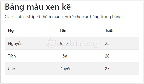
Borders and hover highlighting
Use table-bordered when clear cell boundaries are important. If the table is already visually dense, a border on every cell may add clutter, so compare it with Bootstrap's default horizontal dividers.
<table class="table table-bordered">
  ...
</table>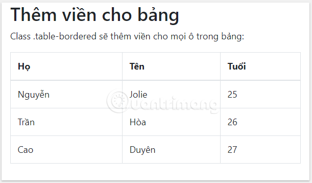
The table-hover class adds a visual hover state to rows inside <tbody>. It can help someone track the row under the pointer, but it should not be the only way to communicate a selected or important state.
<table class="table table-hover">
  ...
</table>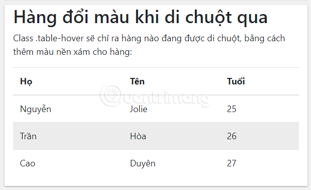
Dark and combined styles
Add table-dark to the table for a dark variant:
<table class="table table-dark">
  ...
</table>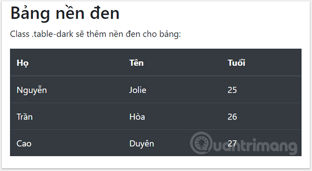
Modifiers can be combined. For example, the following table uses the dark variant and highlights body rows on hover:
<table class="table table-dark table-hover">
  ...
</table>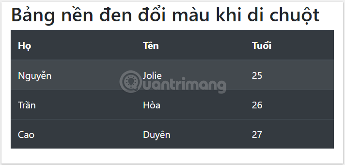
You can similarly combine table-dark with table-striped. Check the contrast after combining classes, especially if you also add custom colors.
Borderless tables
Use table-borderless when grouping, spacing, and alignment make the row and column relationships clear without rules:
<table class="table table-borderless">
  ...
</table>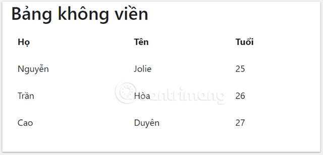
Apply contextual table colors
Bootstrap provides contextual variants that can be applied to a whole table, an individual row, or a cell. They are named table-primary, table-secondary, table-success, table-danger, table-warning, table-info, table-light, and table-dark. The table-active class identifies an active row or cell.
| Example | Typical interface meaning |
|---|---|
table-primary | Primary or emphasized item |
table-success | Successful or positive state |
table-danger | Error or dangerous state |
table-warning | State that needs attention |
table-info | Informational state |
table-active | Current or active item |
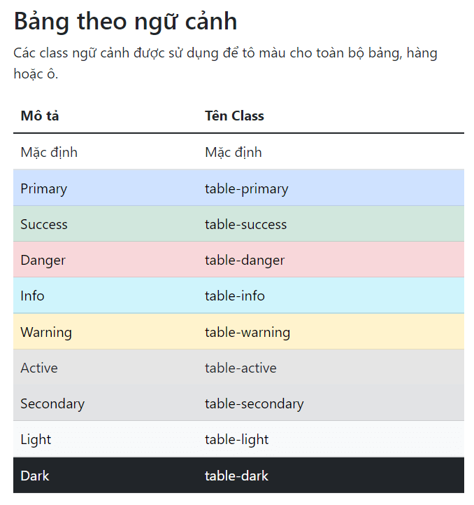
Do not rely on color alone. Add a text label, icon with an accessible name, or another cue so the state is understandable to people who cannot distinguish the colors.
Style the table header
A contextual class can be applied to <thead>. For a standard dark or light header in Bootstrap 5, use table-dark or table-light. The older thead-dark and thead-light classes belong to Bootstrap 4 and should not be used in Bootstrap 5 markup.
<table class="table">
  <thead class="table-dark">
    <tr>
      <th scope="col">Product</th>
      <th scope="col">Status</th>
    </tr>
  </thead>
  ...
</table>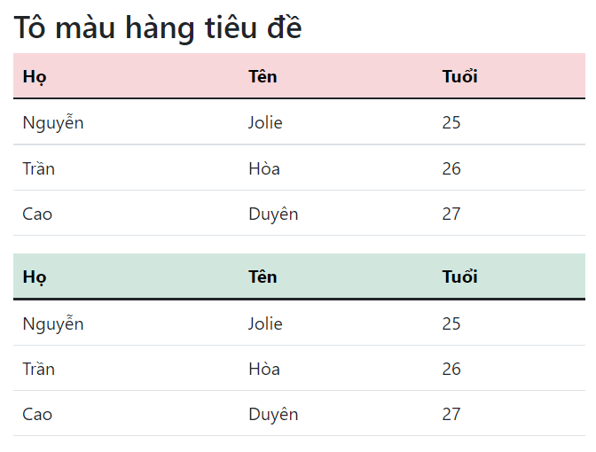
Make a compact table
The table-sm modifier reduces the cell padding. It is useful for data-heavy admin screens, but the denser layout can make scanning and tapping harder. Use it when compactness matters, not as a default for every table.
<table class="table table-bordered table-sm">
  ...
</table>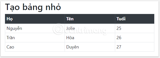
Make a Bootstrap table responsive
A wide table can overflow a phone screen. Bootstrap's responsive table helper solves this by putting horizontal scrolling on a wrapper. The class belongs on a <div> around the table, not on the table itself:
<div class="table-responsive">
  <table class="table table-bordered">
    ...
  </table>
</div>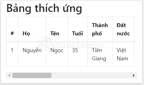
Use table-responsive for scrolling at every viewport size. Breakpoint-specific variants scroll only below the named breakpoint:
| Wrapper class | Responsive behavior |
|---|---|
table-responsive-sm | Scrolls below 576px |
table-responsive-md | Scrolls below 768px |
table-responsive-lg | Scrolls below 992px |
table-responsive-xl | Scrolls below 1200px |
table-responsive-xxl | Scrolls below 1400px |
A responsive wrapper prevents the whole page from widening, but it does not simplify the data. On very narrow screens, consider whether some columns can be omitted, shortened, or moved into a detail view.
Practical table checklist
- Use a table only for genuinely tabular information.
- Add a concise
<caption>when the table's purpose is not already obvious. - Mark column and row headers with
<th>and the correctscope. - Start with
table, then add only the modifiers that improve comprehension. - Use labels or icons as well as contextual color.
- Wrap wide tables in a responsive container and test keyboard as well as touch scrolling.
You can edit and test these examples in one of the HTML editors for Windows. For the complete set of table options, consult the official Bootstrap tables documentation.
Related Articles
 Lesson 42: Large Grid in Bootstrap 54 minutes read
 Lesson 38: Grid Systems from Stacked to Horizontal in Bootstrap 54 minutes read
 Lesson 30: Flexing in Bootstrap 59 minutes read
 Lesson 15: Pagination in Bootstrap 54 minutes read
 Lesson 4: Typography in Bootstrap 512 minutes read
 Lesson 29: Utilities in Bootstrap 59 minutes read
Reader Comments 0
Sign in with email or Google to join the discussion.