How to create an effect when hovering over (hover) with CSS
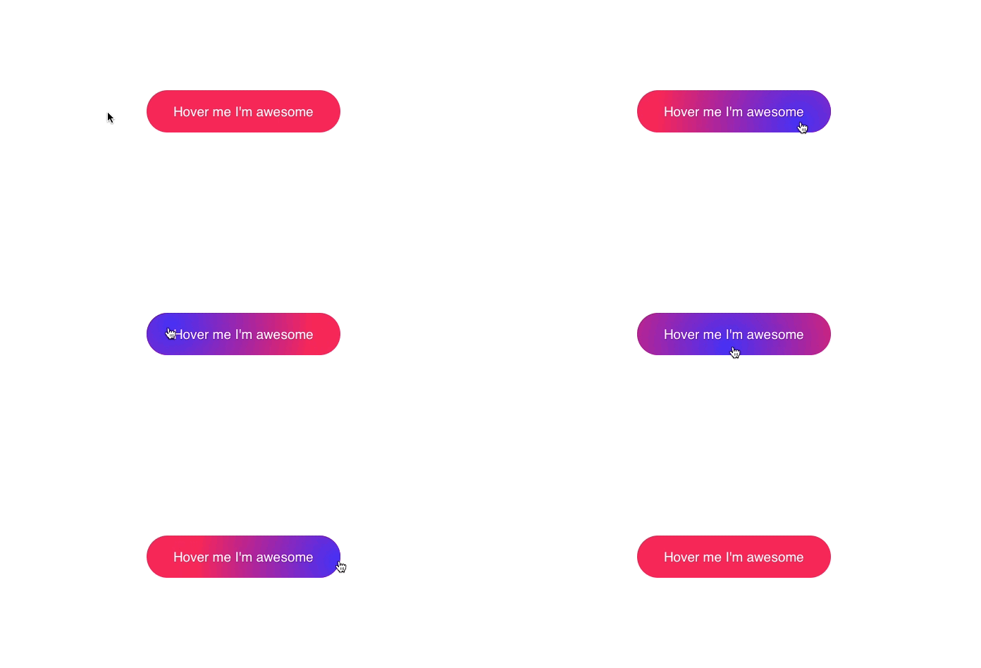
Website designers are certainly no stranger to CSS - the tool is still used to 'change clothes' for the website interface.The following article will show you how to create fun effects, change colors in the form of gradients, when users hover over a certain part of the web page.

Gradient effect when hovering over the button
Position the mouse cursor
The first step is to position the mouse pointer to track movement by the code below.
 document.querySelector('.button').onmousemove = (e) => {

  const x = e.pageX - e.target.offsetLeft
  const y = e.pageY - e.target.offsetTop

  e.target.style.setProperty('--x', `${ x }px`)
  e.target.style.setProperty('--y', `${ y }px`)

 }
The above lines of code correspond to 3 steps:
- Select the element and wait until the user moves the mouse over it.
- Calculate the position corresponding to the element.
- Save coordinates in CSS variables.
It only takes 9 lines of code to let CSS know the user's cursor position.
Create a gradient effect
Once you have the coordinates stored in the CSS variable, you can use them anywhere in the CSS file.
.button {
position: relative;
appearance: none;
background: #f72359;
padding: 1em 2em;
border: none;
color: white;
font-size: 1.2em;
cursor: pointer;
outline: none;
overflow: hidden;
border-radius: 100px;
span {
position: relative;}
&::before {
--size: 0;
content: '';
position: absolute;
left: var(--x);
top: var(--y);
width: var(--size);
height: var(--size);
background: radial-gradient(circle closest-side, #4405f7, transparent);
transform: translate(-50%, -50%);
transition: width .2s ease, height .2s ease;
}
&:hover::before {
--size: 400px;
}
}
- Wrap the text inside the
spanto prevent the gradient from overflowing. - Start with the
widthandheightof0pxand bring it to400pxwhen the user moves the mouse over.Don't forget to set the transition so the effect is smooth. - Use coordinates to follow the mouse pointer.
- Use
radial-gradientfor the background and select theclosest-sidecircle so that the gradient ends at the closest center corner, if there are two positions that meet the requirement, it will be evenly distributed.
When you get the mouse coordinates, you can create and apply many other interesting effects.Try it and don't forget to share it.
See more:
- CSS is so powerful that it is possible to get anonymous Facebook user information
- Using only HTML and CSS code, one can create a masterpiece full of aesthetics like this
- Top 5 popular CSS Framework that you should keep in mind
You should read it
- How to create sky effect for photos with B612
- How to use Photoshop CS6 (Part 4): Create a fading effect
- How to Create an Orton Effect in Photoshop
- Instructions for creating 3D balloon effect banner
- Instructions for creating photos of sunset effects online
- How to write text to change colors on Facebook to create special effects
- How to create snowfall effect with DesktopSnowOK
- Create a snow effect on the Windows Taskbar
- 14 simple steps to create a snow effect for the photo
- How to create a video with a wavy effect as a Facebook avatar
- How to create whirlpool effect on Photoshop
- How to create a poster with the Text Portrait effect in GIMP
Maybe you are interested
5 Great Pocket Alternatives for Saving Bookmarks Instructions for playing classic Arcade games on computer Why You Shouldn't Trust Your ISP's Wi-Fi Router? Test playing Resident Evil Village on PC without graphics card Why is the PS5 DualSense Edge controller worth it? Google Play has a new Kids tab that contains apps suitable for children
