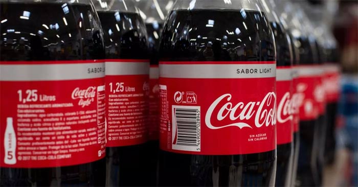
The Hidden Message Behind Coca-Cola Bottles That Few People Know
The Coca-Cola logo is iconic on its own. But if you look a little closer, it contains something dear to the heart of the company—a nod to joy.
The logos of famous household brands are so ingrained in our brains that it's hard to believe that any detail about them can go unnoticed. However, there are many secret messages in company logos, and once you find them, you'll be surprised. The Coke logo is one example.

By now, everyone knows that the Coca-Cola font is iconic in its own right. But if you look a little closer, it contains something dear to the heart of the company—a nod to fun.
Curious? Here are the secrets behind the Coke logo , along with an expert's take on what makes it so memorable.
The hidden message behind the Coke logo
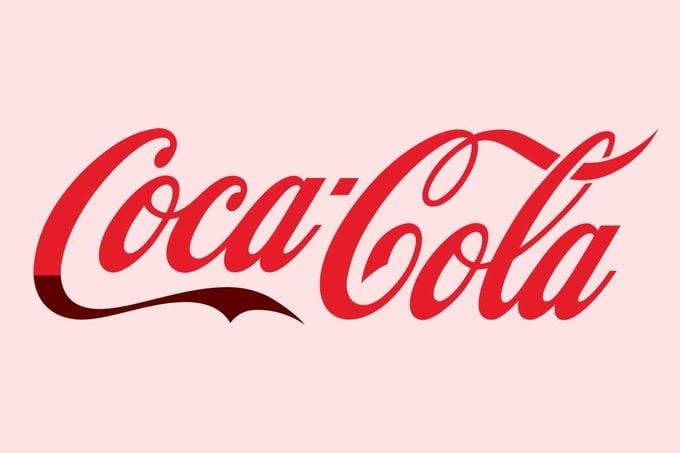
Many believe that the ribbon-like extension of the first 'C' in Coca-Cola is actually a smile. This, in theory, fits with Coca-Cola's overarching message that the classic carbonated beverage brings happiness to all who drink it. And Coke's past slogans have included 'Drink Coke and Smile,' 'Unlock Happiness,' and 'Taste the Feeling.'
'The Coca-Cola logo has become an American icon steeped in nostalgia and flavor,' says Reilly Newman, co-founder of California-based branding studio Motif Brands and co-author of Brandy: 101 Sips of Wisdom for Attaining a Successful Brand. 'The distinctive look of the wordmark makes the brand's logo feel authentic and fresh. It flows with the imagery as the typography shapes each letter.' So what's the hidden message? 'The ribbons feel abstractly liquid, while there are clear curves in the shapes that, yes, feel like smiles,' says Newman.
Newman also notes that the logo's upward flow and angle help consumers' brains register more positive emotions, gliding from left to right across the entire line.

History of the Coke logo
As you may know, John S. Pemberton, a pharmacist, invented Coca-Cola in 1886. According to the Coca-Cola website, his bookkeeper, F.M. Robinson, is credited with creating the first version of the Coke logo. Robinson suggested the name and wrote the now famous trademark 'Coca‑Cola' in Spencerian script, which was common at the time. While the logo has changed over the centuries, you can still see its origins in the current version.
Just four years after its inception in 1890, the Coca-Cola logo got a little more dramatic, as more swirls were added to accentuate the logo. This is when the logo became closer in style to the Coke logo we know today. But it's actually the 1969 logo update that really brings out the undeniable appeal of the "Arden Square" logo. This is when Coca-Cola started using a white font within a red square box, with a white ribbon underneath.
Who created the Coke logo?
While Robinson is credited with creating the first Coca-Cola logo, Louis Madarasz, a Texas calligrapher, claimed that he actually designed the logo. Robinson denied this in a 1914 trial, claiming that he and a gentleman named Frank Ridge created it. Unfortunately, Madarasz passed away in 1910 and never got a chance to tell his side of the story.
- Pouring salt into Coca obtained results that surprised everyone
- What does the yellow Coca-Cola bottle cap mean?
- Hackers successfully built Coca-Cola machines that automatically paid with Bitcoin
- What happens when mixing Coca Cola with bleach?
- 11 most common misunderstandings that billions of people around the world still believe
- Please refer and download the beautiful font from the big brand logo
- 'Round the eyes' with 21 innovative ways to recycle old plastic bottles
- Decipher the mystery behind the 'water bottle flipping' trick that is causing the world 'storm'
- How to hide chat and find hidden chat on Android Zalo
- 6 historical facts that surprise you
 How to change the Windows 10 boot logo
  How to insert Logo into Video by Camtasia Studio software
  How to change the logo and OEM name in Windows 10/8/7
  How to insert a logo into the image on Paint
  Collection of the most beautiful football logos
  How to remove the WutaCam logo in photos