Debranding and the era of the 'no words' logo
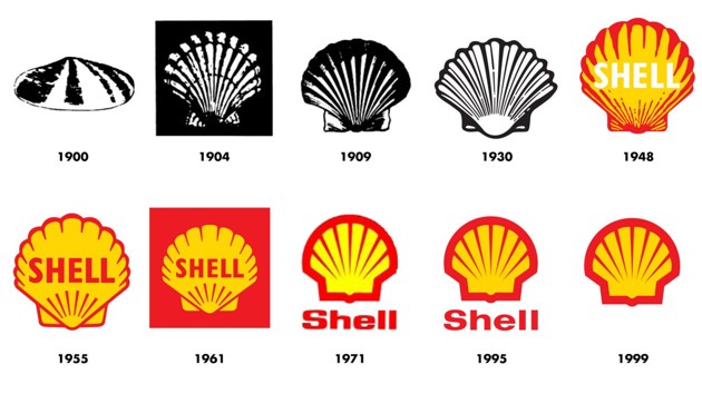
Debranding is the term used to refer to the form of removing names or removing both names and logos on products. Following this trend, many major brands in the world have also begun to change the look of their logos to become less literal than before.
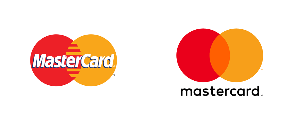
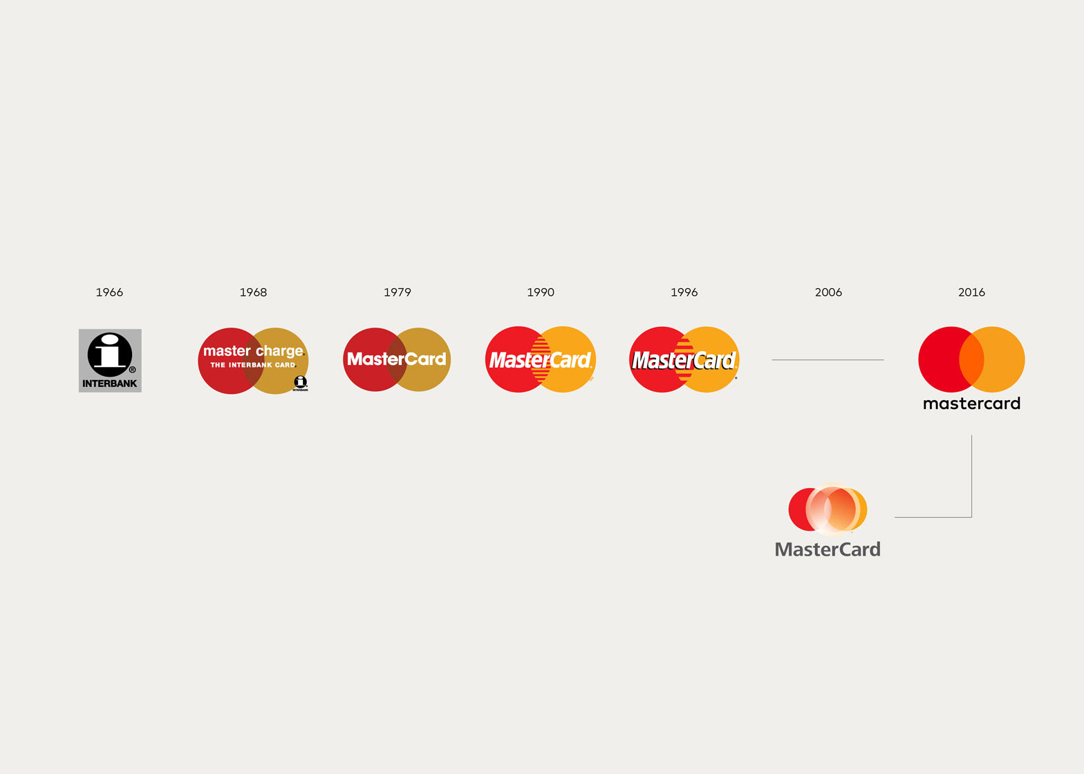
In the early summer of 2016, MasterCard revealed a new logo design and following the brand renewing trend (rebranding), the changes were very subtle: The company kept the image of two red and gold balls with one part overlapped, the text part alone has been changed. Previously, the word "MasterCard" was embossed and placed in the center of the logo, now it has been moved down to the position under two balls and written down: "mastercard".
According to MasterCard, with the development of the trend, it's clear that it's time to leave the name completely off the logo. The focus should be on symbols rather than words.

MasterCard's change reflects a broader transition in some of the widely recognized global brands: reducing the emphasis on text or removing it entirely from the logo.
Nike was one of the first brands to change the logo to this trend, that was in 1995 - when the Swoosh logo had the slogan "Just Do It" and then, there was no word at all. on the logo. Apple, McDonald's and other brands also move in this trajectory: aiming to use a wordless logo after a period of converting many logo styles with taglines like "Think Different" or "I'm lovin 'it" .

This transformation seems to be consistent with a more logical approach to design as well as some typical characteristics of the modern economy: Icons work better than long names on apps and screens. computer; and they also allow for greater flexibility if the company wants to join multiple fields at the same time. For example, names like Starbucks Coffe and MasterCard are closely tied to specific products in ways that symbols cannot show. This would be detrimental if it was time for a company producing phones to expand into more cars. In addition, visual cue can also be suitable for promoting the brand to more countries because they have eliminated the need to use translation tools (no text on the logo anymore, meaning is that users can freely guess the meaning of the logo in their own way, and brands need not "translate" the content on their logo.
But perhaps the most powerful impetus for the creation of these "slimy" logos is that the growing difficulty of reaching buyers when there are so many customers now is skeptical of large corporations. A recent survey conducted by PR provider Cohn & Wolfe found that four-fifths of global consumers now view brands that are not open and untrue. "Customers were fed up with advertising in a way that a few decades ago, they were not," said Adam Alter, associate professor of marketing at New York's Stern School of Business. "It's hard to appeal to them like before and now, they tend to look for public offers." As a result, this also leads to a change in brand strategy. "Companies are forced to learn about sophistication."

That change is what is called "debranding" (the form of removing names or names on products) or "decorporatizing" (this is to make sense of disappearing the feeling of a large corporation) - a strategy based on a narrower idea that can only be deployed by the best-known brands. Some markerers believe that debranding can make global brands "less of a more specific organization" and "more personal" to consumers. Because the wordless logos can stimulate many immediate and personal reactions - it is very important in the media environment with numerous distractions and distractions.
According to Jill J. Avery, senior lecturer at Harvard Business School, "Researchers have demonstrated the use of visual images (visual imager) [in comparison with images shown in words. - verbal imagery] in advertising will increase consumer attention and challenge them to interpret and understand the brand's message in a more proactive way than words . Clarification process or "self-production" will produce mental image quality (an explanation of things / images formed in one's mind based on their memory or imagination, just It's just fake) is higher and in many cases is a more personal understanding of the message of advertising ".

In short, debranding makes it easier to create connections based on two red and gold balls than adding MasterCard to the image center.
The demand for individuality and friendliness is particularly relevant for young people - the target market for many global consumer goods manufacturing companies. It is likely that these two factors also impact MasterCard's branding decision.
Because of an increasing number of consumers - especially young people - prefer to trade on the phone rather than using cash or cards and want to avoid having to face credit card debt a worry The concern for MasterCard investors is that the company still has no place in the mobile payment market. Meanwhile, PayPal - another brand that has refreshed its image a few years ago by reducing the emphasis on its name in the logo - has quickly built a user database. Millennial generation (who was born between 1980 and 2000) is very significant - including quite a good number of loyalists to Venmo - a very popular mobile payment application that was later PayPal repurchase.
The benefits of debranding form are extremely great. For example, one of the most successful deployments of this trend is Coca-Cola's "Share a Coke" media campaign. Basically, users will have the opportunity to encounter very popular names printed on coca bottles, such as Sarah or David and are encouraged to share these bottles of water for friends and family. As a result, the campaign has boosted US sales by more than 2%, also reversing the decline in Coca-Cola's sales figures in the United States over the past decade.

The advertising industry likes to call this type of marketing "authentic". Cohn & Wolfe annually collects a list of "the world's most trusted brands", drawn from participatory surveys of nearly 12,000 consumers in 14 countries. This year's top 20 also includes PayPal, Coca-Cola and MasterCard.
Obviously, trustworthy are very funny things in the marketing field: Affirming the credibility of something is unreliable. However, at a time when users increasingly value companies that create things that are more truthful than show their growth, credibility is so significant that marketers start to feel more difficult. when distinguishing between the two concepts.
- How to design a simple logo in Photoshop
- Software to remove logos, words on videos and usage
- How to create a logo super fast and beautiful with professional Logo design software AAA Logo
- Firefox launched a new flat-design logo with 23 Beta version
- Facebook launches a new logo, simple but with many implications
- Google edited the logo, the puzzle you discovered


 How to change the Windows 10 boot logo
  How to insert Logo into Video by Camtasia Studio software
  How to change the logo and OEM name in Windows 10/8/7
  How to insert a logo into the image on Paint
  Collection of the most beautiful football logos
  How to remove the WutaCam logo in photos