Article on the subject of "charts"
-

PowerPoint 2019 (Part 22): Charts
including a chart in your presentation allows your audience to see the meaning behind the numbers, making it easier to visualize comparisons and trends.
-
How to Find a Song You Don't Know the Name Of
nothing is quite so frustrating as having a song you can't remember the name of stuck in your head. if you only know a couple of lyrics or can hum a brief song bar, all is not lost. utilize search engines or music recognition websites to...
-
The 13-inch MacBook Pro is the best-selling laptop on Amazon
apple devices get the most attention while e-books kindle wi-fi is the best-selling electronic device on amazon.
-
Instructions for creating charts in Excel 2007 or 2010
the chart is a very effective way of displaying data in computational or statistical programs, especially microsoft excel. in the tutorial below, we will cover the basic operations to create a chart from the data table in excel 2007 or 2010 version ...
-
How to use Sparklines in Excel 2010
the main sparklines is a mini chart that you can put inside the cells to be able to observe data and charts on the same table.
-
How to draw a map chart on Excel
in excel 2019, there is a map diagram, showing the names of countries in the world.
-
Instructions on how to create charts in Excel professional
instructions on how to create charts in excel professional. excel supports many types of charts from column charts, line charts to area charts, scatter charts, radar charts .... you can freely choose the chart type that fits the table. data required
-
PowerPoint 2016: Working with Charts
charts are a tool that users can employ to represent data graphically. using a chart in a presentation helps the audience better understand the meaning behind the numbers.
-
Work with charts in PowerPoint 2016
charts are a tool that users can use to graphically represent data. using a chart in a presentation helps the audience better understand the meaning behind the numbers.
-
How to draw charts and graphs in Excel simply and quickly
charts in excel help visualize data and support easy data analysis. you can create bar charts, pie charts, and line charts with just a few simple steps.
-
Instructions for creating charts on PowerPoint
drawing a graph of powerpoint presentations is a basic operation. you can select different chart types for powerpoint presentations such as column charts, line charts, pie charts, bar charts, area charts, scattering charts.
-
Guide to drawing charts in Canva
canva offers many tools to help you design your content, including support for drawing charts in slides or documents.
-
Instructions for creating interactive charts in Excel with INDEX function
excel makes it easy to create clear, concise charts from your raw data. however, sometimes the graphs create static and not interesting. so the following article will introduce a simple method to help you turn static excel charts into dynamic charts.
-
Instructions for drawing charts with AI accurately and quickly
in this article you will have more tools to draw charts using ai very simply, accurately, saving time and operations.
-
PowerPoint 2019 (Part 22): Charts
including a chart in your presentation allows your audience to see the meaning behind the numbers, making it easier to visualize comparisons and trends.
-
How to create interactive charts and graphs on your Mac using Numbers
charts and graphs are great tools for displaying data. they are easy to read, understand and provide a clear picture of the information. numbers for mac provides a feature for creating interactive charts and graphs. here is how to use it.
-
How to create 2 Excel charts on the same image
the combination of 2 charts on the same excel image helps users easily show the data.
-
MS PowerPoint 2007 - Lesson 7: Insert images and graphics in the slide
smartart is a feature in office 2007 that allows you to select different images and graphics into sile including development charts, list charts, pie charts, process charts, ... in this article tipsmake.com will show you how to insert images into slides and insert data charts into presentations.
-
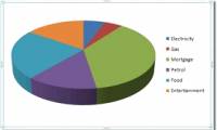
How to draw a pie chart in Excel 2016
pie charts are the best way to show data, making your reports and summary sheets more scientific and logical, in today's article, tipsmake will help you write how to draw pie charts in excel. 2016 with quite simple steps.
-
How to Use Charts and Diagrams in OpenOffice Draw
draw offers no special toolbar for creating organization charts, where individual fields appear as rectangles. however, drawing these charts presents no special problems, however. the use of different fill colors clearly represents...
-
Excel 2019 (Part 22): Charts
it can be a bit overwhelming when an excel workbook contains a lot of data. charts allow you to visualize workbook data graphically, making it easier to understand comparisons and trends.
-
The most detailed instructions on drawing, creating, and inserting charts in Word 2013
charts in word 2013 help you present data in a visual, easy-to-understand way. if you don't know how to do it, this article, tipsmake will guide you in detail on how to draw, create and insert charts.
-
Instructions for displaying charts in powerpoint 2007
when you create a chart showing a certain table of data in powerpoint 2007. but you do not know how to customize it as you like, refer to the article below.
-
The Benefits of Utilizing Radar Charts for Data Visualization
from simple bar charts to intricate scatter plots, the world of data visualization is full of options that help make large, diverse data sets readily understandable.
-
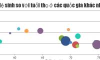
JavaScript code to create bubble charts and graphs.
the example below shows a bubble chart created using javascript, along with the source code that you can edit in your browser or save to your computer to run locally.