Instructions for creating charts in Excel 2007 or 2010
The chart is a very effective way of displaying data in computational or statistical programs, especially Microsoft Excel. In the tutorial below, we will cover the basic operations to create a chart from the data table in Excel 2007 or 2010 version ....
TipsMake.com - The chart is a very effective way of displaying data in calculation or statistics programs, especially Microsoft Excel. In the tutorial below, we will cover the basic operations to create a chart from the data table in Excel 2007 or 2010 version.
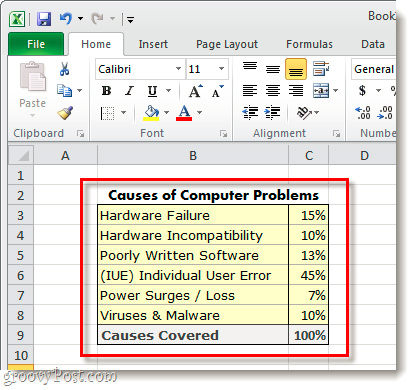
First, we need a statistic data sheet calculated in% as shown below:
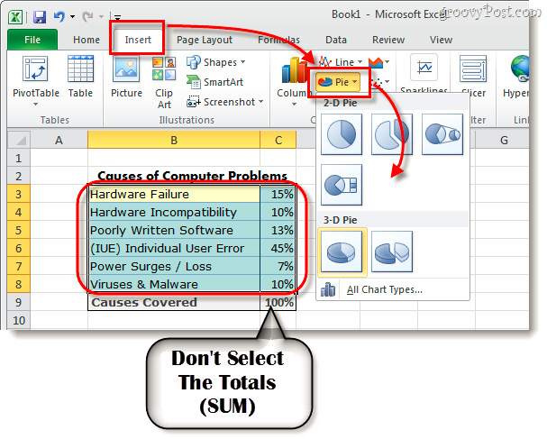
Select which pieces of information to list in the chart, you can select individual components, but remember not to select the total. Then, click the Insert> Pie button, where we will have a separate choice between 2D and 3D charts:
Shortly thereafter, the chart will display on the text. The next thing to do is to change or customize a set number to increase efficiency. Choose the chart you just created and click Chart Tools, which includes 3 main items: Design , Layout , and Format :

The corresponding functions in the Chart Tools section :

Depending on the data table and the desired presentation, please choose to set it up as you like. Of course, in the first practice, the results will not be as expected. Below is a sample of our test:

Good luck!